Category Archives: Pcurve

Visual Inspection of Strength of Evidence: P-Curve vs. Z-Curve

Statistics courses often introduce students to a bewildering range of statistical test.  They rarely point out how test statistics are related.  For example, although t-tests may be easier to understand than F-tests, every t-test could be performed as an F-test and the F-value in the F-test is simply the square of the t-value (t^2 or t*t).

At an even more conceptual level, all test statistics are ratios of the effect size (ES) and the amount of sampling error (ES).   The ratio is sometimes called the signal (ES) to noise (ES) ratio.  The higher the signal to noise ratio (ES/SE), the stronger the observed results deviate from the hypothesis that the effect size is zero.  This hypothesis is often called the null-hypothesis, but this terminology has created some confusing.  It is also sometimes called the nil-hypothesis the zero-effect hypothesis or the no-effect hypothesis.  Most important, the test-statistic is expected to average zero if the same experiment could be replicated a gazillion times.

The test statistics of statistical tests cannot be directly compared.  A t-value of 2 in a study with N = 10 participants provides weaker evidence against the null-hypothesis than a z-score of 1.96.  and an F-value of 4 with df(1,40) provides weaker evidence than an F(10,200) = 4 result.  It is only possible to compare test values directly that have the same sampling distribution (z with z, F(1,40) with F(1,40), etc.).

There are three solutions to this problem. One solution is to use effect sizes as the unit of analysis. This is useful if the aim is effect size estimation.  Effect size estimation has become the dominant approach in meta-analysis.  This blog post is not about effect size estimation.  I just mention it because many readers may be familiar with effect size meta-analysis, but not familiar with meta-analysis of test statistics that reflect the ratio of effect size and sampling error (Effect size meta-analysis: unit = ES; Test Statistic Meta-Analysis: unit ES/SE).

P-Curve

There are two approaches to standardize test statistics so that they have a common unit of measurement.  The first approach goes back to Ronald Fisher, who is considered the founder of modern statistics for researchers.  Following Fisher it is common practice to convert test-statistics into p-values (for this blog post assumes that you are familiar with p-values).   P-values have the same meaning independent of the test statistic that was used to compute them.   That is, p = .05 based on a z-test, t-test, or an F-test provide equally strong evidence against the null-hypothesis (Bayesians disagree, but that is a different story).   The use of p-values as a common metric to examine strength of evidence (evidential value) was largely forgotten, until Simonsohn, Simmons, and Nelson (SSN) used p-values to develop a statistical tool that takes publication bias and questionable research practices into account.  This statistical approach is called p-curve.  P-curve is a family of statistical methods.  This post is about the p-curve plot.

A p-curve plot is essentially a histogram of p-values with two characteristics. First, it only shows significant p-values (p < .05, two-tailed).  Second, it plots the p-values between 0 and .05 with 5 bars.  The Figure shows a p-curve for Motyl et al.’s (2017) focal hypothesis tests in social psychology.  I only selected t-test and F-tests from studies with between-subject manipulations.

p.curve.motyl

The main purpose of a p-curve plot is to examine whether the distribution of p-values is uniform (all bars have the same height).  It is evident that the distribution for Motyl et al.’s data is not uniform.  Most of the p-values fall into the lowest range between 0 and .01. This pattern is called “rigth-skewed.”  A right-skewed plot shows that the set of studies has evidential value. That is, some test statistics are based on non-zero effect sizes.  The taller the bar on the left is, the greater the proportion of studies with an effect.  Importantly, meta-analyses of p-values do not provide information about effect sizes because p-values take effect size and sampling error into account.

The main inference that can be drawn from a visual inspection of a p-curve plot is how unlikely it is that all significant results are false positives; that is, the p-value is below .05 (statistically significant), but this strong deviation from 0 was entirely due to sampling error, while the true effect size is 0.

The next Figure also shows a plot of p-values.  The difference is that it shows the full range of p-values and that it differentiates more between p-values because p = .09 provides weaker evidence than p = .0009.

all.p.curve.motyl.png

The histogram shows that most p-values are below p < .001.  It also shows very few non-significant results.  However, this plot is not more informative than the actual p-curve plot. The only conclusion that is readily visible is that the distribution is not uniform.

The main problem with p-value plots is that p-values do not have interval scale properties.  This means, the difference between p = .4 and p = .3 is not the same as the difference between p = .10 and p = .00 (e.g., .001).

Z-Curve  

Stouffer developed an alternative method to Fisher’s p-value meta-analysis.  Every p-value can be transformed into a z-scores that corresponds to a particular p-value.  It is important to distinguish between one-sided and two-sided p-values.  The transformation requires the use of one-sided p-values, which can be obtained by simply dividing a two-sided p-value by 2.  A z-score of -1.96 corresponds to a one-sided p-value of 0.025 and a z-score of 1.96 corresponds to a one-sided p-values of 0.025.  In a two sided test, the sign no longer matters and the two p-values are added to yield 0.025 + 0.025 = 0.05.

In a standard meta-analysis, we would want to use one-sided p-values to maintain information about the sign.  However, if the set of studies examines different hypothesis (as in Motyl et al.’s analysis of social psychology in general) the sign is no longer important.   So, the transformed two-sided p-values produce absolute (only positive) z-scores.

The formula in R is Z = -qnorm(p/2)   [p = two.sided p-value]

For very strong evidence this formula creates problems. that can be solved by using the log.P=TRUE option in R.

Z = -qnorm(log(p/2), log.p=TRUE)

p.to.z.transformation.png

The plot shows the relationship between z-scores and p-values.  While z-scores are relatively insensitive to variation in p-values from .05 to 1, p-values are relatively insensitive to variation in z-scores from 2 to 15.

only.sig.p.to.z.transformation

The next figure shows the relationship only for significant p-values.  Limiting the distribution of p-values does not change the fact that p-values and z-values have very different distributions and a non-linear relationship.

The advantage of using (absolute) z-scores is that z-scores have ratio scale properties.  A z-score of zero has real meaning and corresponds to the absence of evidence for an effect; the observed effect size is 0.  A z-score of 2 is twice as strong as a z-score of 1. For example, given the same sampling error the effect size for a z-score of 2 is twice as large as the effect size for a z-score of 1 (e.g., d = .2, se = .2, z = d/se = 1,  d = 4, se = .2, d/se = 2).

It is possible to create the typical p-curve plot with z-scores by selecting only z-scores above z = 1.96. However, this graph is not informative because the null-hypothesis does not predict a uniform distribution of z-scores.   For z-values the central tendency of z-values is more important.  When the null-hypothesis is true, p-values have a uniform distribution and we would expect an equal number of p-values between 0 and 0.025 and between 0.025 and 0.050.   A two-sided p-value of .025 corresponds to a one-sided p-value of 0.0125 and the corresponding z-value is 2.24

p = .025
-qnorm(log(p/2),log.p=TRUE)
[1] 2.241403

Thus, the analog to a p-value plot is to examine how many significant z-scores fall into the region from 1.96 to 2.24 versus the region with z-values greater than 2.24.

z.curve.plot1.png

The histogram of z-values is called z-curve.  The plot shows that most z-values are in the range between 1 and 6, but the histogram stretches out to 20 because a few studies had very high z-values.  The red line shows z = 1.96. All values on the left are not significant with alpha = .05 and all values on the right are significant (p < .05).  The dotted blue line corresponds to p = .025 (two tailed).  Clearly there are more z-scores above 2.24 than between 1.96 and 2.24.  Thus, a z-curve plot provides the same information as a p-curve plot.  The distribution of z-scores suggests that some significant results reflect true effects.

However, a z-curve plot provides a lot of additional information.  The next plot removes the long tail of rare results with extreme evidence and limits the plot to z-scores in the range between 0 and 6.  A z-score of six implies a signal to noise ratio of 6:1 and corresponds to a p-value of p = 0.000000002 or 1 out of 2,027,189,384 (~ 2 billion) events. Even particle physics settle for z = 5 to decide that an effect was observed if it is so unlikely for a test result to occur by chance.

> pnorm(-6)*2
[1] 1.973175e-09

Another addition to the plot is to include a line that identifies z-scores between 1.65 and 1.96.  These z-scores correspond to two-sided p-values between .05 and .10. These values are often published as weak but sufficient evidence to support the inference that a (predicted) effect was detected. These z-scores also correspond to p-values below .05 in one-sided tests.

z.curve.plot2

A major advantage of z-scores over p-values is that p-values are conditional probabilities based on the assumption that the null-hypothesis is true, but this hypothesis can be safely rejected with these data.  So, the actual p-values are not important because they are conditional on a hypothesis that we know to be false.   It is like saying, I would be a giant if everybody else were 1 foot tall (like Gulliver in Lilliput), but everybody else is not 1 foot tall and I am not a giant.

Z-scores are not conditioned on any hypothesis. They simply show the ratio of the observed effect size and sampling error.  Moreover, the distribution of z-scores tell us something about the ratio of the true effect sizes and sampling error.  The reason is that sampling error is random and like any random variable has a mean of zero.  Therefore, the mode, median, or mean of a z-curve plot tells us something about ratio of the true effect sizes and sampling error.  The more the center of a distribution is shifted to the right, the stronger is the evidence against the null-hypothesis.  In a p-curve plot, this is reflected in the height of the bar with p-values below .01 (z > 2.58), but a z-curve plot shows the actual distribution of the strength of evidence and makes it possible to see where the center of a distribution is (without more rigorous statistical analyses of the data).

For example, in the plot above it is not difficult to see the mode (peak) of the distribution.  The most common z-values are between 2 and 2.2, which corresponds to p-values of .046 (pnorm(-2.2)*2) and .028 (pnorm(-2.2)*2).   This suggests that the modal study has a ratio of 2:1 for effect size over sampling error.

The distribution of z-values does not look like a normal distribution. One explanation for this is that studies vary in sampling errors and population effect sizes.  Another explanation is that the set of studies is not a representative sample of all studies that were conducted.   It is possible to test this prediction by trying to fit a simple model to the data that assumes representative sampling of studies (no selection bias or p-hacking) and that assumes that all studies have the same ratio of population effect size over sampling error.   The median z-score provides an estimate of the center of the sampling distribution.  The median for these data is z = 2.56.   The next picture shows the predicted sampling distribution of this model, which is an approximately normal distribution with a folded tail.


z.curve.plot3

A comparison of the observed and predicted distribution of z-values shows some discrepancies. Most important is that there are too few non-significant results.  This observation provides evidence that the results are not a representative sample of studies.  Either non-significant results were not reported or questionable research practices were used to produce significant results by increasing the type-I error rate without reporting this (e.g., multiple testing of several DVs, or repeated checking for significance during the course of a study).

It is important to see the difference between the philosophies of p-curve and z-curve. p-curve assumes that non-significant results provide no credible evidence and discards these results if they are reported.  Z-curve first checks whether non-significant results are missing.  In this way, p-curve is not a suitable tool for assessing publication bias or other problems, whereas even a simple visual inspection of z-curve plots provides information about publication bias and questionable research practices.

z.curve.plot4.png

The next graph shows a model that selects for significance.  It no longer attempts to match the distribution of non-significant results.  The objective is only to match the distribution of significant z-values.  You can do this by hand and simply try out different values for the center of the normal distribution.  The lower the center, the more z-scores are missing because they are not significant.  As a result, the density of the predicted curve needs to be adjusted to reflect the fact that some of the area is missing.

center.z = 1.8  #pick a value
z = seq(0,6,.001)  #create the range of z-values
y = dnorm(z,center.z,1) + dnorm(z,-center.z,1)  # get the density for a folded normal
y2 = y #duplicate densities
y2[x < 1.96] = 0   # simulate selection bias, density for non-significant results is zero
scale = sum(y2)/sum(y)  # get the scaling factor so that area under the curve of only significant results is 1.
y = y / scale   # adjust the densities accordingly

# draw a histogram of z-values
# input is  z.val.input
# example; z.val.input = rnorm(1000,2)
hist(z.val.input,freq=FALSE,xlim=c(0,6),ylim=c(0,1),breaks=seq(0,20,.2), xlab=””,ylab=”Density”,main=”Z-Curve”)

abline(v=1.96,col=”red”)   # draw the line for alpha = .05 (two-tailed)
abline(v=1.65,col=”red”,lty=2)  # draw marginal significance (alpha = .10 (two-tailed)

par(new=TRUE) #command to superimpose next plot on histogram

# draw the predicted sampling distribution
plot(x,y,type=”l”,lwd=4,ylim=c(0,1),xlim=c(0,6),xlab=”(absolute) z-values”,ylab=””)

Although this model fits the data better than the previous model without selection bias, it still has problems fitting the data.  The reason is that there is substantial heterogeneity in the true strength of evidence.  In other words, the variability in z-scores is not just sampling error but also variability in sampling errors (some studies have larger samples than others) and population effect sizes (some studies examine weak effects and others examine strong effects).

Jerry Brunner and I developed a mixture model to fit a predicted model to the observed distribution of z-values.  In a nutshell the mixture model has multiple (folded) normal distributions.  Jerry’s z-curve lets the center of the normal distribution move around and give different weights to them.  Uli’s z-curve uses fixed centers one standard deviation apart (0,1,2,3,4,5 & 6) and uses different weights to fit the model to the data.  Simulation studies show that both methods work well.  Jerry’s method works a bit better if there is little variability and Uli’s method works a bit better with large variability.

The next figure shows the result for Uli’s method because the data have large variability.

z.curve.plot5

The dark blue line in the figure shows the density distribution for the observed data.  A density distribution assigns densities to an observed distribution that does not fit a mathematical sampling distribution like the standard normal distribution.   We use the Kernel Density Estimation method implemented in the R base package.

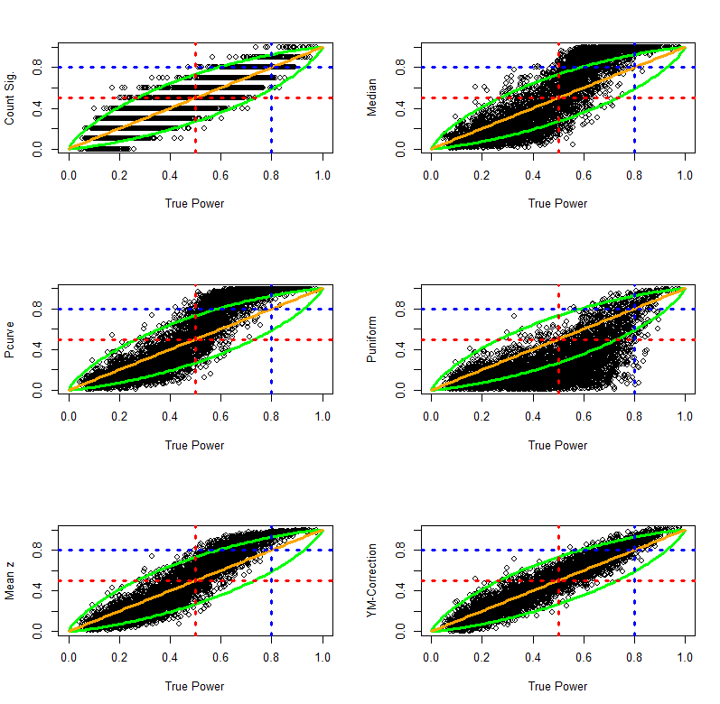
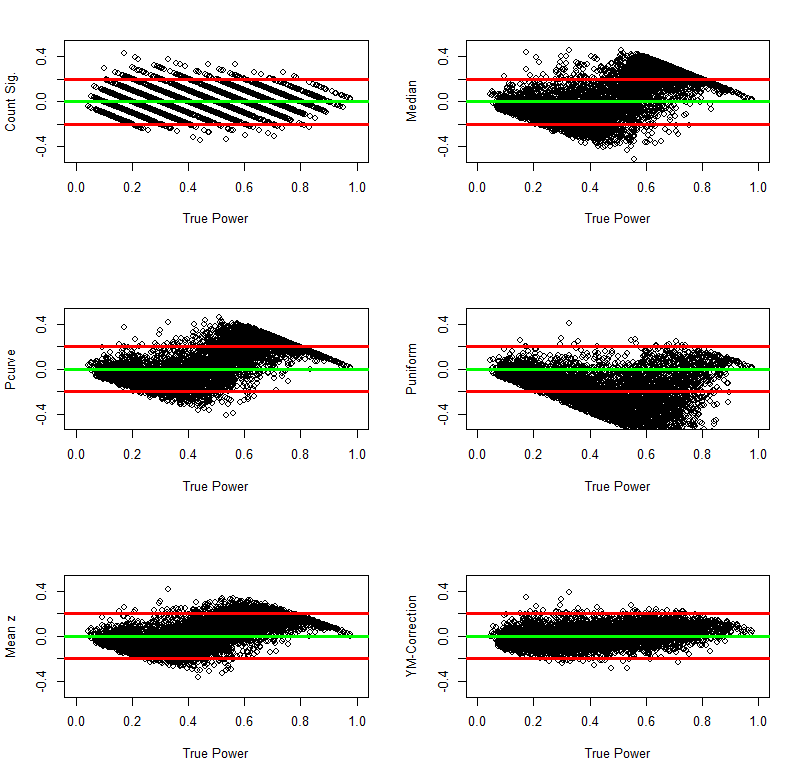
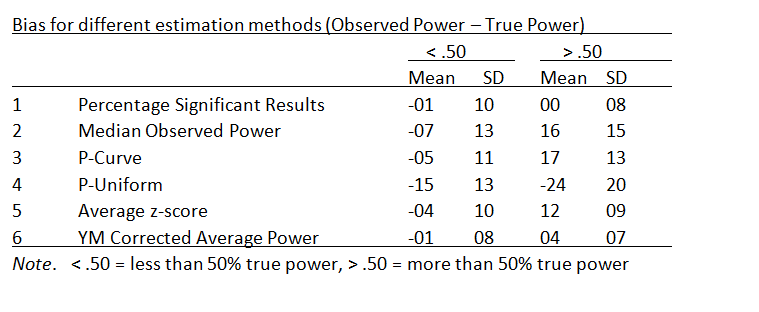
The grey line shows the predicted density distribution based on Uli’s z-curve method.  The z-curve plot makes it easy to see the fit of the model to the data, which is typically very good.  The model result of the model is the weighted average of the true power that corresponds to the center of the simulated normal distributions.  For this distribution,  the weighted average is 48%.

The 48% estimate can be interpreted in two ways.  First, it means that if researchers randomly sampled from the set of studies in social psychology and were able to exactly reproduce the original study (including sample size),  they have a probability of 48% to replicate a significant result with alpha = .05.  The complementary interpretation is that if researchers were successful in replicating all studies exactly,  the reproducibility project is expected to produce 48% significant results and 52% non-significant results.  Because average power of studies predicts the success of exact replication studies, Jerry and I refer to the average power of studies that were selected for significance replicability.  Simulation studies show that our z-curve methods have good large sample accuracy (+/- 2%) and we adjust for the small estimation bias in large samples by computing a conservative confidence interval that adds 2% to the upper limit and 2% to the lower limit.

Below is the R-Code to obtain estimates of replicability from a set of z-values using Uli’s method.

<<<Download Zcurve R.Code>>>

Install R.Code on your computer, then run from anywhere with the following code

location =  <user folder>  #provide location information where z-curve code is stored
source(paste0(location,”fun.uli.zcurve.sharing.18.1.R”))  #read the code
run.zcurve(z.val.input)  #get z-curve estimates with z-values as input


Meta-Analysis of Observed Power: Comparison of Estimation Methods

Meta-Analysis of Observed Power

Citation: Dr. R (2015). Meta-analysis of observed power. R-Index Bulletin, Vol(1), A2.

In a previous blog post, I presented an introduction to the concept of observed power. Observed power is an estimate of the true power on the basis of observed effect size, sampling error, and significance criterion of a study. Yuan and Maxwell (2005) concluded that observed power is a useless construct when it is applied to a single study, mainly because sampling error in a single study is too large to obtain useful estimates of true power. However, sampling error decreases as the number of studies increases and observed power in a set of studies can provide useful information about the true power in a set of studies.

This blog post introduces various methods that can be used to estimate power on the basis of a set of studies (meta-analysis). I then present simulation studies that compare the various estimation methods in terms of their ability to estimate true power under a variety of conditions. In this blog post, I examine only unbiased sets of studies. That is, the sample of studies in a meta-analysis is a representative sample from the population of studies with specific characteristics. The first simulation assumes that samples are drawn from a population of studies with fixed effect size and fixed sampling error. As a result, all studies have the same true power (homogeneous). The second simulation assumes that all studies have a fixed effect size, but that sampling error varies across studies. As power is a function of effect size and sampling error, this simulation models heterogeneity in true power. The next simulations assume heterogeneity in population effect sizes. One simulation uses a normal distribution of effect sizes. Importantly, a normal distribution has no influence on the mean because effect sizes are symmetrically distributed around the mean effect size. The next simulations use skewed normal distributions. This simulation provides a realistic scenario for meta-analysis of heterogeneous sets of studies such as a meta-analysis of articles in a specific journal or articles on different topics published by the same author.

Observed Power Estimation Method 1: The Percentage of Significant Results

The simplest method to determine observed power is to compute the percentage of significant results. As power is defined as the long-range percentage of significant results, the percentage of significant results in a set of studies is an unbiased estimate of the long-term percentage. The main limitation of this method is that the dichotomous measure (significant versus insignificant) is likely to be imprecise when the number of studies is small. For example, two studies can only show observed power values of 0, 25%, 50%, or 100%, even if true power were 75%. However, the percentage of significant results plays an important role in bias tests that examine whether a set of studies is representative. When researchers hide non-significant results or use questionable research methods to produce significant results, the percentage of significant results will be higher than the percentage of significant results that could have been obtained on the basis of the actual power to produce significant results.

Observed Power Estimation Method 2: The Median

Schimmack (2012) proposed to average observed power of individual studies to estimate observed power. Yuan and Maxwell (2005) demonstrated that the average of observed power is a biased estimator of true power. It overestimates power when power is less than 50% and it underestimates true power when power is above 50%. Although the bias is not large (no more than 10 percentage points), Yuan and Maxwell (2005) proposed a method that produces an unbiased estimate of power in a meta-analysis of studies with the same true power (exact replication studies). Unlike the average that is sensitive to skewed distributions, the median provides an unbiased estimate of true power because sampling error is equally likely (50:50 probability) to inflate or deflate the observed power estimate. To avoid the bias of averaging observed power, Schimmack (2014) used median observed power to estimate the replicability of a set of studies.

Observed Power Estimation Method 3: P-Curve’s KS Test

Another method is implemented in Simonsohn’s (2014) pcurve. Pcurve was developed to obtain an unbiased estimate of a population effect size from a biased sample of studies. To achieve this goal, it is necessary to determine the power of studies because bias is a function of power. The pcurve estimation uses an iterative approach that tries out different values of true power. For each potential value of true power, it computes the location (quantile) of observed test statistics relative to a potential non-centrality parameter. The best fitting non-centrality parameter is located in the middle of the observed test statistics. Once a non-central distribution has been found, it is possible to assign each observed test-value a cumulative percentile of the non-central distribution. For the actual non-centrality parameter, these percentiles have a uniform distribution. To find the best fitting non-centrality parameter from a set of possible parameters, pcurve tests whether the distribution of observed percentiles follows a uniform distribution using the Kolmogorov-Smirnov test. The non-centrality parameter with the smallest test statistics is then used to estimate true power.

Observed Power Estimation Method 4: P-Uniform

van Assen, van Aert, and Wicherts (2014) developed another method to estimate observed power. Their method is based on the use of the gamma distribution. Like the pcurve method, this method relies on the fact that observed test-statistics should follow a uniform distribution when a potential non-centrality parameter matches the true non-centrality parameter. P-uniform transforms the probabilities given a potential non-centrality parameter with a negative log-function (-log[x]). These values are summed. When probabilities form a uniform distribution, the sum of the log-transformed probabilities matches the number of studies. Thus, the value with the smallest absolute discrepancy between the sum of negative log-transformed percentages and the number of studies provides the estimate of observed power.

Observed Power Estimation Method 5: Averaging Standard Normal Non-Centrality Parameter

In addition to these existing methods, I introduce to novel estimation methods. The first new method converts observed test statistics into one-sided p-values. These p-values are then transformed into z-scores. This approach has a long tradition in meta-analysis that was developed by Stouffer et al. (1949). It was popularized by Rosenthal during the early days of meta-analysis (Rosenthal, 1979). Transformation of probabilities into z-scores makes it easy to aggregate probabilities because z-scores follow a symmetrical distribution. The average of these z-scores can be used as an estimate of the actual non-centrality parameter. The average z-score can then be used to estimate true power. This approach avoids the problem of averaging power estimates that power has a skewed distribution. Thus, it should provide an unbiased estimate of true power when power is homogenous across studies.

Observed Power Estimation Method 6: Yuan-Maxwell Correction of Average Observed Power

Yuan and Maxwell (2005) demonstrated a simple average of observed power is systematically biased. However, a simple average avoids the problems of transforming the data and can produce tighter estimates than the median method. Therefore I explored whether it is possible to apply a correction to the simple average. The correction is based on Yuan and Maxwell’s (2005) mathematically derived formula for systematic bias. After averaging observed power, Yuan and Maxwell’s formula for bias is used to correct the estimate for systematic bias. The only problem with this approach is that bias is a function of true power. However, as observed power becomes an increasingly good estimator of true power in the long run, the bias correction will also become increasingly better at correcting the right amount of bias.

The Yuan-Maxwell correction approach is particularly promising for meta-analysis of heterogeneous sets of studies such as sets of diverse studies in a journal. The main advantage of this method is that averaging of power makes no assumptions about the distribution of power across different studies (Schimmack, 2012). The main limitation of averaging power was the systematic bias, but Yuan and Maxwell’s formula makes it possible to reduce this systematic bias, while maintaining the advantage of having a method that can be applied to heterogeneous sets of studies.

RESULTS

Homogeneous Effect Sizes and Sample Sizes

The first simulation used 100 effect sizes ranging from .01 to 1.00 and 50 sample sizes ranging from 11 to 60 participants per condition (Ns = 22 to 120), yielding 5000 different populations of studies. The true power of these studies was determined on the basis of the effect size, sample size, and the criterion p < .025 (one-tailed), which is equivalent to .05 (two-tailed). Sample sizes were chosen so that average power across the 5,000 studies was 50%. The simulation drew 10 random samples from each of the 5,000 populations of studies. Each sample of a study simulated a between-subject design with the given population effect size and sample size. The results were stored as one-tailed p-values. For the meta-analysis p-values were converted into z-scores. To avoid biases due to extreme outliers, z-scores greater than 5 were set to 5 (observed power = .999).

The six estimation methods were then used to compute observed power on the basis of samples of 10 studies. The following figures show observed power as a function of true power. The green lines show the 95% confidence interval for different levels of true power. The figure also includes red dashed lines for a value of 50% power. Studies with more than 50% observed power would be significant. Studies with less than 50% observed power would be non-significant. The figures also include a blue line for 80% true power. Cohen (1988) recommended that researchers should aim for a minimum of 80% power. It is instructive how accurate estimation methods are in evaluating whether a set of studies met this criterion.

The histogram shows the distribution of true power across the 5,000 populations of studies.

The histogram shows YMCA fig1that the simulation covers the full range of power. It also shows that high-powered studies are overrepresented because moderate to large effect sizes can achieve high power for a wide range of sample sizes. The distribution is not important for the evaluation of different estimation methods and benefits all estimation methods equally because observed power is a good estimator of true power when true power is close to the maximum (Yuan & Maxwell, 2005).

The next figure shows scatterplots of observed power as a function of true power. Values above the diagonal indicate that observed power overestimates true power. Values below the diagonal show that observed power underestimates true power.

YMCA fig2

Visual inspection of the plots suggests that all methods provide unbiased estimates of true power. Another observation is that the count of significant results provides the least accurate estimates of true power. The reason is simply that aggregation of dichotomous variables requires a large number of observations to approximate true power. The third observation is that visual inspection provides little information about the relative accuracy of the other methods. Finally, the plots show how accurate observed power estimates are in meta-analysis of 10 studies. When true power is 50%, estimates very rarely exceed 80%. Similarly, when true power is above 80%, observed power is never below 50%. Thus, observed power can be used to examine whether a set of studies met Cohen’s recommended guidelines to conduct studies with a minimum of 80% power. If observed power is 50%, it is nearly certain that the studies did not have the recommended 80% power.

To examine the relative accuracy of different estimation methods quantitatively, I computed bias scores (observed power – true power). As bias can overestimate and underestimate true power, the standard deviation of these bias scores can be used to quantify the precision of various estimation methods. In addition, I present the mean to examine whether a method has large sample accuracy (i.e. the bias approaches zero as the number of simulations increases). I also present the percentage of studies with no more than 20% points bias. Although 20% bias may seem large, it is not important to estimate power with very high precision. When observed power is below 50%, it suggests that a set of studies was underpowered even if the observed power estimate is an underestimation.

The quantitatiYMCA fig12ve analysis also shows no meaningful differences among the estimation methods. The more interesting question is how these methods perform under more challenging conditions when the set of studies are no longer exact replication studies with fixed power.

Homogeneous Effect Size, Heterogeneous Sample Sizes

The next simulation simulated variation in sample sizes. For each population of studies, sample sizes were varied by multiplying a particular sample size by factors of 1 to 5.5 (1.0, 1.5,2.0…,5.5). Thus, a base-sample-size of 40 created a range of sample sizes from 40 to 220. A base-sample size of 100 created a range of sample sizes from 100 to 2,200. As variation in sample sizes increases the average sample size, the range of effect sizes was limited to a range from .004 to .4 and effect sizes were increased in steps of d = .004. The histogram shows the distribution of power in the 5,000 population of studies.

YMCA fig4

The simulation covers the full range of true power, although studies with low and very high power are overrepresented.

The results are visually not distinguishable from those in the previous simulation.

YMCA fig5

The quantitative comparison of the estimation methods also shows very similar results.

YMCA fig6

In sum, all methods perform well even when true power varies as a function of variation in sample sizes. This conclusion may not generalize to more extreme simulations of variation in sample sizes, but more extreme variations in sample sizes would further increase the average power of a set of studies because the average sample size would increase as well. Thus, variation in effect sizes poses a more realistic challenge for the different estimation methods.

Heterogeneous, Normally Distributed Effect Sizes

The next simulation used a random normal distribution of true effect sizes. Effect sizes were simulated to have a reasonable but large variation. Starting effect sizes ranged from .208 to 1.000 and increased in increments of .008. Sample sizes ranged from 10 to 60 and increased in increments of 2 to create 5,000 populations of studies. For each population of studies, effect sizes were sampled randomly from a normal distribution with a standard deviation of SD = .2. Extreme effect sizes below d = -.05 were set to -.05 and extreme effect sizes above d = 1.20 were set to 1.20. The first histogram of effect sizes shows the 50,000 population effect sizes. The histogram on the right shows the distribution of true power for the 5,000 sets of 10 studies.

YMCA fig7

The plots of observed and true power show that the estimation methods continue to perform rather well even when population effect sizes are heterogeneous and normally distributed.

YMCA fig9

The quantitative comparison suggests that puniform has some problems with heterogeneity. More detailed studies are needed to examine whether this is a persistent problem for puniform, but given the good performance of the other methods it seems easier to use these methods.

YMCA fig8

Heterogeneous, Skewed Normal Effect Sizes

The next simulation puts the estimation methods to a stronger challenge by introducing skewed distributions of population effect sizes. For example, a set of studies may contain mostly small to moderate effect sizes, but a few studies examined large effect sizes. To simulated skewed effect size distributions, I used the rsnorm function of the fGarch package. The function creates a random distribution with a specified mean, standard deviation, and skew. I set the mean to d = .2, the standard deviation to SD = .2, and skew to 2. The histograms show the distribution of effect sizes and the distribution of true power for the 5,000 sets of studies (k = 10).

YMCA fig10

This time the results show differences between estimation methods in the ability of various estimation methods to deal with skewed heterogeneity. The percentage of significant results is unbiased, but is imprecise due to the problem of averaging dichotomous variables. The other methods show systematic deviations from the 95% confidence interval around the true parameter. Visual inspection suggests that the Yuan-Maxwell correction method has the best fit.

YMCA fig11

This impression is confirmed in quantitative analyses of bias. The quantitative comparison confirms major problems with the puniform estimation method. It also shows that the median, p-curve, and the average z-score method have the same slight positive bias. Only the Yuan-Maxwell corrected average power shows little systematic bias.

YMCA fig12

To examine biases in more detail, the following graphs plot bias as a function of true power. These plots can reveal that a method may have little average bias, but has different types of bias for different levels of power. The results show little evidence of systematic bias for the Yuan-Maxwell corrected average of power.

YMCA fig13

The following analyses examined bias separately for simulation with less or more than 50% true power. The results confirm that all methods except the Yuan-Maxwell correction underestimate power when true power is below 50%. In contrast, most estimation methods overestimate true power when true power is above 50%. The exception is puniform which still underestimated true power. More research needs to be done to understand the strange performance of puniform in this simulation. However, even if p-uniform could perform better, it is likely to be biased with skewed distributions of effect sizes because it assumes a fixed population effect size.

YMCA fig14

Conclusion

This investigation introduced and compared different methods to estimate true power for a set of studies. All estimation methods performed well when a set of studies had the same true power (exact replication studies), when effect sizes were homogenous and sample sizes varied, and when effect sizes were normally distributed and sample sizes were fixed. However, most estimation methods were systematically biased when the distribution of effect sizes was skewed. In this situation, most methods run into problems because the percentage of significant results is a function of the power of individual studies rather than the average power.

The results of these analyses suggest that the R-Index (Schimmack, 2014) can be improved by simply averaging power and then applying the Yuan-Maxwell correction. However, it is important to realize that the median method tends to overestimate power when power is greater than 50%. This makes it even more difficult for the R-Index to produce an estimate of low power when power is actually high. The next step in the investigation of observed power is to examine how different methods perform in unrepresentative (biased) sets of studies. In this case, the percentage of significant results is highly misleading. For example, Sterling et al. (1995) found percentages of 95% power, which would suggest that studies had 95% power. However, publication bias and questionable research practices create a bias in the sample of studies that are being published in journals. The question is whether other observed power estimates can reveal bias and can produce accurate estimates of the true power in a set of studies.