Background: In a tweet that I can no longer find because Uri Simonsohn blocked me from his twitter account, Uri suggested that it would be good if scientists could discuss controversial issues in private before they start fighting on social media. I was just about to submit a manuscript that showed some problems with his p-curve approach to power estimation and a demonstration that z-curve works better in some situations, namely when there is substantial variation in studies in statistical power. So, I thought I give it a try and sent him the manuscript so that we could try to find agreement in a private email exchange.
The outcome of this attempt was that we could not reach agreement on this topic. At best, Uri admitted that p-curve is biased when some extreme test statistics (e.g., F(1,198) = 40, or t(48) = 5.00) are included in the dataset. He likes to call these values outliers. I consider them part of the data that influence the variability and distribution of test statistics.
For the most part Uri disagreed with my conclusions and considers the simulation results that show evidence for my claims unrealistic. Meanwhile, Uri published a blog post with his simulations that have small heterogeneity to claim that p-curve works even better than z-curve when there is heterogeneity.
The reason for the discrepancy between his results and my results are different assumptions about what is realistic variability in strength of evidence against the null-hypothesis, as reflected in absolute z-scores (transformation of p-values into z-scores by means of -qnorm(p.2t) with p.2t equals two.tailed t-test or F-test.
To give everybody an opportunity to examine the arguments that were exchanged during our discussion of p-curve versus z-curve, I am sharing the email exchange. I hope that more statisticians will examine the properties of p-curve and z-curve and add to the discussion. To facilitate this, I will make the r-code to run simulation studies of p-curve and z-curve available in a separate blog post.
P.S. P-curve is available as an online app that provides power estimates without any documentation how p-curve behaves in simulation studies or warnings that datasets with large test statistics can produce inflated estimates of average power.
My email correspondence with Uri Simonsohn – RE: p-curve and heterogeneity
From: URI
To: ULI
Date: 11/24/2017
Hi Uli,
I think email is better at this point.
Ok I am behind a ton of stuff and have a short workday today so cannot look in detail are your z-curve paper right now.
I did a quick search for “osf”, “http” and “code” and could not find the R Code , that may facilitate things if you can share it. Mostly, I would like the code that shows p-curve is biased, especially looking at how the population parameter being estimated is being defined.
I then did a search for “p-curve” and found this
Quick reactions:
1) For power estimation p-curve does not assume homogeneity of effect size, indeed, if anything it assumes homogeneity of power and allows each study to have a different effect size, but it is not really assuming a single power, it is asking what single power best fits the data, which is a different thing. It is computing an average. All average computations ask “what single value best fits the data” but that’s not the same as saying “I think all values are identical, and identical to the average”
2) We do report a few tests of the impact of heterogeneity on p-curve, maybe you have something else in mind. But here they go just in case:
Figure 2C in our POPS paper, has d~N(x,sd=.2)
[Clarification: This Figure shows estimation of effect sizes. It does not show estimation of power.]
Supplement 2
[Again. It does not show simulations for power estimation.]
A key thing to keep in mind is the population parameter of interst. P-curve does not estimate the population effect size or power of all studies attempted, published, reported, etc. It does for the set of studies included in p-curve. So note, for example, in the figure S2C above that when half of studies are .5 and half are .3 among the attempted, p-curve estimates the average included study accurately but differently from .4. The truth is .48 for included studies, p-curve says .47, and the average attempted study is .4
[This is not the issue. Replicability implies conditioning on significance. We want to predict the success rate of studies that replicate significant results. Of course it is meaningful to do follow up studies on non-significant results. But the goal here is not to replicate another inconclusive non-significant result.]
Happy to discuss of course, Uri
—————————————————————————————————————————————
From ULI
To URI
Date 11/24/2017
Hi Uri,
I will change the description of your p-curve code for power.
Honest, I am not fully clear about what the code does or what the underlying assumptions are.
So, thanks for clarifying.
I agree with you that pcurve (also puniform) are surprisingly robust estimates of effect sizes even with heterogeneity (I have pointed that out in comments in the Facebook Discussion group), but that doesn’t mean it works well for power. If you have published any simulation tests for the power estimation function, I am happy to cite them.
Attached is a single R code file that contains (a) my shortened version of your p-curve code, (b) the z-curve code, (c) the code for the simulation studies.
The code shows the cumulative results. You don’t have to run all 5,000 replications before you see the means stabilizing.
Best, Uli
—————————————————————————————————————————————
From URI
To ULI
Date 11/27/2017
Hi Uli,
Thanks for sending the code, I am trying to understand it. I am a little confused about how the true power is being generated. I think you are drawing “noncentrality” parameters (ncp) that are skewed, and then turning those into power, rather than drawing directly skewedly distributed power, correct? (I am not judging that as good or bad, I am just verifying).
[Yes that is correct]
In any case, I created a histogram of the distribution of true power implied by the ncp’s that you are drawing (I think, not 100% sure I am getting that right).
For scenario 3.1 it looks like this:

For scenario 3.3 it looks like this:

(the only code I added was to turn all the true power values into a vector before averaging it, and then ploting a histogram for that vector, if interestd, you can copy paste this into the line of code that just reads “tp” in your code and you will re-produce my histogram)
#ADDED BY URI uri
power.i=pnorm(z,z.crit)[obs.z > z.crit] #line added by Uri SImonsohn to look at the distribution
hist(power.i,xlab=’true power of each study’)
mean.pi=round(mean(power.i),2)
median.pi=round(median(power.i),2)
sd.pi=round(sd(power.i),2)
mtext(side=3,line=0,paste0(“mean=”,mean.pi,” median=”,median.pi,” sd=”,sd.pi))
I wanted to make sure
1) I am correctly understanding this variable as being the true power of the observed studies, the average/median of which we are trying to estimate
2) Those distributions are the distributions you intended to generate
[Yes, that is correct. To clarify, 90% power for p < .05 (two-tailed) is obtained with a z-score of qnorm(.90, 1.96) = 3.24. A z-score of 4 corresponds to 97.9% power. So, in the literature with adequately powered studies, we would expect studies to bunch up at the upper limit of power, while some studies may have very low power because the theory made the wrong prediction and effect sizes are close to zero and power is close to alpha (5%).]
Thanks, Uri
—————————————————————————————————————————————
From ULI
To URI
Date 11/27/2017
Hi Uri,
Thanks for getting back to me so quickly. You are right, it would be more accurate to describe the distribution as the distribution of the non-centrality parameters rather than power.
The distribution of power is also skewed but given the limit of 1, all high power studies will create a spike at 1. The same can happen at the lower end and you can easily get U-shaped distributions.
So, what you see is something that you would also see in actual datasets. Actually, the dataset minimizes skew because I only used non-centrality parameters from 0 to 6.
I did this because z-curve only models z-values between 0 and 6 and treats all observed z-scores greater than 6 as having a true power of 1. That reduces the pile on the right side.
You could do the same to improve performance of p-curve, but it will still not work as well as z-curve, as the simulations with z-scores below 6 show.
Best, Uli
—————————————————————————————————————————————
From URI
To ULI
Date 11/27/2017
OK, yes, probably worth clarifying that.
Ok, now I am trying to make sure I understand the function you use to estimate power with z-curve.
If I see p-values, say c(.001,.002,.003,.004,.005) and I wanted to estimate true power for them via z-curve, I would run:
p= c(.001,.002,.003,.004,.005)
z= -qnorm(p/2)
fun.zcurve(z)
And estimate true power to be 85%, correct?
Uri
—————————————————————————————————————————————
From ULI
To URI
Date 11/27/2017
Yes.
—————————————————————————————————————————————
From URI
To ULI
Date 11/27/2017
Hi Uli,
To make sure I understood z-curve’s function I run a simple simulation.
I am getting somewhat biased results with z-curve, do you want to take a look and see if I may be doing something wrong?
I am attaching the code, I tried to make it clear but it is sometimes hard to convey what one is trying to do, so feel free to ask any questions.
Uri
—————————————————————————————————————————————
From ULI
To URI
Date 11/27/2017
Hi Uri,
What is the k in these simulations? (z-curve requires somewhat large k because the smoothing of the density function can distort things)
You may also consult this paper (the smallest k was 15 in this paper).
http://www.utstat.toronto.edu/~brunner/zcurve2016/HowReplicable.pdf
In this paper, we implemented pcurve differently, so you can ignore the p-curve results.
If you get consistent underestimation with z-curve, I would like to see how you simulate the data.
I haven’t seen this behavior in z-curve in my simulations.
Best, Uli
—————————————————————————————————————————————
From ULI
To URI
Date 11/27/2017
Hi Uli,
I don’t know where “k” is set, I am using the function you sent me and it does not have k as a parameter
I am running this:
fun.zcurve = function(z.val.input, z.crit = 1.96, Int.End=6, bw=.05) {…
Where would k be set?
Into the function you have this
### resolution of density function (doesn’t seem to matter much)
bars = 500
Is that k?
URI
—————————————————————————————————————————————
From ULI
To URI
Date 11/27/2017
I mean the number of test statistics that you submit to z-curve.
length(z.val.input)
—————————————————————————————————————————————
From ULI
To URI
Date 11/27/2017
I just checked with k = 20, the z-curve code I sent you underestimates fixed power of 80 as 72.
The paper I sent you shows a similar trend with true power of 75.
k 15 25 50 100 250
Z-curve 0.704 0.712 0.717 0.723 0.728
[Clarification: This is from the Brunner & Schimmack, 2016, article]
—————————————————————————————————————————————
From ULI
To URI
Date 11/30/2017
Hi Uli,
Sorry for disappearing, got distracted with other things.
I looked a bit more at the apparent bias downwards that z-curve has on power estimates.
First, I added p-curve’s estimates to the chart I had sent, I know p-curve performs well for that basic setup so I used it as a way to diagnose possible errors in my simulations, but p-curve did correctly recover power, so I conclude the simulations are fine.
If you spot a problem with them, however, let me know.
—————————————————————————————————————————————
From ULI
To URI
Date 11/30/2017
Hi Uri,
I am also puzzled why z-curve underestimates power in the homogeneous case even with large N. This is clearly an undersirable behavior and I am going to look for solutions to the problem.
However, in real data that I analyze, this is not a problem because there is heterogeneity.
When there is heterogenity, z-curve performs very well, no matter what the distribution of power/non-centrality parameters is. That is the point of the paper. Any comments on comparisons in the heterogeneous case?
Best, Uli
—————————————————————————————————————————————
From ULI
To URI
Date 11/30/2017
Hey Uli,
I have something with heterogeneity but want to check my work and am almost done for the day, will try tomorrow.
Uri
[Remember: I supplied Uri with r-code to rerun the simulations of heterogeneity and he ran them to show what the distribution of power looks like. So at this point we could discuss the simulation results that are presented in the manuscript.]
—————————————————————————————————————————————
From ULI
To URI
Date 11/30/2017
I ran simulations with t-distrubutions and N = 40.
The results look the same for me.
Mean estimates for 500 simulations
32, 48, 75
As you can see, p-curve also has bias when t-values are converted into z-scores and then analyzed with p-curve.
This suggests that with small N, the transformation from t to z introduces some bias.
The simulations by Jerry Brunner showed less bias because we used the sample sizes in Psych Science for the simulation (median N ~ 80).
So, we are in agreement that zcurve underestimates power when true power is fixed, above 50%, and N and k are small.
—————————————————————————————————————————————
From URI
To ULI
Date 11/30/2017
Hi Uli,
The fact that p-curve is also biased when you convert to z-scores suggests to me that approximation is indeed part of the problem.
[Clarification: I think URI means z-curve]
Fortunately p-curve analysis does not require that transformation and one of the reasons we ask in the app to enter test-statistics is to avoid unnecessary transformations.
I guess it would also be true that if you added .012 to p-values p-curve would get it wrong, but p-curve does not require one to add .012 to p-values.
You write “So, we are in agreement that zcurve underestimates power when true power is fixed, above 50%, and N and k are small.”
Only partial agreement, because the statement implies that for larger N and larger K z-curve is not biased, I believe it is also biased for large k and large N. Here, for instance, is the chart with n=50 per cell (N=100 total) and 50 studies total.
Today I modified the code I sent you so that I would accommodate any power distribution in the submitted studies, not just a fixed level. (attached)
I then used the new montecarlo function to play around with heterogeneity and skewness.
The punchline is that p-curve continues to do well, and z-curve continues to be biased downward.
I also noted, by computed the standard deviation of estimates across simulations, that p-curve has a slightly less random error.
My assessment is that z-curve and p-curve are very similar and will generally agree, but that z-curve is more biased and has more variance.
In any case, let’s get to the simulations Below I show 8 scenarios sorted by the ex-post average true power for the sets of studies.
[Note, N = 20 per cell. As I pointed out earlier, with these small sample sizes the t to z-transformation is a factor. Also k = 20 is a small set of studies that makes it difficult to get good density distributions. So, this plot is p-hacked to show that p-curve is perfect and z-curve consistently worse. The results are not wrong, but they do not address the main question. What happens when we have substantial heterogeneity in true power? Again, Uri has the data, he has the r-code, and he has the results that show p-curve starts overestimating. However, he ignores this problem and presents simulations that are most favorable for p-curve.]
—————————————————————————————————————————————
From URI
To ULI
Date 12/1/2017
Hi Uri,
I really do not care so much about bias in the homogeneous case. I just fixed the problem by first doing a test of the variance and if variance is small to use a fixed effects model.
[Clarification: This is not yet implemented in z-curve and was not done for the manuscript submitted for publication which just acknowledges that p-curve is superior when there is no heterogeneity.]
The main point of the manuscript is really about data that I actually encounter in the literature (see demonstrations in the manuscript, including power posing) where there is considerable heterogeneity.
In this case, p-curve overestimates as you can see in the simulations that I sent you. That is really the main point of the paper and any comments from you about p-curve and heterogeneity would be welcome.
And, I did not mean to imply that pcurve needs transformation. I just found it interesting that transformation is a problem when N is small (as N gets bigger t approaches z and the transformation has less influence).
So, we are in agreement that pcurve does very well when there is little variability in the true power across studies. The question is whether we are in agreement about heterogeneity in power?
Best, Uli
—————————————————————————————————————————————
From ULI
To URI
Date 12/1/2017
Hi Uri,
Why not simulate scenarios that match onto real data.
[I attached data from my focal hypothesis analysis of Bargh’s book “Before you know it” ]
https://replicationindex.com/2017/11/28/before-you-know-it-by-john-a-bargh-a-quantitative-book-review/
—————————————————————————————————————————————
From ULI
To URI
Date 12/1/2017
P.P.S
Also, my simulations show that z-curve OVERestimates when true power is below 50%. Do you find this as well?
This is important because power posing estimates are below 50%, so estimation problems with small k and N would mean that z-curve estimate is inflated rather than suggesting that p-curve estimate is correct.
Best, Uli
—————————————————————————————————————————————
From URI
To ULI
Date 12/2/2017
Hi Uli,
The results I sent show substantial heterogeneity and p-curve does well, do you disagree?
Uri
—————————————————————————————————————————————
From URI
To ULI
Date 12/2/2017
Not sure what you mean here. What aspect of real data would you like to add to the simulations? I did what I did to address the concerns you had that p-curve may not handle heterogeneity and skewed distributions of power, and it seems to do well with very substantial skew and heterogeneity.
What aspect are the simulations abstracting away from that you worry may lead p-curve to break down with real data?
Uri
—————————————————————————————————————————————
From ULI
To URI
Date 12/2/2017
Hi Uri,
I think you are not simulating sufficient heterogeneity to see that p-curve is biased in these situations.
Let’s focus on one example (simulation 2.3) in the r-code I sent you: High true power (.80) and heterogeneity.
This is the distribution of the non-centrality parameters.
And this is the distribution of true power for p < 05 (two-tailed, |z| > = 1.96).
[Clarification: this is not true power, it is the distribution of observed absolute z-scores]
More important, the variance of the observed significant (z > 1.96) z-scores is 2.29.
[Clarification: In response to this email exchange, I added the variance of significant z-scores to the manuscript as a measure of heterogeneity. Due to the selection for significance, variance with low power can be well below 1. A variance of 2.29 is large heterogeneity. ]
In comparison the variance for the fixed model (non-central z = 2.80) is 0.58.
So, we can start talking about heterogeneity in quantitative terms. How much variance do you simulated observed p-values have when you convert them into z-scores?
The whole point of the paper is that performance of z-curve suffers, the greater the heterogeneity of true power is. As sampling error is constant for z-scores, variance of observed z-scores has a maximum of 1 if true power is constant. It is lower than 1 due to selection for significance, which is more severe the lower the power is.
The question is whether my simulations use some unrealistic, large amount of heterogeneity. I attached some Figures for the Journal of Judgment and Decision Making.
As you can see, heterogeneity can be even larger than the heterogeneity simulated in scenario 2.3 (with a normal distribution around z = 2.75).
In conclusion, I don’t doubt that you can find scenarios where p-curve does well with some heterogeneity. However, the point of the paper is that it is possible to find scenarios where there is heterogeneity and p-curve does not well. What your simulations suggest is that z-curve can also be biased in some situations, namely with low variability, small N (so that transformation to z-scores matters) and small number of studies.
I am already working on a solution for this problem, but I see it as a minor problem because most datasets that I have examined (like the one’s that I used for the demonstrations in the ms) do not match this scenario.
So, if I can acknowledge that p-curve outperforms z-curve in some situations, I wonder whether you can do the same and acknowledge that z-curve outperforms p-curve when power is relatively high (50%+) and there is substantial heterogeneity?
Best, Uli
—————————————————————————————————————————————
From ULI
To URI
Date 12/2/2017
What surprises me is that I sent you r-code with 5 simulations that showed when p-curve is breaking down (starting with normal distributed variability of non-central z-scores and 50% power (sim2.2) followed by higher power (80%) and all skewed distributions (sim 3.1, 3.2, 3.3). Do you find a problem with these simulations or is there some other reason why you ignore these simulation studies?
—————————————————————————————————————————————
From ULI
To URI
Date 12/2/2017
I tried “power = runif(n.sim)*.4 + .58” with k = 100.
Now pcurve starts to overestimate and zcurve is unbiased.
So, k makes a difference. Even if pcurve does well with k = 20, we also have to look for larger sets of studies.
Results of 500 simulations with k = 100
—————————————————————————————————————————————
From ULI
To URI
Date 12/2/2017
Even with k = 40, pcurve overestimates as much as zcurve underestimates.
zcurve pcurve
Min. :0.5395 Min. :0.5600
1st Qu.:0.7232 1st Qu.:0.7900
Median :0.7898 Median :0.8400
Mean :0.7817 Mean :0.8246
3rd Qu.:0.8519 3rd Qu.:0.8700
Max. :0.9227 Max. :0.9400
—————————————————————————————————————————————
From ULI
To URI
Date 12/2/2017
Hi Uri,
This is what I find with systematic variation of number of studies (k) and the maximum heterogeneity for a uniform distribution of power and average power of 80% after selection for significance.
power = runif(n.sim)*.4 + .58”
zcurve pcurve
k = 20 77.5 81.2
k = 40 78.2 82.5
k = 100 79.3 82.7
k = 10000 80.2 81.7
(1 run)
If we are going to look at k = 20, we also have to look at k = 100.
Best, Uli
—————————————————————————————————————————————
From ULI
To URI
Date 12/2/2017
Hi Uri,
Why did you truncate the beta distributions so that they start at 50% power?
Isn’t it realistic to assume that some studies have less than 50% power, including false positives (power = alpha = 5%)?
How about trying this beta distribution?
curve(dbeta(x,.5,.35)*.95+.05,0,1,ylim=c(0,3),col=”red”)
80% true power after selection for significance.
Best, Uli
—————————————————————————————————————————————
From ULI
To URI
Date 12/2/2017
HI Uli,
I know I have a few emails from you, thanks.
My plan is to get to them on Monday or Tuesday. OK?
Uri
—————————————————————————————————————————————
Hi Uli,
We have a blogpost going up tomorrow and have been distracted with that, made someprogress with z- vs p- but am not ready yet.
Sorry Uri
—————————————————————————————————————————————
Hi Uli,
From ULI
To URI
Date 12/2/2017
Ok, finally I have time to answer your emails from over the weekend.
Why I run something different?
First, you asked why I run simulations that were different from those you have in your paper (scenario 2.1 and 3.1).
The answer is that I tried to simulate what I thought you were describing in the text: heterogeneity in power that was skewed.
When I saw you had run simulations that led to a power distribution that looked like this:
I assumed that was not what was intended.
First, that’s not skewed
Second, that seems unrealistic, you are simulating >30% of studies powered above 90%.
[Clarification: If studies were powered at 80%, 33% of studies would be above 90% :
1-pnorm(qnorm(.90,1.96),qnorm(.80,1.96))
It is important to remember that we are talking only about studies that produced a significant result. Even if many null-hypothesis are tested, relatively few of these would make it into the set of studies that produced a significant result. Most important, this claim ignores the examples in the paper and my calculations of heterogeneity that can be used to compare simulations of heterogeneity with real data.]
Third, when one has extremely bimodal data, central tendency measures are less informative/important (e.g., the average human wears half a bra). So if indeed power was distributed that way, I don’t think I would like to estimate average power anyway. And if it did, saying the average is 60% or 80% is almost irrelevant, hardly any studies are in that range in reality (like say the average person wears .65 bras, that’s wrong, but inconsequentially worse that .5 bras).
Fourth, if indeed 30% of studies have >90% power, we don’t need p-curve or z-curve. Stuff is gonna be obviously true to naked eye.
But below I will ignore these reservations and stick to that extreme bimodal distribution you propose that we focus our attention on.
The impact of null findings
Actually, before that, let me acknowledge I think you raised a very valid point about the importance of adding null findings to the simulations. I don’t think the extreme bimodal you used is the way to do it, but I do think power=5% in the mix does make sense.
We had not considered p-curve’s performance there and we should have.
Prompted by this exchange I did that, and I am comfortable with how p-curve handles power=5% in the mix.
For example, I considered 40 studies, starting with all 40 null, and then having an increasing number drawn from U(40*-80%) power. Looks fine.
Why p-curve overshoots?
Ok. So having discuss the potential impact of null findings on estimates, and leaving aside my reservations with defining the extreme bimodal distribution of power as something we should worry about, let’s try to understand why p-curve over-estimates and z-curve does not.
Your paper proposes it is because p-curve assumes homogeneity.
It doesn’t. p-curve does not assume homogeneity of power any more than computing average height involves assuming homogeneity of height. It is true that p-curve does not estimate heterogeneity in power, but averaging height also does not compute the SD(height). P-curve does not assume it is zero, in fact, one could use p-curve results to estimate heterogeneity.
But in any case, is z-curve handling the extreme bimodal better thanks to its mixture of distributions, as you propose in the paper, or due to something else?
Because power is nonlinearly related to ncp I assumed it had to do with the censoring of high z-values you did rather than the mixture (though I did not actually look into the mixture in any detail at all)..
To look into that I censored t-values going into p-curve. Not as a proposal for a modification but to make the discussion concrete. I censored at t<3.5 so that any t>3.5 is replaced by 3.5 before being entered into p-curve. I did not spend much time fine-tuning it and I am definitely not proposing htat if one were to censore t-values in p-curve they should be censored at 3.5
Ok, so I run p-curve with censored t-values for the rbeta() distribution you sent and for various others of the same style.
We see that censored p-curve behaves very similarly to z-curve (which is censored also).
I also tried adding more studies, running rbeta(3,1) and (1,3), etc.. Across the board, I find that if there is a high share of extremely high powered studies, censored p-curve and z-curve look quite similar.
If we knew nothing else, we would be inclined to censor p-curve going forward, or to use z-curve instead. But censored p-curve, and especially z-curve, give worse answers when the set of studies does not include many extremely high-powered ones, and in real life we don’t have many extremely high-powered studies. So z-curve and censored p-curve make gains in an world that I don’t think exist, and exhibit losses in one that I do think exists.
In particular, z-curve estimates power to be about 10% when the null is true, instead of 5% (censored p-curve actually get this one right, null is estimated at 5%).
Also, z-curve underestimates power in most scenarios not involving an extreme bimodal distribution (see charts I sent in my previous email). IN addition, z-curve tends to have higher variance than p-curve.
As indicated in my previous email, z-curve and p-curve agree most of the time, their differences will typically be within sampling error. It is a low stakes decision to use p-curve vs z-curve, especially compared to the much more important issue of which studies are selected and which tests are selected within studies.
Thanks for engaging in this conversation.
We don’t have to converge to agreement to gain from discussing things.
Btw, we will write a blog post on the repeated and incorrect claim that p-curve assumes homogeneity and does not deal with heterogeneity well. We will send you a draft when we do, but it could be several weeks till we get to that. I don’t anticipate it being a contentions post from your point of view but figured I would tell you about it now.
Uri
—————————————————————————————————————————————
From ULI
To URI
Date 12/2/2017
Hi Uri,
Now that we are on the same page, the only question is what is realistic.
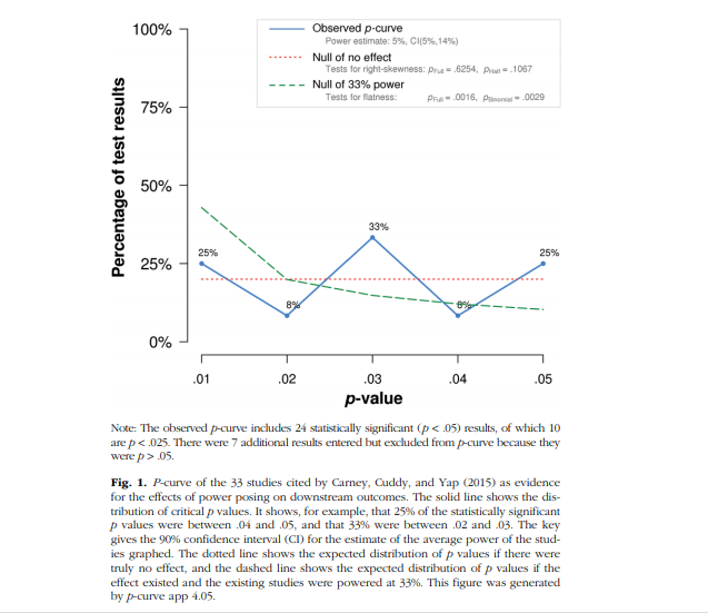
First, your blog post on outliers already shows what is realistic. A single outlier in the power pose study increases the p-curve estimate by more than 10% points.
You can fix this now, but p-curve as it existed did not do this. I would also describe this as a case of heterogeneity. Clearly the study with z = 7 is different from studies with z = 2.
This is in the manuscript that I asked you to evaluate and you haven’t commented on it at all, while writing a blog post about it.
The paper contains several other examples that are realistic because they are based on real data.
I mainly present them as histograms of z-scores rather than historgrams of p-values or observed power because I find the distribution of the z-scores more informative (e.g., where is the mode, is the distribution roughly normal, etc.), but if you convert the z-scores into power you get distributions like the one shown below (U-shpaed), which is not surprising because power is bounded at alpha and 1. So, that is a realistic scenario, whereas your simulations of truncated distributions are not.
I think we can end the discussion here. You have not shown any flaws with my analyses. You have shown that under very limited and unrealistic situations p-curve performs better than z-curve, which is fine because I already acknowledged in the paper that p-curve does better in the homogeneous case.
I will change the description of the assumption underlying p-curve, but leave everything else as is.
If you think there is an error let me know but I have been waiting patiently for you to comment on the paper, and examined your new simulations.
Best, Uli
—————————————————————————————————————————————
Hi Uri,
What about the real world of power posing?
A few z-scores greater than 4 mess up p-curve as you just pointed out in your outlier blog.
I have presented several real world data to you that you continue to ignore.
Please provide one REAL dataset where p-curve gets it right and z-curve underestimates.
Best, Uli
Hi Uli,
—————————————————————————————————————————————
From ULI
To URI
Date 12/6/2017
With real datasets you don’t know true power so you don’t know what’s right and wrong.
The point of our post today is that there is no point statistically analyzing the studies that Cuddy et al put together, with p-curve or any other tool.
I personally don’t think we ever observe true power with enough granularity to make z- vs p-curve prediction differences consequential.
But I don’t think we, you and I, should debate this aspect (is this bias worth that bias). Let’s stick to debating basic facts such as whether or not p-curve assumes homogeneity, or z-curve differs from p-curve because of homogeneity assumption or because of censoring, or how big bias is with this or that assumption. Then when we write we present those facts as transparently as possible to our readers, and they can make an educated decision about it based on their priors and preferences.
Uri
—————————————————————————————————————————————
From ULI
To URI
Date 12/6/2017
Just checking where we agree or disagree.
p-curve uses a single parameter for true power to predict observed p-values.
Agree
Disagree
z-curve uses multiple parameters, which improves prediction when there is substantial heterogeneity?
Agree
Disagree
In many cases, the differences are small and not consequential.
Agree
Disagree
When there is substantial heterogeneity and moderate to high power (which you think is rare), z-curve is accurate and p-curve overestimates.
(see simulations in our manuscript)
Agree
Disagree
I want to submit the manuscript by end of the week.
Best, Uli
—————————————————————————————————————————————
From ULI
To URI
Date 12/6/2017
Going through the manuscript one more time, I found this.
To examine the robustness of estimates against outliers, we also obtained estimates for a subset of studies with z-scores less than 4 (k = 49). Excluding the four studies with extreme scores had relatively little effect on z-curve; replicability estimate = 34%. In contrast, the p-curve estimate dropped from 44% to 5%, while the 90%CI of p-curve ranged from 13% to 30% and did not include the point estimate.
Any comments on this, I mean point estimate is 5% and 90%CI is 13 to 30%,
Best, Uli
[Clarification: this was a mistake. I confused point estimate and lower bound of CI in my output]
—————————————————————————————————————————————
From URI
To ULI
Date 12/7/2017
Hi Uli.
See below:
From: Ulrich Schimmack [mailto:ulrich.schimmack@utoronto.ca]
Sent: Wednesday, December 6, 2017 10:44 PM
To: Simonsohn, Uri <uws@wharton.upenn.edu>
Subject: RE: Its’ about censoring i think
Just checking where we agree or disagree.
p-curve uses a single parameter for true power to predict observed p-values.
Agree
z-curve uses multiple parameters,
Agree I don’t know the details of how z-curve works, but I suspect you do and are correct.
which improves prediction when there is substantial heterogeneity?
Disagree.
Few fronts.
1) I don’t think heterogeneity per-se is the issue, but extremity of the values. P-curve is accurate with very substantial heterogeneity. In your examples what causes the trouble are those extremely high power values. Even with minimal heterogeneity you will get over-estimation if you use such values.
2) I also don’t know that it is the extra parametres in z-curve that are helping because p-curve with censoring does just as well. so I suspect it is the censoring and not the multiple parameters. That’s also consistent with z-curve under-estimating almost everywhere, the multiple parameters should not lead to that I don’t think.
In many cases, the differences are small and not consequential.
Agree, mostly. I would not state that in an unqualified way out of context.
For example, my persona assessment, which I realize you probably don’t share, is that z-curve does worse in contexts that matter a bit more, and that are vastly more likely to be observed.
When there is substantial heterogeneity and moderate to high power (which you think is rare), z-curve is accurate and p-curve overestimates.
(see simulations in our manuscript)
Disagree.
You can have very substantial heterogeneity and very high power and p-curve is accurate (z-curve under-estimates).
For example, for the blogpost on heterogeneity and p-curve I figured that rather than simulating power directly it made more sense to simulate n and d distributions, over which people have better intuitions.. and then see what happened to power (rather than simulating power or ncp directly).
Here is one example. Sets of 20 studies, drawn with n and d from the first two panels, with the implied true power and its estimate in the 3rd panel.
I don’t mention this in the post, but z-curve in this simulation under-estimates power, 86% instead of 93%
The parameters are
n~rnorm(mean=100,sd=10)
d~rnorm(mean=.5,sd=.05)
What you need for p-curve to over-estimate and for z-curve to not under-estimate is substantial share of studies at both extremes, many null, many with power>95%
In general very high power leads to over-estimation, but it is trivial in the absence of many very low power studies that lower the average enough that it matters.
That’s the combination I find unlikely, 30%+ with >90% power and at the same time 15% of null findings (approx., going off memory here).
I don’t generically find high power with heterogeneity unlikely, I find the figure above super plausible for instance.
NOTE: For the post I hope to gain more insight on the precise boundary conditions for over-estimation, I am not sure I totally get it just yet.
I want to submit the manuscript by end of the week.
Hope that helps. Good luck.
Best, Uli
From URI
To ULI
Date 12/7/2017
Hi Uli,
First, I had not read your entire paper and only now I realize you analyze the Cuddy et al paper, that’s an interesting coincidence. For what is worth, we worked on the post before you and I had this exchange (the post was written in November and we first waited for Thanksgiving and then over 10 days for them to reply). And moreover, our post is heavily based off the peer-review Joe wrote when reviewing this paper, nearly a year ago, and which was largely ignored by the authors unfortunately.
In terms of the results. I am not sure I understand. Are you saying you get an estimate of 5% with a confidence interval between 13 and 30?
That’s not what I get.
—————————————————————————————————————————————
From ULI
To URI
Date 12/7/2017
Hi Uri
That was a mistake. It should be 13% estimate with 5% to 30% confidence interval.
I was happy to see pcurve mess up (motivated bias), but I already corrected it yesterday when I went through the manuscript again and double checked.
As you can see in your output, the numbers are switched (I should label columns in output).
So, the question is whether you will eventually admit that pcurve overestimates when there is substantial heterogeneity.
We can then fight over what is realistic and substantial, etc. but to simply ignore the results of my simulations seems defensive.
This is the last chance before I will go public and quote you as saying that pcurve is not biased when there is substantial heterogeneity.
If that is really your belief, so be it. Maybe my simulations are wrong, but you never commented on them.
Best, Uli
—————————————————————————————————————————————
HI Uli,
See below
From: Ulrich Schimmack [mailto:ulrich.schimmack@utoronto.ca]
Sent: Friday, December 8, 2017 12:39 AM
To: Simonsohn, Uri <uws@wharton.upenn.edu>
Subject: RE: one more question
Hi Uri
That was a mistake. It should be 13% estimate with 5% to 30% confidence interval.
*I figured
I was happy to see pcurve mess up (motivated bias), but I already corrected it yesterday when I went through the manuscript again and double checked.
*Happens to the best of us
As you can see in your output, the numbers are switched (I should label columns in output).
*I figured
So, the question is whether you will eventually admit that pcurve overestimates when there is substantial heterogeneity.
*The tone is a bit accusatorial “admit”, but yes, in my blog post I will talk about it. My goal is to present facts in a way that lets readers decide with the same information I am using to decide.
It’s not always feasible to achieve that goal, but I strive for it. I prefer people making right inferences than relying on my work to arrive at them.
We can then fight over what is realistic and substantial, etc. but to simply ignore the results of my simulations seems defensive.
*I don’t think that’s for us to decide. We can ‘fight’ about how to present the facts to readers, they decide which is more realistic.
I am not ignoring your simulation results.
This is the last chance before I will go public and quote you as saying that pcurve is not biased when there is substantial heterogeneity.
*I would prefer if you don’t speak on my behalf either way, our conversation is for each of us to learn from the other, then you speak for yourself.
If that is really your belief, so be it. Maybe my simulations are wrong, but you never commented on them.
*I haven’t tried to reproduce your simulations, but I did indicate in our emails that if you run the rbeta(n,.35,.5)*.95+.05 p-curve over-estimates, I also explained why I don’t find that particularly worrisome. But you are not publishing a report on our email exchange, you are proposing a new tool. Our exchange hopefully helped make that paper clearer.
Please don’t quote any aspect of our exchange. You can say you discussed matters with me, but please do not quote me. This is a private email exchange. You can quote from my work and posts. The heterogeneity blog post may be up in a week or two.
Uri