Category Archives: P-Curve

Z-Curve: An even better p-curve

So far Simmons, Nelson, and Simonsohn have not commented on this blog post. I now submitted it as a commentary to JEP-General. Let’s see whether it will be send out for review and whether they will comment as (anonymous) reviewers.

Abstract

P-Curve was a first attempt to take the problem of selection for significance seriously and to evaluate whether a set of studies provides credible evidence against the null-hypothesis after taking selection bias into account. Here I showed that p-curve has serious limitations and provides misleading evidence about the strength of evidence against the null-hypothesis. I showed that all of the information that is provided by a p-curve analysis (Simonsohn, Nelson, & Simmons, 2014) is also provided by a z-curve analysis (Bartos & Schimmack, 2021). Moreover, z-curve provides additional information about the presence and the amount of selection bias. As z-curve is superior than p-curve, the rational choice is to use z-curve to examine the credibility of significant results.

Keywords: Publication Bias, Selection Bias, Z-Curve, P-Curve, Expected Replication Rate, Expected Discovery Rate, File-Drawer, Power

Introduction

In 2011, it dawned on psychologists that something was wrong with their science. Daryl Bem had just published an article with nine studies that showed an incredible finding (Bem, 2011). Participants’ responses were influenced by random events that had not yet occurred. Since then, the flaws in research practices have become clear and it has been shown that they are not limited to mental time travel (Schimmack, 2020). For decades, psychologists assumed that statistically significant results reveal true effects and reported only statistically significant results (Motyl et al., 2017; Sterling, 1959; Sterling et al., 1995). However, selective reporting of significant results undermines the purpose of significance testing to distinguish true and false hypotheses. If only significant results are reported, most published results could be false positive results (Simmons, Nelson, & Simonsohn, 2011).

Selective reporting of significant results also undermines the credibility of meta-analyses (Rosenthal, 1979), which explains why meta-analyses also suggest humans posses psychic abilities (Bem & Honorton, 1994). Thus, selection bias not only invalidates the results of original studies, it also threatens the validity of conclusions based on meta-analyses that do not take selection bias into account.

Concerns about a replication crisis in psychology led to an increased focus on replication studies. An ambitious project found that only 37% of studies in (cognitive & social) experimental psychology could be replicated (Open Science Collaboration, 2015). This dismal result created a crisis of confidence in published results. To alleviate these concerns, psychologists developed new methods to detect publication bias. These new methods showed that Bem’s paranormal results were obtained with the help of questionable research practices (Francis, 2012; Schimmack, 2012), which explained why replication attempts were unsuccessful (Galak et al., 2012). Furthermore, Francis showed that many published articles in the prestigious journal Psychological Science show signs of publication bias (Francis, 2014). However, the presence of publication bias does not imply that the published results are false (positives). Publication bias may merely inflate effect sizes without invalidating the main theoretical claims. To address the latter question it is necessary to conduct meta-analyses that take publication bias into account. In this article, I compare two methods that were developed for this purpose; p-curve (Simonsohn et al., 2014), and z-curve (Bartos & Schimmack, 2021; Brunner & Schimmack, 2020). P-curve was introduced in 2014 and has already been used in many articles. Z-curve was developed in 2015, but was only published recently in a peer-reviewed journal. Experimental psychologists who are familiar with speed-accuracy tradeoffs may not be surprised to learn that z-curve is a superior method. As Brunner and Schimmack (2020) demonstrated with simulation studies, p-curve often produces inflated estimates of the evidential value of original studies. This bias was not detected by the developers of p-curve because they did not evaluate their method with simulation studies. Moreover, their latest version of p-curve was never peer-reviewed. In this article, I first provide a critical review of p-curve and then show how z-curve addresses all of them.

P-Curve

P-curve is a name for a family of statistical tests that have been combined into the p-curve app that researchers can use to conduct p-curve analyses, henceforth called p-curve . The latest version of p-curve is version 4.06 that was last updated on November 30, 2017 (p-curve.com).

The first part of a p-curve analysis is a p-curve plot. A p-curve plot is a histogram of all significant p-values where p-values are placed into five bins, namely p-values ranging from 0 to .01, .01 to .02, .02 to .03, .03 to .04, and .04 to .05. If the set of studies contains mostly studies with true effects that have been tested with moderate to high power, there are more p-values between 0 and .01 than between .04 and .05. This pattern has been called a right-skewed distribution by the p-curve authors. If the distribution is flat or reversed (more p-values between .04 and .05 than between 0 and .01), the data lack evidential value; that is, the results are more consistent with the null-hypothesis than with the presence of a real effect.

The main limitation of p-curve plots is that it is difficult to evaluate ambiguous cases. To aid in the interpretation of p-curve plots, p-curve also provides statistical tests of evidential value. One test is a significance tests against the null-hypothesis that all significant p-values are false positive results. If this null-hypothesis can be rejected with the traditional alpha criterion of .05, it is possible to conclude that at least some of the significant results are not false positives. The main problem with this significance test is that it does not provide information about effect sizes. A right-skewed p-curve with a significant p-values may be due to weak evidence with many false positive results or strong evidence with few false positives.

To address this concern, the p-curve app also provides an estimate of statistical power. When studies are heterogeneous (i.e., different sample sizes or effect sizes or both) this estimate is an estimate of mean unconditional power (Bartos & Schimmack, 2021; Brunner & Schimmack, 2020). Unconditional power refers to the fact that a significant result may be a false positive result. Unconditional power does not condition on the presence of an effect (i.e., the null-hypothesis is false). When the null-hypothesis is true, a result has a probability of alpha (typically 5%) to be significant. Thus, a p-curve analysis that includes some false positive results, includes some studies with a probability equal to alpha and others with probabilities greater than alpha.

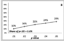
To illustrate the p-curve app, I conducted a meta-analysis of all published articles by Leif D. Nelson, one of the co-authors of p-curve  I found 119 studies with codable data and coded the most focal hypothesis for each of these studies. I then submitted the data to the online p-curve app. Figure 1 shows the output.

Visual inspection of the p-curve plot shows a right-skewed distribution with 57% of the p-values between 0 and .01 and only 6% of p-values between .04 and .05. The statistical tests against the null-hypothesis that all of the significant p-values are false positives is highly significant. Thus, at least some of the p-values are likely to be true positives. Finally, the power estimate is very high, 97%, with a tight confidence interval ranging from 96% to 98%. Somewhat redundant with this information, the p-curve app also provides a significance test for the hypothesis that power is less than 33%. This test is not significant, which is not surprising given the estimated power of 97%.

The p-curve results are surprising. After all, Nelson openly stated that he used questionable research practices before he became aware of the high false positive risk associated with these practices. “We knew many researchers—including ourselves—who readily admitted to dropping dependent variables, conditions, or participants to achieve significance.” (Simmons, Nelson, & Simonsohn, 2018, p. 255). The impressive estimate of 97% power is in stark contrast to the claim that questionable research practices were used to produce Nelson’s results. A z-curve analysis of the data shows that the p-curve results provide false information about the robustness of Nelson’s published results.

Z-Curve

Like p-curve, z-curve analyses are supplemented by a plot of the data. The main difference is that p-values are converted into z-scores using the formula for the inverse normal distribution; z = qnorm(1-p/2). The second difference is that significant and non-significant p-values are plotted. The third difference is that z-curve plots have a much finer resolution than p-curve plots. Whereas p-curve bins all z-scores from 2.58 to infinity into one bin (p < .01), z-curve uses the information about the distribution of z-scores all the way up to z = 6 (p = .000000002; 1/500,000,000). Z-statistics greater than 6 are assigned a power of 1.

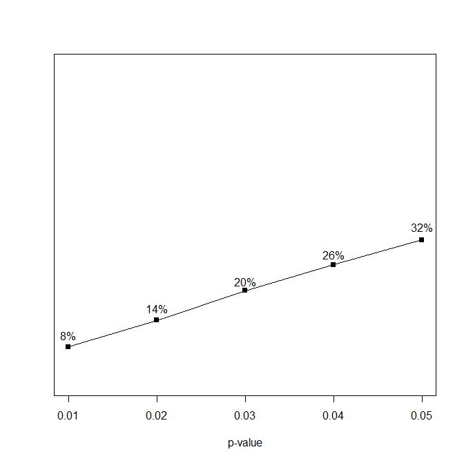
Visual inspection of the z-curve plot reveals something that the p-curve plot does not show, namely there is clear evidence for the presence of selection bias. Whereas p-curve suggests that “highly” significant results (0 to .01) are much more common than “just” significant results (.04 to .05), z-curve shows that just significant results (.05 to .005) are much more frequent than highly significant (p < .005) results. The difference is due to the implicit definition of high and low in the two plots. The high frequency of highly significant (p < .01) results in the p-curve plots is due to the wide range of values that are lumped together into this bin. Once it is clear that many p-values are clustered just below .05 (z > 1.96, the vertical red line), it is immediately notable that there are too few just non-significant (z < 1.96) values. This steep drop in frequencies for just significant to just not significant values is inconsistent with random sampling error. Thus, publication bias is readily visible by visual inspection of a z-curve plot. In contrast, p-curve plots provide no information about publication bias because non-significant results are not shown. Even worse, right skewed distributions are often falsely interpreted as evidence that there is no publication bias or use of questionable research practices (e.g., Rusz, Le Pelley, Kompier, Mait, & Bijleveld, 2020). This misinterpretation of p-curve plots can be easily avoided by inspection of z-curve plots.

The second part of a z-curve analysis uses a finite mixture model to estimate two statistical parameters of the data. These parameters are called the expected discovery rate and the expected replication rate (Bartos & Schimmack, 2021). Another term for these parameters is mean power before selection and mean power after selection for significance (Brunner & Schimmack, 2020). The meaning of these terms is best understood with a simple example where a researcher tests 100 false hypotheses and 100 true hypotheses with 100% power. The outcome of this study produces significant and non-significant p-values. The expected value for the frequency of significant p-values is 100 for the 100 true hypotheses tested with 100% power and 5% for the 100 false hypotheses that produce 5 significant results when alpha is set to 5%. Thus, we are expecting 105 significant results and 95 non-significant results. In this example, the discovery rate is 105/200 = 52.5%. With real data, the discovery rate is often not known because not all statistical tests are published. When selection for significance is present, the observed discovery rate is an inflated estimate of the actual discovery rate. For example, if 50 of the 95 non-significant results are missing, the observed discovery rate is 105/150 = 70%. Z-curve.2.0 uses the distribution of the significant z-scores to estimate the discovery rate by taking selection bias into account. That is, it uses the truncated distribution for z-scores greater than 1.96 to estimate the shape of the full distribution (i.e., the grey curve in Figure 2). This produces an estimate of the mean power before selection for significance. As significance is determined by power and sampling error, the estimate of mean power provides an estimate of the expected discovery rate. Figure 2 shows an observed discovery rate of 87%. This is in line with estimates of discovery rates around 90% in psychology journals (Motyl et al., 2017; Sterling, 1959; Sterling et al., 1995). However, the z-curve estimate of the expected discovery rate is only 27%. The bootstrapped, robust confidence interval around this estimate ranges from 5% to 51%. As this interval does not include the value for the observed discovery rate, the results provide statistically significant evidence that questionable research practices were used to produce 89% significant results. Moreover, the difference between the observed and expected discovery rate is large. This finding is consistent with Nelson’s admission that many questionable research practices were used to achieve significant results (Simmons et al., 2018). In contrast, p-curve provides no information about the presence or amount of selection bias.

The power estimate provided by the p-curve app is the mean power of studies with a significant result. Mean power for these studies is equal or greater to the mean power of all studies because studies with higher power are more likely to produce a significant result (Brunner & Schimmack, 2020). Bartos and Schimmack (2021) refer to mean power after selection for significance as the expected replication rate. To explain this term, it is instructive to see how selection for significance influences mean power in the example with 100 test of true null-hypotheses and 100 tests of true alternative hypotheses with 100% power. We expect only 5 false positive results and 100 true positive results. The average power of these 105 studies is (5  * .05 + 100 * 1)/105 = 95.5%.  This is much higher than the mean power before selection for significance which was based on 100 rather than just 5 tests of a true null-hypothesis. For Nelson’s data, p-curve produced an estimate of 97% power. Thus, p-curve predicts that 96% of replication attempts of Nelson’s published results would produce a significant result again. The z-curve estimate in Figure 2 shows that this is a dramatically inflated estimate of the expected replication rate. The z-curve estimate is only 52% with a robust 95% confidence interval ranging from 40% to 68%. Simulation studies show that z-curve estimates are close to the simulated values, whereas p-curve estimates are inflated when the studies are heterogeneous (Brunner & Schimmack, 2020). The p-curve authors have been aware of this bias in p-curve estimates since January 2018 (Simmons, Nelson, & Simonsohn, 2018), but they have not changed their app or warned users about this problem. The present example clearly shows that p-curve estimates can be highly misleading and that it is unscientific to use or interpret p-curve estimates of the expected replication rate.

Published Example

Since p-curve was introduced, it has been cited in over 500 articles and it has been used in many meta-analyses. While some meta-analyses correctly interpreted p-curve results to demonstrate merely that a set of studies have some evidential value (i.e., the nil-hypothesis that all significant results are false positives), others went further and drew false conclusions from a p-curve analysis. Moreover, meta-analyses that used p-curve missed the opportunity to quantify the amount of selection bias in a literature. To illustrate how meta-analysts can benefit from a z-curve analysis, I reexamined a meta-analysis of the effects of reward stimuli on attention (Rusz, et al., 2020).

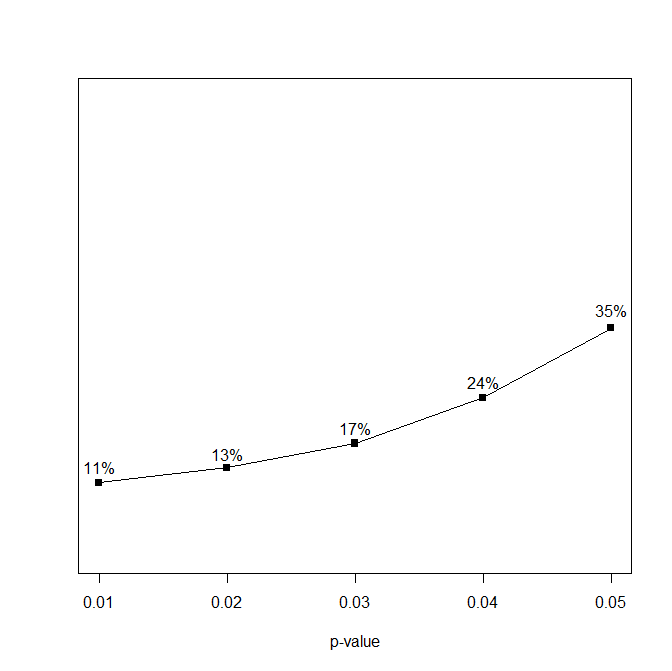
Using their open data (https://osf.io/rgeb6/), I first reproduced their p-curve analysis using the p-curve app (http://www.p-curve.com/app4/). Figure 3 show that 42% of the p-values are between .01 and 0, whereas only 7% of the p-values are between .04 and .05. The figure also shows that the observed p-curve is similar to the p-curve that is predicted by a homogeneous set of studies with 33% power. Nevertheless, power is estimated to be 52%. Rusz et al. (2020) interpret these results as evidence that “this set of studies contains evidential value for reward-driven distraction” and that “It provides no evidence for p-hacking” (p. 886).

Figure 4 shows the z-curve for the same data. Visual inspection of the z-curve plot shows that there are many more just-significant than just-not-significant results. This impression is confirmed by a comparison of the observed discovery rate (74%) versus the expected discovery rate (27%). The bootstrapped, robust 95% confidence interval, 8% to 58%, does not include the observed discovery rate. Thus, there is statistically significant evidence that questionable research practices inflated the percentage of significant results. The expected replication rate is also lower (37%) than the p-curve estimate (52%). With an average power of 37%, it is clear that published studies are underpowered. Based on these results, it is clear that effect-size meta-analysis that do not take selection bias into account produce inflated effect size estimates. Moreover, when the ERR is higher than the EDR, studies are heterogenous, which means that some studies have even less power than the average power of 37%, and some of these may be false positive results. It is therefore unclear which reward stimuli and which attention paradigms show a theoretically significant effect and which do not. However, meta-analysts often falsely generalize an average effect to individual studies. For example, Rusz et al. (2020) concluded from their significant average effect size (d ~ .3) that high-reward stimuli impair cognitive performance “across different paradigms and across different reward cues” (p. 887). This conclusion is incorrect because they mean effect size is inflated and could be based on subsets of reward stimuli and paradigms. To demonstrate that a specific reward stimulus influences performance on a specific task would require high powered replication studies for the various combinations of rewards and paradigms. At present, the meta-analysis merely shows that some rewards can interfere with some tasks.

Conclusion

Simonsohn et al. (2014) introduced p-curve as a statistical tool to correct for publication bias and questionable research practices in meta-analyses. In this article, I critically reviewed p-curve and showed several limitations and biases in p-curve results. The first p-curve methods focussed on statistical significance and did not quantify the strength of evidence against the null-hypothesis that all significant results are false positives. This problem was solved by introducing a method that quantified strength of evidence as the mean unconditional power of studies with significant results. However, the estimation method was never validated with simulation studies. Independent simulation studies showed that p-curve systematically overestimates power when effect sizes or sample sizes are heterogeneous. In the present article, this bias inflated mean power for Nelson’s published results from 52% to 97%. This is not a small or negligible deviation. Rather, it shows that p-curve results can be extremely misleading. In an application to a published meta-analysis, the bias was less extreme, but still substantial, 37% vs. 52%, a 15 percentage points difference. As the amount of bias is unknown unless p-curve results are compared to z-curve results, researchers can simply use z-curve to obtain an estimate of mean power after selection for significance or the expected replication rate.

Z-curve not only provides a better estimate of the expected replication rate. It also provides an estimate of the expected discovery rate; that is the percentage of results that are significant if all studies were available (i.e., after researchers empty their file drawer). This estimate can be compared to the observed discovery rate to examine whether selection bias is present and how large it is. In contrast, p-curve provides no information about the presence of selection bias and the use of questionable research practices.

In sum, z-curve does everything that p-curve does better and it provides additional information. As z-curve is better than p-curve on all features, the rational choice is to use z-curve in future meta-analyses and to reexamine published p-curve analyses with z-curve. To do so, researchers can use the free R-package zcurve (Bartos & Schimmack, 2020).

References

Bartoš, F., & Schimmack, U. (2020). “zcurve: An R Package for Fitting Z-curves.” R package version 1.0.0

Bartoš, F., & Schimmack, U. (2021). Z-curve.2.0: Estimating the replication and discovery rates. Meta-Psychology, in press.

Bem, D. J. (2011). Feeling the future: Experimental evidence for anomalous retroactive influences on cognition and affect. Journal of Personality and Social Psychology, 100, 407–425. http://dx.doi.org/10.1037/a0021524

Bem, D. J., & Honorton, C. (1994). Does psi exist? Replicable evidence for an anomalous process of information transfer. Psychological Bulletin, 115(1), 4–18. https://doi.org/10.1037/0033-2909.115.1.4

Brunner, J. & Schimmack, U. (2020). Estimating population mean power under conditions of heterogeneity and selection for significance. Meta-Psychology, 4, https://doi.org/10.15626/MP.2018.874

Francis, G. (2012). Too good to be true: Publication bias in two prominent studies from experimental psychology. Psychonomic Bulletin & Review, 19, 151–156. http://dx.doi.org/10.3758/s13423-012-0227-9

Francis G., (2014). The frequency of excess success for articles in Psychological Science. Psychonomic Bulletin and Review, 21, 1180–1187. https://doi.org/10.3758/s13423-014-0601-x

Galak, J., LeBoeuf, R. A., Nelson, L. D., & Simmons, J. P. (2012). Correcting the past: Failures to replicate. Journal of Personality and Social Psychology, 103, 933–948. http://dx.doi.org/10.1037/a0029709

Motyl, M., Demos, A. P., Carsel, T. S., Hanson, B. E., Melton, Z. J., Mueller, A. B., Prims, J. P., Sun, J., Washburn, A. N., Wong, K. M., Yantis, C., & Skitka, L. J. (2017). The state of social and personality science: Rotten to the core, not so bad, getting better, or getting worse? Journal of Personality and Social Psychology, 113(1), 34–58. https://doi.org/10.1037/pspa0000084

Open Science Collaboration. (2015). Estimating the reproducibility of psychological science. Science, 349(6251), aac4716–aac4716. https://doi.org/10.1126/science.aac4716

Rosenthal, R. (1979). The file drawer problem and tolerance for null results. Psychological Bulletin, 86(3), 638–641. https://doi.org/10.1037/0033-2909.86.3.638

Rusz, D., Le Pelley, M. E., Kompier, M. A. J., Mait, L., & Bijleveld, E. (2020). Reward-driven distraction: A meta-analysis. Psychological Bulletin, 146(10), 872–899. https://doi.org/10.1037/bul0000296

Schimmack, U. (2012). The ironic effect of significant results on the credibility of multiple-study articles. Psychological Methods, 17, 551–566. https://doi.org/10.1037/a0029487

Schimmack, U. (2020). A meta-psychological perspective on the decade of replication failures in social psychology. Canadian Psychology/Psychologie canadienne. 61 (4), 364-376. https://doi.org/10.1037/cap0000246

Simmons, J. P., Nelson, L. D., & Simonsohn, U. (2011). False-positive psychology: Undisclosed flexibility in data collection and analysis allows presenting anything as significant. Psychological Science, 22, 1359–1366. http://dx.doi.org/10.1177/0956797611417632

Simmons, J. P., Nelson, L. D., & Simonsohn, U. (2018). False-positive citations. Perspectives on Psychological Science, 13(2), 255–259. https://doi.org/10.1177/1745691617698146

Simonsohn, U., Nelson, L. D., & Simmons, J. P. (2014). P-curve: A key to the file-drawer. Journal of Experimental Psychology: General, 143(2), 534–547. https://doi.org/10.1037/a0033242

Sterling, T. D. (1959). Publication decision and the possible effects on inferences drawn from tests of significance – or vice versa. Journal of the American Statistical Association, 54, 30–34. https://doi.org/10.2307/2282137

Sterling, T. D., Rosenbaum, W. L., & Weinkam, J. J. (1995). Publication decisions revisited: The effect of the outcome of statistical tests on the decision to publish and vice versa. The American Statistician, 49, 108–112. https://doi.org/10.2307/2684823

Smart P-Hackers Have File-Drawers and Are Not Detected by Left-Skewed P-Curves

Abstract

In the early 2010s, two articles suggested that (a) p-hacking is common, (b) false positives are prevalent, and (c) left-skewed p-curves reveal p-hacking to produce false positive results (Simmons et al., 2011; Simonsohn, 2014a). However, empirical application of p-curve have produced few left-skewed p-curves. This raises question about the absence of left-skewed z-curves. One explanation is that some p-hacking strategies do not produce notable left skew and that these strategies may be used more often because they require fewer resources. Another explanation could be that file-drawering is much more common than p-packing. Finally, it could be that most of the time p-hacking is used to inflate true effect sizes rather than to chase false positive results. P-curve plots do not allow researchers to distinguish these alternative hypotheses. Thus, p-curve should be replaced by more powerful tools that detect publication bias or p-hacking and estimate the amount of evidence against the null-hypothesis. Fortunately, there is an app for this (zcurve package).

Introduction

Simonsohn, Nelson, and Simmons (2014) coined the term p-hacking for a set of questionable research practices that increase the chances of obtaining a statistically significant result. In the worst case scenario, p-hacking can produce significant results without a real effect. In this case, the statistically significant result is entirely explained by p-hacking.

Simonsohn et al. (2014) make a clear distinction between p-hacking and publication bias. Publication bias is unlikely to produce a large number of false positive results because it requires 20 attempts to produce a single significant result in either direction or 40 attempts to get a significant result with a predicted direction. In contrast, “p-hacking can allow researchers to get most studies to reveal significant relationships between truly unrelated variables (Simmons et al., 2011)” (p. 535).

There have been surprisingly few investigations of the best way to p-hack studies. Some p-hacking strategies may work in simulation studies that do not impose limits on resources, but they may not be practical in real applications of p-hacking. I postulate that the main goal of p-hacking is to get significant results with minimal resources rather than with a minimum number of studies and that p-hacking is more efficient with a file drawer of studies that are abandoned.

Simmons et al. (2011) and Simonsohn et al. (2014) suggest one especially dumb p-hacking strategy, namely simply collecting more data until a significant result emerges.

“For example, consider a researcher who p-hacks by analyzing data after every five per-condition participants and ceases upon obtaining significance.” (Simonsohn et al., 2014).

This strategy is known to produce more p-values close to .04 than .01.

The main problem with this strategy is that sample sizes can get very large before the significant result emerges. I limited the maximum sample size before a researcher would give up to N = 200. A limit of 20 makes sense because N = 200 would allow a researcher to run 20 studies with the starting sample size of N = 10 to get a significant result. The p-curve plot shows a similar distribution as the simulation in the p-curve article.

The success rate was 25%. This means, 75% of studies with N = 200 produced a non-significant result that had to be put in the file-drawer. Figure 2 shows the distribution of sample sizes for the significant results.

The key finding is that the chances of a significant results drop drastically after the first attempt. The reason is that the most favorable results in the first trial produce a significant result in the first trial. As a result, the non-significant ones are less favorable. It would be better to start a new study because the chances to get a significant result are higher than adding participants after an unsuccessful attempt. In short, just adding participants to get significant is a dumb p-hacking method.

Simonsohn et al. (2014) do not disclose the stopping rule, but they do show that they got only 5.6% significant results compared to the 25% with N = 200. This means they stopped much earlier. Simulation suggest that they stopped when N = 30 (n = 15 per cell) did not produce a significant result (1 million simulations, success rate = 5.547%). The success rates for N = 10, 20, and 30 were 2.5%, 1.8%, and 1.3%, respectively. These probabilities can be compared to a probability of 2.5 for each test with N = 10. It is clear that trying three studies is a more efficient strategy than to add participants until N reaches 30. Moreover, neither strategy avoids producing a file drawer. To avoid a file-drawer, researchers would need to combine several questionable research practices (Simmons et al., 2011).

Simmons et al. (2011) proposed that researchers can add covariates to increase the number of statistical tests and to increase the chances of producing a significant result. Another option is to include several dependent variables. To simplify the simulation, I am assuming that dependent variables and covariates are independent of each other. Sample size has no influence on these results. To make the simulation consistent with typical results in actual studies, I used n = 20 per cell. Adding covariates or additional dependent variables requires the same amount of resources. For example, participants make additional ratings for one more item and this item is either used as a covariate or as a dependent variable. Following Simmons et al. (2011), I first simulated a scenario with 10 covariates.

The p-curve plot is similar to the repeated peaking plot and is called left-skewed. The success rate, however, is disappointing. Only 4.48% of results were statistically significant. This suggests that collecting data to be used as covariates is another dumb p-hacking strategy.

Adding dependent variables is much more efficient. In the simple scenario, with independent DVs, the probability of obtaining a significant result equals 1-(1-.025)^11 = 24.31%. A simulation with 100,000 trials produced a percentage of 24.55%. More important, the p-curve is flat.

Correlation among the dependent variables produces a slight left-skewed distribution, but not as much as the other p-hacking methods. With a population correlation of r = .3, the percentages are 17% for p < .01 and 22% for p between .04 and .05.

These results provide three insights into p-hacking that have been overlooked. First, some p-hacking methods are more effective than others. Second, the amount of left-skewness varies across p-hacking methods. Third, efficient p-hacking produces a fairly large file-drawer of studies with non-significant results because it is inefficient to add participants to data that failed to produce a significant result.

Implications

False P-curve Citations

The p-curve authors made it fairly clear what p-curve does and what it does not do. The main point of a p-curve analysis is to examine whether a set of significant results was obtained at least partially with some true effects. That is, at least in a subset of the studies the null-hypothesis was false. The authors call this evidential value. A right-skewed p-curve suggests that a set of significant results have evidential value. This is the only valid inference that can be drawn from p-curve plots.

“We say that a set of significant findings contains evidential value when we can rule out selective reporting as the sole [italics added] explanation of those findings” (p. 535).

The emphasize on selective reporting as the sole explanation is important. A p-curve that shows evidential value can still be biased by p-hacking and publication bias, which can lead to inflated effect size estimates.

To make sure that I interpret the article correctly, I asked one of the authors on twitter and the reply confirmed that p-curve is not a bias test, but strictly a test that some real effects contributed to a right-skewed p-curve. The answer also explains why the p-curve authors did not care about testing for bias. They assume that bias is almost always present; which makes it unnecessary to test for it.

Although the authors stated the purpose of p-curve plots clearly, many meta-analysists have misunderstood the meaning of a p-curve analysis and have drawn false conclusions about right-skewed p-curves. For example, Rivers (2017) writes that a right-skewed p-curve suggests “that the WIT effect is a) likely to exist, and b) unlikely biased by extensive p-hacking.” The first inference is correct. The second one is incorrect because p-curve is not a bias detection method. A right-skewed p-curve could be a mixture of real effects and bias due to selective reporting.

Rivers also makes a misleading claim that a flat p-curve shows the lack of evidential value, whereas “a significantly left-skewed distribution indicates that the effect under consideration may be biased by p-hacking.” These statements are wrong because a flat p-curve can also be produced by p-hacking, especially when a real effect is also present.

Rivers is by no means the only one who misinterpreted p-curve results. Using the 10 most highly cited articles that applied p-curve analysis, we can see the same mistake in several articles. A tutorial for biologists claims “p-curve can, however, be used to identify p-hacking, by only considering significant findings” (Head, 2015, p. 3). Another tutorial for biologists repeats this false interpretation of p-curves. “One proposed method for identifying P-hacking is ‘P-curve’ analysis” (Parker et al., 2016, p. 714). A similar false claim is made by Polanin et al. (2016). “The p-curve is another method that attempts to uncover selective reporting, or “p-hacking,” in primary reports (Simonsohn, Nelson, Leif, & Simmons, 2014)” (p. 211). The authors of a meta-analysis of personality traits claim that they conduct p-curve analyses “to check whether this field suffers from publication bias” (Muris et al., 2017, 186). Another meta-analysis on coping also claims “p-curve analysis (Simonsohn, Nelson, & Simmons, 2014) allows the detection of selective reporting by researchers who “file-drawer” certain parts of their studies to reach statistical significance” (Cheng et al., 2014; p. 1594).

Shariff et al.’s (2016) article on religious priming effects provides a better explanation of p-curve, but their final conclusion is still misleading. “These results suggest that the body of studies reflects a true effect of religious priming, and not an artifact of publication bias and p-hacking.” (p. 38). The first part is correct, but the second part is misleading. The correct claim would be “not solely the result of publication bias and p-hacking”, but it is possible that publication bias and p-hacking inflate effect size estimates in this literature. The skew of p-curves simply does not tell us about this. The same mistake is made by Weingarten et al. (2016). “When we included all studies (published or unpublished) with clear hypotheses for behavioral measures (as outlined in our p-curve disclosure table), we found no evidence of p-hacking (no left-skew), but dual evidence of a right-skew and flatter than 33% power.” (p. 482). While a left-skewed p-curve does reveal p-hacking, the absence of left-skew does not ensure that p-hacking was absent. The same mistake is made by Steffens et al. (2017), who interpret a right-skewed p-curve as evidence “that the set of studies contains evidential value and that there is no evidence of p-hacking or ambitious p-hacking” (p. 303).

Although some articles correctly limit the interpretation of the p-curve to the claim that the data contain evidential value (Combs et al., 2015; Rand, 2016; Siks et al., 2018), the majority of applied p-curve articles falsely assume that p-curve can reveal the presence or absence of p-hacking or publication bias. This is incorrect. A left-skewed p-curve does provide evidence of p-hacking, but the absence of left-skew does not imply that p-hacking is absent.

How prevalent are left-skewed p-curves?

After 2011, psychologists were worried that many published results might be false positive results that were obtained with p-hacking (Simmons et al., 2011). As the combination of p-hacking in the absence of a real effect does produce left-skewed p-curves, one might expect that a large percentage of p-curve analyses revealed left-skewed distributions. However, empirical examples of left-skewed p-curves are extremely rare. Take, power-posing as an example. It is widely assumed these days that original evidence for power-posing was obtained with p-hacking and that the real effect size of power-posing is negligible. Thus, power-posing would be expected to show a left-skewed p-curve.

Simmons and Simonsohn (2017) conducted a p-curve analysis of the power-posing literature. They did not observe a left-skewed p-curve. Instead, the p-curve was flat, which justifies the conclusion that the studies contain no evidential value (i.e., we cannot reject the null-hypothesis that all studies tested a true null-hypothesis). The interpretation of this finding is misleading.

“In this Commentary, we rely on p-curve analysis to answer the following question: Does the literature reviewed by Carney et al. (2015) suggest the existence of an effect once one accounts for selective reporting? We conclude that it does not. The distribution of p values from those 33 studies is indistinguishable from what would be expected if (a) the average effect size were zero and (b) selective reporting (of studies or analyses) were solely responsible for the significant effects that were published”

The interpretation only focus on selective reporting (or testing of independent DVs) as a possible explanation for lack of evidential value. However, usually the authors emphasize p-hacking as the most likely explanation for significant results without evidential value. Ignoring p-hacking is deceptive because a flat p-curve can occur as a combination of p-hacking and real effect, as the authors showed themselves (Simonsohn et al., 2014).

Another problem is that significance testing is also one-sided. A right-skewed p-curve can be used to reject the null-hypotheses that all studies are false positives, but the absence of significant right skew cannot be used to infer the lack of evidential value. Thus, p-curve cannot be used to establish that there is no evidential value in a set of studies.

There are two explanations for the surprising lack of left-skewed p-curves in actual studies. First, p-hacking may be much less prevalent than is commonly assumed and the bigger problem is publication bias which does not produce a left-skewed distribution. Alternatively, false positive results are much rarer than has been assumed in the wake of the replication crisis. The main reason for replication failures could be that published studies report inflated effect sizes and that replication studies with unbiased effect size estimates are underpowered and produce false negative results.

How useful are Right-skewed p-curves?

In theory, left-skew is diagnostic of p-hacking, but in practice left-skew is rarely observed. This leaves right-skew as the only diagnostic information of p-curve plots. Right skew can be used to reject the null-hypothesis that all of the significant results tested a true null-hypothesis. The problem with this information is shared by all significance tests. It does not provide evidence about the effect size. In this case, it does not provide evidence about the percentage of significant results that are true positives (the false positive risk), nor does it quantify the strength of evidence.

This problem has been addressed by other methods that quantify how strong the evidence against the null-hypothesis is. Confusingly, the p-curve authors used the term p-curve for a method that estimates the strength of evidence in terms of the unconditional power of the set of studies (Simonsohn et al., 2014b). The problem with these power estimates is that they are biased when studies are heterogeneous (Bartos & Schimmack, 2021; Brunner & Schimmack, 2020). Simulation studies show that z-curve is a superior method to quantify the strength of evidence against the null-hypothesis. In addition, z-curve.2.0 provides additional information about the false positive risk; that is the maximum number of significant results that may be false positives.

In conclusion, p-curve plots no longer produce meaningful information. Left-skew can be detected in z-curves plots as well as in p-curve plots and is extremely rare. Right skew is diagnostic of evidential value, but does not quantify the strength of evidence. Finally, p-curve plots are not diagnostic when data contain evidential value and bias due to p-hacking or publication bias.

An Even Better P-curve

It is my pleasure to post the first guest post on the R-Index blog.  The blog post is written by my colleague and partner in “crime”-detection, Jerry Brunner.  I hope we will see many more guest posts by Jerry in the future.

GUEST POST:

Jerry Brunner
Department of Statistical Sciences
University of Toronto


First, my thanks to the mysterious Dr. R for the opportunity to do this guest post. At issue are the estimates of population mean power produced by the online p-curve app. The current version is 4.06, available at http://www.p-curve.com/app4/pcurve4.php. As the p-curve team (Simmons, Nelson, and Simonsohn) observe in their blog post entitled “P-curve handles heterogeneity just fine” at http://datacolada.org/67, the app does well on average as long as there is not too much heterogeneity in power. They show in one of their examples that it can over-estimate mean power when there is substantial heterogeneity.

Heterogeneity in power is produced by heterogeneity in effect size and heterogeneity in sample size. In the simulations reported at http://datacolada.org/67, sample size varies over a fairly narrow range — as one might expect from a meta-analysis of small-sample studies. What if we wanted to estimate mean power for sets of studies with large heterogeneity in sample sizes or an entire discipline, or sub-areas, or journals, or psychology departments? Sample size would be much more variable.

This post gives an example in which the p-curve app consistently over-estimates population mean power under realistic heterogeneity in sample size. To demonstrate that heterogeneity in sample size alone is a problem for the online pcurve app, population effect size was held constant.

In 2016, Brunner and Schimmack developed an alternative p-curve method (p-curve 2.1), which performs much better than the online app p-curve 4.06. P-curve 2.1 is fully documented and evaluated in Brunner and Schimmack (2018). This is the most recent version of the notorious and often-rejected paper mentioned in https://replicationindex.com/201/03/25/open-discussion-forum. It has been re-written once again, and submitted to Meta-psychology. It will shortly be posted during the open review process, but in the meantime I have put a copy on my website at http://www.utstat.toronto.edu/~brunner/papers/Zcurve6.7.pdf.

P-curve 2.1 is based on Simonsohn, Nelson and Simmons’ (2014) p-curve estimate of effect size. It is designed specifically for the situation where there is heterogeneity in sample size, but just a single fixed effect size. P-curve 2.1 is a simple, almost trivial application of p-curve 2.0. It first uses the p-curve 2.0 method to estimate a common effect size. It then combines that estimated effect size and the observed sample sizes to calculate an estimated power for each significance test in the sample. The sample mean of the estimated power values is the p-curve 2.1 estimate.

One of the virtues of p-curve is that it allows for publication bias, using only significant test statistics as input. The population mean power being estimated is the mean power of the sub-population of tests that happened to be significant. To compare the performance of p-curve 4.06 to p-curve 2.1, I simulated samples of significant test statistics with a single effect size, and realistic heterogeneity in sample size.

Here’s how I arrived at the “realistic” sample sizes. In another project, Uli Schimmack had harvested a large number of t and F statistics from the journal Psychological Science, from the years 2001-2015. I used N = df + 2 to calculate implied total sample sizes. I then eliminated all sample sizes less than 20 and greater than 500, and randomly sampled 5,000 of the remaining numbers. These 5,000 numbers will be called the “Psychological Science urn.” They are available at http://www.utstat.toronto.edu/~brunner/data/power/PsychScience.urn3.txt, and can be read directly into R with the scan function.

The numbers in the Psychological Science urn are not exactly sample sizes and they are not a true random sample. In particular, truncating the distribution at 500 makes them less heterogeneous than real sample sizes, since web surveys with enormous sample sizes are eliminated. Still, I believe the numbers in the Psychological Science urn may be fairly reflective of the sample sizes in psychology journals. Certainly, they are better than anything I would be able to make up. Figure 1 shows a histogram, which is right skewed as one might expect.

Figure1

By sampling with replacement from the Psychological Science urn, one could obtain a random sample of sample sizes, similar to sampling without replacement from a very large population of studies. However, that’s not what I did. Selection for significance tends to select larger sample sizes, because tests based on smaller sample sizes have lower power and so are less likely to be significant. The numbers in the Psychological Science urn come from studies that passed the filter of publication bias. It is the distribution of sample size after selection for significance that should match Figure 1.

To take care of this issue, I constructed a distribution of sample size before selection and chose an effect size that yielded (a) population mean power after selection equal to 0.50, and (b) a population distribution of sample size after selection that exactly matched the relative frequencies in the Psychological Science urn. The fixed effect size, in a metric of Cohen (1988, p. 216) was w = 0.108812. This is roughly Cohen’s “small” value of w = 0.10. If you have done any simulations involving literal selection for significance, you will realize that getting the numbers to come out just right by trial and error would be nearly impossible. I got the job done by using a theoretical result from Brunner and Schimmack (2018). Details are given at the end of this post, after the results.

I based the simulations on k=1,000 significant chi-squared tests with 5 degrees of freedom. This large value of k (the number of studies, or significance tests on which the estimates are based) means that estimates should be very accurate. To calculate the estimates for p-curve 4.06, it was easy enough to get R to write input suitable for pasting into the online app. For p-curve 2.1, I used the function heteroNpcurveCHI, part of a collection developed for the Brunner and Schimmack paper. The code for all the functions is available at http://www.utstat.toronto.edu/~brunner/Rfunctions/estimatR.txt. Within R, the functions can be defined with source("http://www.utstat.toronto.edu/~brunner/Rfunctions/estimatR.txt"). Then to see a list of functions, type functions() at the R prompt.

Recall that population mean power after selection is 0.50. The first time I ran the simulation, the p-curve 4.06 estimate was 0.64, with a 95% confidence interval from from 0.61 to 0.66.. The p-curve 2.1 estimate was 0.501. Was this a fluke? The results of five more independent runs are given in the table below. Again, the true value of mean power after selection for significance is 0.50.

Estimate
P-curve 2.1 P-curve 4.06 P-curve 4.06 Confidence Interval
0.510 0.64 0.61 0.67
0.497 0.62 0.59 0.65
0.502 0.62 0.59 0.65
0.509 0.64 0.61 0.67
0.487 0.61 0.57 0.64

It is clear that the p-curve 4.06 estimates are consistently too high, while p-curve 2.1 is on the money. One could argue that an error of around twelve percentage points is not too bad (really?), but certainly an error of one percentage point is better. Also, eliminating sample sizes greater than 500 substantially reduced the heterogeneity in sample size. If I had left the huge sample sizes in, the p-curve 4.06 estimates would have been ridiculously high.

Why did p-curve 4.06 fail? The answer is that even with complete homogeneity in effect size, the Psychological Science urn was heterogeneous enough to produce substantial heterogeneity in power. Figure 2 is a histogram of the true (not estimated) power values.

Figure2

Figure 2 shows that that even under homogeneity in effect size, a sample size distribution matching the Psychological Science urn can produce substantial heterogeneity in power, with a mode near one even though the mean is 0.50. In this situation, p-curve 4.06 fails. P-curve 2.1 is clearly preferable, because it specifically allows for heterogeneity in sample size.

Of course p-curve 2.1 does assume homogeneity in effect size. What happens when effect size is heterogeneous too? The paper by Brunner and Schimmack (2018) contains a set of large-scale simulation studies comparing estimates of population mean power from p-curve, p-uniform, maximum likelihood and z-curve, a new method dreamed up by Schimmack. The p-uniform method is based on van Assen, van Aertand and Wicherts (2014), extended to power estimation as in p-curve 2.1. The p-curve method we consider in the paper is p-curve 2.1. It does okay as long as heterogeneity in effect size is modest. Other methods may be better, though. To summarize, maximum likelihood is most accurate when its assumptions about the distribution of effect size are satisfied or approximately satisfied. When effect size is heterogeneous and the assumptions of maximum likelihood are not satisfied, z-curve does best.

I would not presume to tell the p-curve team what to do, but I think they should replace p-curve 4.06 with something like p-curve 2.1. They are free to use my heteroNpcurveCHI and heteroNpcurveF functions if they wish. A reference to Brunner and Schimmack (2018) would be appreciated.

Details about the simulations

Before selection for significance, there is a bivariate distribution of sample size and effect size. This distribution is affected by the selection process, because tests with higher effect size or sample size (or especially, both) are more likely to be significant. The question is, exactly how does selection affect the joint distribution? The answer is in Brunner and Schimmack (2018). This paper is not just a set of simulation studies. It also has a set of “Principles” relating the population distribution of power before selection to its distribution after selection. The principles are actually theorems, but I did not want it to sound too mathematical. Anyway, Principle 6 says that to get the probability of a (sample size, effect size) pair after selection, take the probability before selection, multiply by the power calculated from that pair, and divide by the population mean power before selection.

In the setting we are considering here, there is just a single effect size, so it’s even simpler. The probability of a (sample size, effect size) pair is just the probability of the sample size. Also, we know the probability distribution of sample size after selection. It’s the relative frequencies of the Psychological Science urn. Solving for the probability of sample size before selection yields this rule: the probability of sample size before selection equals the probability of sample size after selection, divided by the power for that sample size, and multiplied by population mean power before selection.

This formula will work for any fixed effect size. That is, for any fixed effect size, there is a probability distribution of sample size before selection that makes the distribution of sample size after selection exactly match the Psychological Science frequencies in Figure 1. Effect size can be anything. So, choose the effect size that makes expected (that is, population mean) power after selection equal to some nice value like 0.50.

Here’s the R code. First, we read the Psychological Science urn and make a table of probabilities.

rm(list=ls())

options(scipen=999) # To avoid scientific notation

source("http://www.utstat.toronto.edu/~brunner/Rfunctions/estimatR.txt"); functions()

PsychScience = scan("http://www.utstat.toronto.edu/~brunner/data/power/PsychScience.urn3.txt")

hist(PsychScience, xlab='Sample size',breaks=100, main = 'Figure 1: The Psychological Science Urn')

# A handier urn, for some purposes

nvals = sort(unique(PsychScience)) # There are 397 rather than 8000 values

nprobs = table(PsychScience)/sum(table(PsychScience))

# sum(nvals*nprobs) = 81.8606 = mean(PsychScience)

For any given effect size, the frequencies from the Psychological Science urn can be used to calculate expected power after selection. Minimizing the (squared) difference between this value and the desired mean power yields the required effect size.

# Minimize this function to find effect size giving desired power 

# after selection for significance.

fun = function(es,wantpow,dfreedom) 

    {

    alpha = 0.05; cv=qchisq(1-alpha,dfreedom)

    epow = sum( (1-pchisq(cv,df=dfreedom,ncp=nvals*es))*nprobs ) 

    # cat("es = ",es," Expected power = ",epow,"\n")

    (epow-wantpow)^2    

    } # End of all the fun

# Find needed effect size for chi-square with df=5 and desired 

# population mean power AFTER selection.


popmeanpower = 0.5 # Change this value if you wish

EffectSize = nlminb(start=0.01, objective=fun,lower=0,df=5,wantpow=popmeanpower)$par

EffectSize # 0.108812

Calculate the probability distribution of sample size before selection.

# The distribution of sample size before selection is proportional to the

# distribution after selection divided by power, term by term.

crit = qchisq(0.95,5)

powvals = 1-pchisq(crit,5,ncp=nvals*EffectSize)

Pn = nprobs/powvals 

EG = 1/sum(Pn)

cat("Expected power before selection = ",EG,"\n")

Pn = Pn*EG # Probability distribution of n before selection

Generate test statistics before selection.

nsim = 50000 # Initial number of simulated statistics. This is over-kill. Change the value if you wish.

set.seed(4444)


# For repeated simulations, execute the rest of the code repeatedly.

nbefore = sample(nvals,size=nsim,replace=TRUE,prob=Pn)

ncpbefore = nbefore*EffectSize

powbefore = 1-pchisq(crit,5,ncp=ncpbefore)

Ybefore = rchisq(nsim,5,ncp=ncpbefore)

Select for significance.

sigY = Ybefore[Ybefore>crit]

sigN = nbefore[Ybefore>crit]

sigPOW = 1-pchisq(crit,5,ncp=sigN*EffectSize)

hist(sigPOW, xlab='Power',breaks=100,freq=F ,main = 'Figure 2: Power After Selection for Significance')

Estimate mean power both ways.

# Two estimates of expected power before selection

c( length(sigY)/nsim , mean(powbefore) ) 

c(popmeanpower, mean(sigPOW)) # Golden

length(sigY)


k = 1000 # Select 1,000 significant results.

Y = sigY[1:k]; n = sigN[1:k]; TruePower = sigPOW[1:k]


# Estimate with p-curve 2.1

heteroNpcurveCHI(Y=Y,dfree=5,nn=n) # 0.5058606 the first time.


# Write out chi-squared statistics for pasting into the online app

for(j in 1:k) cat("chi2(5) =",Y[j],"\n")

References

Brunner, J. and Schimmack, U. (2018). Estimating population mean power under conditions of heterogeneity and selection for significance. Under review. Available at http://www.utstat.toronto.edu/~brunner/papers/Zcurve6.7.pdf.

Cohen, J. (1988). Statistical power analysis for the behavioral sciences (2nd Edition), Hillsdale, New Jersey: Erlbaum.

Simonsohn, U., Nelson, L. D., & Simmons, J. P. (2014). P-curve and effect size: correcting for publication bias using only significant results. Perspectives on Psychological Science, 9, 666-681.

van Assen, M. A. L. M., van Aert, R. C. M., & Wicherts, J. M. (2014). Meta-analysis using effect size distributions of only statistically significant studies. Psychological methods, 20, 293-309.

Visual Inspection of Strength of Evidence: P-Curve vs. Z-Curve

Statistics courses often introduce students to a bewildering range of statistical test.  They rarely point out how test statistics are related.  For example, although t-tests may be easier to understand than F-tests, every t-test could be performed as an F-test and the F-value in the F-test is simply the square of the t-value (t^2 or t*t).

At an even more conceptual level, all test statistics are ratios of the effect size (ES) and the amount of sampling error (ES).   The ratio is sometimes called the signal (ES) to noise (ES) ratio.  The higher the signal to noise ratio (ES/SE), the stronger the observed results deviate from the hypothesis that the effect size is zero.  This hypothesis is often called the null-hypothesis, but this terminology has created some confusing.  It is also sometimes called the nil-hypothesis the zero-effect hypothesis or the no-effect hypothesis.  Most important, the test-statistic is expected to average zero if the same experiment could be replicated a gazillion times.

The test statistics of statistical tests cannot be directly compared.  A t-value of 2 in a study with N = 10 participants provides weaker evidence against the null-hypothesis than a z-score of 1.96.  and an F-value of 4 with df(1,40) provides weaker evidence than an F(10,200) = 4 result.  It is only possible to compare test values directly that have the same sampling distribution (z with z, F(1,40) with F(1,40), etc.).

There are three solutions to this problem. One solution is to use effect sizes as the unit of analysis. This is useful if the aim is effect size estimation.  Effect size estimation has become the dominant approach in meta-analysis.  This blog post is not about effect size estimation.  I just mention it because many readers may be familiar with effect size meta-analysis, but not familiar with meta-analysis of test statistics that reflect the ratio of effect size and sampling error (Effect size meta-analysis: unit = ES; Test Statistic Meta-Analysis: unit ES/SE).

P-Curve

There are two approaches to standardize test statistics so that they have a common unit of measurement.  The first approach goes back to Ronald Fisher, who is considered the founder of modern statistics for researchers.  Following Fisher it is common practice to convert test-statistics into p-values (for this blog post assumes that you are familiar with p-values).   P-values have the same meaning independent of the test statistic that was used to compute them.   That is, p = .05 based on a z-test, t-test, or an F-test provide equally strong evidence against the null-hypothesis (Bayesians disagree, but that is a different story).   The use of p-values as a common metric to examine strength of evidence (evidential value) was largely forgotten, until Simonsohn, Simmons, and Nelson (SSN) used p-values to develop a statistical tool that takes publication bias and questionable research practices into account.  This statistical approach is called p-curve.  P-curve is a family of statistical methods.  This post is about the p-curve plot.

A p-curve plot is essentially a histogram of p-values with two characteristics. First, it only shows significant p-values (p < .05, two-tailed).  Second, it plots the p-values between 0 and .05 with 5 bars.  The Figure shows a p-curve for Motyl et al.’s (2017) focal hypothesis tests in social psychology.  I only selected t-test and F-tests from studies with between-subject manipulations.

p.curve.motyl

The main purpose of a p-curve plot is to examine whether the distribution of p-values is uniform (all bars have the same height).  It is evident that the distribution for Motyl et al.’s data is not uniform.  Most of the p-values fall into the lowest range between 0 and .01. This pattern is called “rigth-skewed.”  A right-skewed plot shows that the set of studies has evidential value. That is, some test statistics are based on non-zero effect sizes.  The taller the bar on the left is, the greater the proportion of studies with an effect.  Importantly, meta-analyses of p-values do not provide information about effect sizes because p-values take effect size and sampling error into account.

The main inference that can be drawn from a visual inspection of a p-curve plot is how unlikely it is that all significant results are false positives; that is, the p-value is below .05 (statistically significant), but this strong deviation from 0 was entirely due to sampling error, while the true effect size is 0.

The next Figure also shows a plot of p-values.  The difference is that it shows the full range of p-values and that it differentiates more between p-values because p = .09 provides weaker evidence than p = .0009.

all.p.curve.motyl.png

The histogram shows that most p-values are below p < .001.  It also shows very few non-significant results.  However, this plot is not more informative than the actual p-curve plot. The only conclusion that is readily visible is that the distribution is not uniform.

The main problem with p-value plots is that p-values do not have interval scale properties.  This means, the difference between p = .4 and p = .3 is not the same as the difference between p = .10 and p = .00 (e.g., .001).

Z-Curve  

Stouffer developed an alternative method to Fisher’s p-value meta-analysis.  Every p-value can be transformed into a z-scores that corresponds to a particular p-value.  It is important to distinguish between one-sided and two-sided p-values.  The transformation requires the use of one-sided p-values, which can be obtained by simply dividing a two-sided p-value by 2.  A z-score of -1.96 corresponds to a one-sided p-value of 0.025 and a z-score of 1.96 corresponds to a one-sided p-values of 0.025.  In a two sided test, the sign no longer matters and the two p-values are added to yield 0.025 + 0.025 = 0.05.

In a standard meta-analysis, we would want to use one-sided p-values to maintain information about the sign.  However, if the set of studies examines different hypothesis (as in Motyl et al.’s analysis of social psychology in general) the sign is no longer important.   So, the transformed two-sided p-values produce absolute (only positive) z-scores.

The formula in R is Z = -qnorm(p/2)   [p = two.sided p-value]

For very strong evidence this formula creates problems. that can be solved by using the log.P=TRUE option in R.

Z = -qnorm(log(p/2), log.p=TRUE)

p.to.z.transformation.png

The plot shows the relationship between z-scores and p-values.  While z-scores are relatively insensitive to variation in p-values from .05 to 1, p-values are relatively insensitive to variation in z-scores from 2 to 15.

only.sig.p.to.z.transformation

The next figure shows the relationship only for significant p-values.  Limiting the distribution of p-values does not change the fact that p-values and z-values have very different distributions and a non-linear relationship.

The advantage of using (absolute) z-scores is that z-scores have ratio scale properties.  A z-score of zero has real meaning and corresponds to the absence of evidence for an effect; the observed effect size is 0.  A z-score of 2 is twice as strong as a z-score of 1. For example, given the same sampling error the effect size for a z-score of 2 is twice as large as the effect size for a z-score of 1 (e.g., d = .2, se = .2, z = d/se = 1,  d = 4, se = .2, d/se = 2).

It is possible to create the typical p-curve plot with z-scores by selecting only z-scores above z = 1.96. However, this graph is not informative because the null-hypothesis does not predict a uniform distribution of z-scores.   For z-values the central tendency of z-values is more important.  When the null-hypothesis is true, p-values have a uniform distribution and we would expect an equal number of p-values between 0 and 0.025 and between 0.025 and 0.050.   A two-sided p-value of .025 corresponds to a one-sided p-value of 0.0125 and the corresponding z-value is 2.24

p = .025
-qnorm(log(p/2),log.p=TRUE)
[1] 2.241403

Thus, the analog to a p-value plot is to examine how many significant z-scores fall into the region from 1.96 to 2.24 versus the region with z-values greater than 2.24.

z.curve.plot1.png

The histogram of z-values is called z-curve.  The plot shows that most z-values are in the range between 1 and 6, but the histogram stretches out to 20 because a few studies had very high z-values.  The red line shows z = 1.96. All values on the left are not significant with alpha = .05 and all values on the right are significant (p < .05).  The dotted blue line corresponds to p = .025 (two tailed).  Clearly there are more z-scores above 2.24 than between 1.96 and 2.24.  Thus, a z-curve plot provides the same information as a p-curve plot.  The distribution of z-scores suggests that some significant results reflect true effects.

However, a z-curve plot provides a lot of additional information.  The next plot removes the long tail of rare results with extreme evidence and limits the plot to z-scores in the range between 0 and 6.  A z-score of six implies a signal to noise ratio of 6:1 and corresponds to a p-value of p = 0.000000002 or 1 out of 2,027,189,384 (~ 2 billion) events. Even particle physics settle for z = 5 to decide that an effect was observed if it is so unlikely for a test result to occur by chance.

> pnorm(-6)*2
[1] 1.973175e-09

Another addition to the plot is to include a line that identifies z-scores between 1.65 and 1.96.  These z-scores correspond to two-sided p-values between .05 and .10. These values are often published as weak but sufficient evidence to support the inference that a (predicted) effect was detected. These z-scores also correspond to p-values below .05 in one-sided tests.

z.curve.plot2

A major advantage of z-scores over p-values is that p-values are conditional probabilities based on the assumption that the null-hypothesis is true, but this hypothesis can be safely rejected with these data.  So, the actual p-values are not important because they are conditional on a hypothesis that we know to be false.   It is like saying, I would be a giant if everybody else were 1 foot tall (like Gulliver in Lilliput), but everybody else is not 1 foot tall and I am not a giant.

Z-scores are not conditioned on any hypothesis. They simply show the ratio of the observed effect size and sampling error.  Moreover, the distribution of z-scores tell us something about the ratio of the true effect sizes and sampling error.  The reason is that sampling error is random and like any random variable has a mean of zero.  Therefore, the mode, median, or mean of a z-curve plot tells us something about ratio of the true effect sizes and sampling error.  The more the center of a distribution is shifted to the right, the stronger is the evidence against the null-hypothesis.  In a p-curve plot, this is reflected in the height of the bar with p-values below .01 (z > 2.58), but a z-curve plot shows the actual distribution of the strength of evidence and makes it possible to see where the center of a distribution is (without more rigorous statistical analyses of the data).

For example, in the plot above it is not difficult to see the mode (peak) of the distribution.  The most common z-values are between 2 and 2.2, which corresponds to p-values of .046 (pnorm(-2.2)*2) and .028 (pnorm(-2.2)*2).   This suggests that the modal study has a ratio of 2:1 for effect size over sampling error.

The distribution of z-values does not look like a normal distribution. One explanation for this is that studies vary in sampling errors and population effect sizes.  Another explanation is that the set of studies is not a representative sample of all studies that were conducted.   It is possible to test this prediction by trying to fit a simple model to the data that assumes representative sampling of studies (no selection bias or p-hacking) and that assumes that all studies have the same ratio of population effect size over sampling error.   The median z-score provides an estimate of the center of the sampling distribution.  The median for these data is z = 2.56.   The next picture shows the predicted sampling distribution of this model, which is an approximately normal distribution with a folded tail.


z.curve.plot3

A comparison of the observed and predicted distribution of z-values shows some discrepancies. Most important is that there are too few non-significant results.  This observation provides evidence that the results are not a representative sample of studies.  Either non-significant results were not reported or questionable research practices were used to produce significant results by increasing the type-I error rate without reporting this (e.g., multiple testing of several DVs, or repeated checking for significance during the course of a study).

It is important to see the difference between the philosophies of p-curve and z-curve. p-curve assumes that non-significant results provide no credible evidence and discards these results if they are reported.  Z-curve first checks whether non-significant results are missing.  In this way, p-curve is not a suitable tool for assessing publication bias or other problems, whereas even a simple visual inspection of z-curve plots provides information about publication bias and questionable research practices.

z.curve.plot4.png

The next graph shows a model that selects for significance.  It no longer attempts to match the distribution of non-significant results.  The objective is only to match the distribution of significant z-values.  You can do this by hand and simply try out different values for the center of the normal distribution.  The lower the center, the more z-scores are missing because they are not significant.  As a result, the density of the predicted curve needs to be adjusted to reflect the fact that some of the area is missing.

center.z = 1.8  #pick a value
z = seq(0,6,.001)  #create the range of z-values
y = dnorm(z,center.z,1) + dnorm(z,-center.z,1)  # get the density for a folded normal
y2 = y #duplicate densities
y2[x < 1.96] = 0   # simulate selection bias, density for non-significant results is zero
scale = sum(y2)/sum(y)  # get the scaling factor so that area under the curve of only significant results is 1.
y = y / scale   # adjust the densities accordingly

# draw a histogram of z-values
# input is  z.val.input
# example; z.val.input = rnorm(1000,2)
hist(z.val.input,freq=FALSE,xlim=c(0,6),ylim=c(0,1),breaks=seq(0,20,.2), xlab=””,ylab=”Density”,main=”Z-Curve”)

abline(v=1.96,col=”red”)   # draw the line for alpha = .05 (two-tailed)
abline(v=1.65,col=”red”,lty=2)  # draw marginal significance (alpha = .10 (two-tailed)

par(new=TRUE) #command to superimpose next plot on histogram

# draw the predicted sampling distribution
plot(x,y,type=”l”,lwd=4,ylim=c(0,1),xlim=c(0,6),xlab=”(absolute) z-values”,ylab=””)

Although this model fits the data better than the previous model without selection bias, it still has problems fitting the data.  The reason is that there is substantial heterogeneity in the true strength of evidence.  In other words, the variability in z-scores is not just sampling error but also variability in sampling errors (some studies have larger samples than others) and population effect sizes (some studies examine weak effects and others examine strong effects).

Jerry Brunner and I developed a mixture model to fit a predicted model to the observed distribution of z-values.  In a nutshell the mixture model has multiple (folded) normal distributions.  Jerry’s z-curve lets the center of the normal distribution move around and give different weights to them.  Uli’s z-curve uses fixed centers one standard deviation apart (0,1,2,3,4,5 & 6) and uses different weights to fit the model to the data.  Simulation studies show that both methods work well.  Jerry’s method works a bit better if there is little variability and Uli’s method works a bit better with large variability.

The next figure shows the result for Uli’s method because the data have large variability.

z.curve.plot5

The dark blue line in the figure shows the density distribution for the observed data.  A density distribution assigns densities to an observed distribution that does not fit a mathematical sampling distribution like the standard normal distribution.   We use the Kernel Density Estimation method implemented in the R base package.

The grey line shows the predicted density distribution based on Uli’s z-curve method.  The z-curve plot makes it easy to see the fit of the model to the data, which is typically very good.  The model result of the model is the weighted average of the true power that corresponds to the center of the simulated normal distributions.  For this distribution,  the weighted average is 48%.

The 48% estimate can be interpreted in two ways.  First, it means that if researchers randomly sampled from the set of studies in social psychology and were able to exactly reproduce the original study (including sample size),  they have a probability of 48% to replicate a significant result with alpha = .05.  The complementary interpretation is that if researchers were successful in replicating all studies exactly,  the reproducibility project is expected to produce 48% significant results and 52% non-significant results.  Because average power of studies predicts the success of exact replication studies, Jerry and I refer to the average power of studies that were selected for significance replicability.  Simulation studies show that our z-curve methods have good large sample accuracy (+/- 2%) and we adjust for the small estimation bias in large samples by computing a conservative confidence interval that adds 2% to the upper limit and 2% to the lower limit.

Below is the R-Code to obtain estimates of replicability from a set of z-values using Uli’s method.

<<<Download Zcurve R.Code>>>

Install R.Code on your computer, then run from anywhere with the following code

location =  <user folder>  #provide location information where z-curve code is stored
source(paste0(location,”fun.uli.zcurve.sharing.18.1.R”))  #read the code
run.zcurve(z.val.input)  #get z-curve estimates with z-values as input


Z-curve vs. P-curve: Break down of an attempt to resolve disagreement in private.

Background:   In a tweet that I can no longer find because Uri Simonsohn blocked me from his twitter account, Uri suggested that it would be good if scientists could discuss controversial issues in private before they start fighting on social media.  I was just about to submit a manuscript that showed some problems with his p-curve approach to power estimation and a demonstration that z-curve works better in some situations, namely when there is substantial variation in studies in statistical power. So, I thought I give it a try and sent him the manuscript so that we could try to find agreement in a private email exchange.

The outcome of this attempt was that we could not reach agreement on this topic.  At best, Uri admitted that p-curve is biased when some extreme test statistics (e.g., F(1,198) = 40, or t(48) = 5.00) are included in the dataset.  He likes to call these values outliers. I consider them part of the data that influence the variability and distribution of test statistics.

For the most part Uri disagreed with my conclusions and considers the simulation results that show evidence for my claims unrealistic.   Meanwhile, Uri published a blog post with his simulations that have small heterogeneity to claim that p-curve works even better than z-curve when there is heterogeneity.

The reason for the discrepancy between his results and my results are different assumptions about what is realistic variability in strength of evidence against the null-hypothesis, as reflected in absolute z-scores (transformation of p-values into z-scores by means of  -qnorm(p.2t) with p.2t equals two.tailed t-test or F-test.

To give everybody an opportunity to examine the arguments that were exchanged during our discussion of p-curve versus z-curve, I am sharing the email exchange.  I hope that more statisticians will examine the properties of p-curve and z-curve and add to the discussion.  To facilitate this, I will make the r-code to run simulation studies of p-curve and z-curve available in a separate blog post.

P.S.  P-curve is available as an online app that provides power estimates without any documentation how p-curve behaves in simulation studies or warnings that datasets with large test statistics can produce inflated estimates of average power.

My email correspondence with Uri Simonsohn – RE: p-curve and heterogeneity

From:    URI
To:          ULI
Date:     11/24/2017

Hi Uli,

I think email is better at this point.

Ok I am behind a ton of stuff and have a short workday today so cannot look in detail are your z-curve paper right now.

I did a quick search for “osf”, “http” and “code” and could not find the R Code , that may facilitate things if you can share it. Mostly, I would like the code that shows p-curve is biased, especially looking at how the population parameter being estimated is being defined.

I then did a search for “p-curve” and found this

Quick reactions:

1)            For power estimation p-curve does not assume homogeneity of effect size, indeed, if anything it assumes homogeneity of power and allows each study to have a different effect size, but it is not really assuming a single power, it is asking what single power best fits the data, which is a different thing. It is computing an average. All average computations ask “what single value best fits the data” but that’s not the same as saying “I think all values are identical, and identical to the average”

2)            We do report a few tests of the impact of heterogeneity on p-curve, maybe you have something else in mind. But here they go just in case:

Figure 2C in our POPS paper, has d~N(x,sd=.2)

[Clarification: This Figure shows estimation of effect sizes. It does not show estimation of power.]

Supplement 2

[Again. It does not show simulations for power estimation.]

A key thing to keep in mind is the population parameter of interst. P-curve does not estimate the population effect size or power of all studies attempted, published, reported, etc. It does for the set of studies included in p-curve. So note, for example, in the figure S2C above that  when half of studies are .5 and half are .3 among the attempted, p-curve estimates the average included study accurately but differently from .4. The truth is .48 for included studies, p-curve says .47, and the average attempted study is .4

[This is not the issue. Replicability implies conditioning on significance. We want to predict the success rate of studies that replicate significant results. Of course it is meaningful to do follow up studies on non-significant results. But the goal here is not to replicate another inconclusive non-significant result.]

Happy to discuss of course, Uri

—————————————————————————————————————————————

From     ULI
To           URI
Date      11/24/2017

Hi Uri,

I will change the description of your p-curve code for power.

Honest, I am not fully clear about what the code does or what the underlying assumptions are.

So, thanks for clarifying.

I agree with you that pcurve (also puniform) are surprisingly robust estimates of effect sizes even with heterogeneity (I have pointed that out in comments in the Facebook Discussion group), but that doesn’t mean it works well for power.   If you have published any simulation tests for the power estimation function, I am happy to cite them.

Attached is a single R code file that contains (a) my shortened version of your p-curve code, (b) the z-curve code, (c) the code for the simulation studies.

The code shows the cumulative results. You don’t have to run all 5,000 replications before you see the means stabilizing.

Best, Uli

—————————————————————————————————————————————

From     URI
To           ULI
Date      11/27/2017

Hi Uli,

Thanks for sending the code, I am trying to understand it.  I am a little confused about how the true power is being generated. I think you are drawing “noncentrality” parameters  (ncp) that are skewed, and then turning those into power, rather than drawing directly skewedly distributed power, correct? (I am not judging that as good or bad, I am just verifying).

[Yes that is correct]

In any case, I created a histogram of the distribution of true power implied by the ncp’s that you are drawing (I think, not 100% sure I am getting that right).

For scenario 3.1 it looks like this:


Uri1


For scenario 3.3 it looks like this:

Uri.2


(the only code I added was to turn all the true power values into a vector before averaging it, and then ploting a histogram for that vector, if interestd, you can copy paste this into the line of code that just reads “tp” in your code and you will re-produce my histogram)

#ADDED BY URI uri

power.i=pnorm(z,z.crit)[obs.z > z.crit]                #line added by Uri SImonsohn to look at the distribution

hist(power.i,xlab=’true power of each study’)

mean.pi=round(mean(power.i),2)

median.pi=round(median(power.i),2)

sd.pi=round(sd(power.i),2)

mtext(side=3,line=0,paste0(“mean=”,mean.pi,”   median=”,median.pi,”   sd=”,sd.pi))

I wanted to make sure

1)            I am correctly understanding this variable as being the true power of the observed studies, the average/median of which we are trying to estimate

2)            Those distributions are the distributions you intended to generate

[Yes, that is correct. To clarify, 90% power for p < .05 (two-tailed) is obtained with a z-score of  qnorm(.90, 1.96)  = 3.24.   A z-score of 4 corresponds to 97.9% power.  So, in the literature with adequately powered studies, we would expect studies to bunch up at the upper limit of power, while some studies may have very low power because the theory made the wrong prediction and effect sizes are close to zero and power is close to alpha (5%).]

Thanks, Uri

—————————————————————————————————————————————

From     ULI
To           URI
Date      11/27/2017

Hi Uri,

Thanks for getting back to me so quickly.   You are right, it would be more accurate to describe the distribution as the distribution of the non-centrality parameters rather than power.

The distribution of power is also skewed but given the limit of 1,  all high power studies will create a spike at 1.  The same can happen at the lower end and you can easily get U-shaped distributions.

So, what you see is something that you would also see in actual datasets.  Actually, the dataset minimizes skew because I only used non-centrality parameters from 0 to 6.

I did this because z-curve only models z-values between 0 and 6 and treats all observed z-scores greater than 6 as having a true power of 1.  That reduces the pile on the right side.

You could do the same to improve performance of p-curve, but it will still not work as well as z-curve, as the simulations with z-scores below 6 show.

Best, Uli

—————————————————————————————————————————————

From     URI
To           ULI
Date      11/27/2017

OK, yes, probably worth clarifying that.

Ok, now I am trying to make sure I understand the function you use to estimate power with z-curve.

If I  see p-values, say c(.001,.002,.003,.004,.005) and I wanted to estimate true power for them via z-curve, I would run:

p= c(.001,.002,.003,.004,.005)

z= -qnorm(p/2)

fun.zcurve(z)

And estimate true power to be 85%, correct?

Uri

—————————————————————————————————————————————

From     ULI
To           URI
Date      11/27/2017

Yes.

—————————————————————————————————————————————

From     URI
To           ULI
Date      11/27/2017

Hi Uli,

To make sure I understood z-curve’s function I run a simple simulation.
I am getting somewhat biased results with z-curve, do you want to take a look and see if I may be doing something wrong?

I am attaching the code, I tried to make it clear but it is sometimes hard to convey what one is trying to do, so feel free to ask any questions.

Uri

—————————————————————————————————————————————

From     ULI
To           URI
Date      11/27/2017

Hi Uri,

What is the k in these simulations?   (z-curve requires somewhat large k because the smoothing of the density function can distort things)

You may also consult this paper (the smallest k was 15 in this paper).

http://www.utstat.toronto.edu/~brunner/zcurve2016/HowReplicable.pdf

In this paper, we implemented pcurve differently, so you can ignore the p-curve results.

If you get consistent underestimation with z-curve, I would like to see how you simulate the data.

I haven’t seen this behavior in z-curve in my simulations.

Best, Uli

—————————————————————————————————————————————

From     ULI
To           URI
Date      11/27/2017

Hi Uli,

I don’t know where “k” is set, I am using the function you sent me and it does not have k as a parameter

I am running this:

fun.zcurve = function(z.val.input, z.crit = 1.96, Int.End=6, bw=.05) {…

Where would k be set?

Into the function you have this

### resolution of density function (doesn’t seem to matter much)

bars = 500

Is that k?

URI

—————————————————————————————————————————————

From     ULI
To           URI
Date      11/27/2017

I mean the number of test statistics that you submit to z-curve.

length(z.val.input)

—————————————————————————————————————————————

From     ULI
To           URI
Date      11/27/2017

I just checked with k = 20, the z-curve code I sent you underestimates fixed power of 80 as 72.

The paper I sent you shows a similar trend with true power of 75.

k             15     25    50    100  250
Z-curve 0.704 0.712 0.717 0.723 0.728

[Clarification: This is from the Brunner & Schimmack, 2016, article]

—————————————————————————————————————————————

From     ULI
To           URI
Date      11/30/2017

Hi Uli,

Sorry for disappearing, got distracted with other things.

I looked a bit more at the apparent bias downwards that z-curve has on power estimates.

First, I added p-curve’s estimates to the chart I had sent, I know p-curve performs well for that basic setup so I used it as a way to diagnose possible errors in my simulations, but p-curve did correctly recover power, so I conclude the simulations are fine.

If you spot a problem with them, however, let me know.

—————————————————————————————————————————————

From     ULI
To           URI
Date      11/30/2017

Hi Uri,

I am also puzzled why z-curve underestimates power in the homogeneous case even with large N.  This is clearly an undersirable behavior and I am going to look for solutions to the problem.

However, in real data that I analyze, this is not a problem because there is heterogeneity.

When there is heterogenity, z-curve performs very well, no matter what the distribution of power/non-centrality parameters is. That is the point of the paper.  Any comments on comparisons in the heterogeneous case?

Best, Uli

—————————————————————————————————————————————

From     ULI
To           URI
Date      11/30/2017

Hey Uli,

I have something with heterogeneity but want to check my work and am almost done for the day, will try tomorrow.

Uri

[Remember: I supplied Uri with r-code to rerun the simulations of heterogeneity and he ran them to show what the distribution of power looks like.  So at this point we could discuss the simulation results that are presented in the manuscript.]

—————————————————————————————————————————————

From     ULI
To           URI
Date      11/30/2017

I ran simulations with t-distrubutions and N = 40.

The results look the same for me.

Mean estimates for 500 simulations

32, 48, 75

As you can see, p-curve also has bias when t-values are converted into z-scores and then analyzed with p-curve.

This suggests that with small N,  the transformation from t to z introduces some bias.

The simulations by Jerry Brunner showed less bias because we used the sample sizes in Psych Science for the simulation (median N ~ 80).

So, we are in agreement that zcurve underestimates power when true power is fixed, above 50%, and N and k are small.

—————————————————————————————————————————————

From     URI
To           ULI
Date      11/30/2017

Hi Uli,

The fact that p-curve is also biased when you convert to z-scores suggests to me that approximation is indeed part of the problem.

[Clarification: I think URI means z-curve]

Fortunately p-curve analysis does not require that transformation and one of the reasons we ask in the app to enter test-statistics is to avoid unnecessary transformations.

I guess it would also be true that if you added .012 to p-values p-curve would get it wrong, but p-curve does not require one to add .012 to p-values.

You write “So, we are in agreement that zcurve underestimates power when true power is fixed, above 50%, and N and k are small.”

Only partial agreement, because the statement implies that for larger N and larger K z-curve is not biased, I believe it is also biased for large k and large N. Here, for instance, is the chart with n=50 per cell (N=100 total) and 50 studies total.

Today I modified the code I sent you so that I would accommodate any power distribution in the submitted studies, not just a fixed level. (attached)

I then used the new montecarlo function to play around with heterogeneity and skewness.

The punchline is that p-curve continues to do well, and z-curve continues to be biased downward.

I also noted, by computed the standard deviation of estimates across simulations, that p-curve has a slightly less random error.

My assessment is that z-curve and p-curve are very similar and will generally agree, but that z-curve is more biased and has more variance.

In any case, let’s get to the simulations Below I show 8 scenarios sorted by the ex-post average true power for the sets of studies.

[Note, N = 20 per cell.  As I pointed out earlier, with these small sample sizes the t to z-transformation is a factor. Also k = 20 is a small set of studies that makes it difficult to get good density distributions.  So, this plot is p-hacked to show that p-curve is perfect and z-curve consistently worse.  The results are not wrong, but they do not address the main question. What happens when we have substantial heterogeneity in true power?  Again, Uri has the data, he has the r-code, and he has the results that show p-curve starts overestimating.  However, he ignores this problem and presents simulations that are most favorable for p-curve.]

—————————————————————————————————————————————

From     URI
To           ULI
Date      12/1/2017

Hi Uri,

I really do not care so much about bias in the homogeneous case. I just fixed the problem by first doing a test of the variance and if variance is small to use a fixed effects model.

[Clarification:  This is not yet implemented in z-curve and was not done for the manuscript submitted for publication which just acknowledges that p-curve is superior when there is no heterogeneity.]

The main point of the manuscript is really about data that I actually encounter in the literature (see demonstrations in the manuscript, including power posing) where there is considerable heterogeneity.

In this case, p-curve overestimates as you can see in the simulations that I sent you.   That is really the main point of the paper and any comments from you about p-curve and heterogeneity would be welcome.

And, I did not mean to imply that pcurve needs transformation. I just found it interesting that transformation is a problem when N is small (as N gets bigger t approaches z and the transformation has less influence).

So, we are in agreement that pcurve does very well when there is little variability in the true power across studies.  The question is whether we are in agreement about heterogeneity in power?

Best, Uli

—————————————————————————————————————————————

From     ULI
To           URI
Date      12/1/2017

Hi Uri,

Why not simulate scenarios that match onto real data.

[I attached data from my focal hypothesis analysis of Bargh’s book “Before you know it” ]

https://replicationindex.com/2017/11/28/before-you-know-it-by-john-a-bargh-a-quantitative-book-review/

—————————————————————————————————————————————

From     ULI
To           URI
Date      12/1/2017

P.P.S

Also, my simulations show that z-curve OVERestimates when true power is below 50%.   Do you find this as well?

This is important because power posing estimates are below 50%, so estimation problems with small k and N would mean that z-curve estimate is inflated rather than suggesting that p-curve estimate is correct.

Best, Uli

—————————————————————————————————————————————

From     URI
To           ULI
Date      12/2/2017

Hi Uli,

The results I sent show substantial heterogeneity and p-curve does well, do you disagree?

Uri

—————————————————————————————————————————————

From     URI
To           ULI
Date      12/2/2017

Not sure what you mean here. What aspect of real data would you like to add to the simulations? I did what I did to address the concerns you had that p-curve may not handle heterogeneity and skewed distributions of power, and it seems to do well with very substantial skew and heterogeneity.

What aspect are the simulations abstracting away from that you worry may lead p-curve to break down with real data?

Uri

—————————————————————————————————————————————

From     ULI
To           URI
Date      12/2/2017

Hi Uri,

I think you are not simulating sufficient heterogeneity to see that p-curve is biased in these situations.

Let’s focus on one example (simulation 2.3) in the r-code I sent you: High true power (.80) and heterogeneity.

This is the distribution of the non-centrality parameters.

And this is the distribution of true power for p < 05 (two-tailed, |z| > = 1.96).

[Clarification: this is not true power, it is the distribution of observed absolute z-scores]

More important, the variance of the observed significant (z > 1.96) z-scores is 2.29.

[Clarification: In response to this email exchange, I added the variance of significant z-scores to the manuscript as a measure of heterogeneity.  Due to the selection for significance, variance with low power can be well below 1.   A variance of 2.29 is large heterogeneity. ]

In comparison the variance for the fixed model (non-central z = 2.80) is 0.58.

So, we can start talking about heterogeneity in quantitative terms. How much variance do you simulated observed p-values have when you convert them into z-scores?

The whole point of the paper is that performance of z-curve suffers, the greater the heterogeneity of true power is.  As sampling error is constant for z-scores, variance of observed z-scores has a maximum of 1 if true power is constant. It is lower than 1 due to selection for significance, which is more severe the lower the power is.

The question is whether my simulations use some unrealistic, large amount of heterogeneity.   I attached some Figures for the Journal of Judgment and Decision Making.

As you can see, heterogeneity can be even larger than the heterogeneity simulated in scenario 2.3 (with a normal distribution around z = 2.75).

In conclusion, I don’t doubt that you can find scenarios where p-curve does well with some heterogeneity.  However, the point of the paper is that it is possible to find scenarios where there is heterogeneity and p-curve does not well.   What your simulations suggest is that z-curve can also be biased in some situations, namely with low variability, small N (so that transformation to z-scores matters) and small number of studies.

I am already working on a solution for this problem, but I see it as a minor problem because most datasets that I have examined (like the one’s that I used for the demonstrations in the ms) do not match this scenario.

So, if I can acknowledge that p-curve outperforms z-curve in some situations, I wonder whether you can do the same and acknowledge that z-curve outperforms p-curve when power is relatively high (50%+) and there is substantial heterogeneity?

Best, Uli

—————————————————————————————————————————————

From     ULI
To           URI
Date      12/2/2017

What surprises me is that I sent you r-code with 5 simulations that showed when p-curve is breaking down (starting with normal distributed variability of non-central z-scores and 50% power (sim2.2) followed by higher power (80%) and all skewed distributions (sim 3.1, 3.2, 3.3).  Do you find a problem with these simulations or is there some other reason why you ignore these simulation studies?

—————————————————————————————————————————————

From     ULI
To           URI
Date      12/2/2017

I tried “power = runif(n.sim)*.4 + .58”  with k = 100.

Now pcurve starts to overestimate and zcurve is unbiased.

So, k makes a difference.  Even if pcurve does well with k = 20,  we also have to look for larger sets of studies.

Results of 500 simulations with k = 100

—————————————————————————————————————————————

From     ULI
To           URI
Date      12/2/2017

Even with k = 40,  pcurve overestimates as much as zcurve underestimates.

zcurve           pcurve

Min.   :0.5395   Min.   :0.5600

1st Qu.:0.7232   1st Qu.:0.7900

Median :0.7898   Median :0.8400

Mean   :0.7817   Mean   :0.8246

3rd Qu.:0.8519   3rd Qu.:0.8700

Max.   :0.9227   Max.   :0.9400

—————————————————————————————————————————————

From     ULI
To           URI
Date      12/2/2017

Hi Uri,

This is what I find with systematic variation of number of studies (k) and the maximum heterogeneity for a uniform distribution of power and average power of 80% after selection for significance.

power = runif(n.sim)*.4 + .58”

zcurve   pcurve

k = 20                    77.5        81.2

k = 40                    78.2        82.5

k = 100                  79.3        82.7

k = 10000             80.2       81.7

(1 run)

If we are going to look at k = 20, we also have to look at k = 100.

Best, Uli

—————————————————————————————————————————————

From     ULI
To           URI
Date      12/2/2017

Hi Uri,

Why did you truncate the beta distributions so that they start at 50% power?

Isn’t it realistic to assume that some studies have less than 50% power, including false positives (power = alpha = 5%)?

How about trying this beta distribution?

curve(dbeta(x,.5,.35)*.95+.05,0,1,ylim=c(0,3),col=”red”)

80% true power after selection for significance.

Best, Uli

—————————————————————————————————————————————

From     ULI
To           URI
Date      12/2/2017

HI Uli,

I know I have a few emails from you, thanks.

My plan is to get to them on Monday or Tuesday. OK?

Uri

—————————————————————————————————————————————

Hi Uli,

We have a blogpost going up tomorrow and have been distracted with that, made someprogress with z- vs p- but am not ready yet.

Sorry Uri

—————————————————————————————————————————————

Hi Uli,

From     ULI
To           URI
Date      12/2/2017

Ok, finally I have time to answer your emails from over the weekend.

Why I run something different?

First, you asked why I run simulations that were different from those you have in your paper (scenario 2.1 and 3.1).

The answer is that I tried to simulate what I thought you were describing in the text: heterogeneity in power that was skewed.

When I saw you had run simulations that led to a power distribution that looked like this:

I assumed that was not what was intended.

First, that’s not skewed

Second, that seems unrealistic, you are simulating >30% of studies powered above 90%.

[Clarification:  If studies were powered at 80%,  33% of studies would be above 90% :

1-pnorm(qnorm(.90,1.96),qnorm(.80,1.96))

It is important to remember that we are talking only about studies that produced a significant result. Even if many null-hypothesis are tested, relatively few of these would make it into the set of studies that produced a significant result.  Most important, this claim ignores the examples in the paper and my calculations of heterogeneity that can be used to compare simulations of heterogeneity with real data.]

Third, when one has extremely bimodal data, central tendency measures are less informative/important (e.g., the average human wears half a bra). So if indeed power was distributed that way, I don’t think I would like to estimate average power anyway. And if it did, saying the average is 60% or 80% is almost irrelevant, hardly any studies are in that range in reality (like say the average person wears .65 bras, that’s wrong, but inconsequentially worse that .5 bras).

Fourth, if indeed 30% of studies have >90% power, we don’t need p-curve or z-curve. Stuff is gonna be obviously true to naked eye.

But below I will ignore these reservations and stick to that extreme bimodal distribution you propose that we focus our attention on.

The impact of null findings

Actually, before that, let me acknowledge I think you raised a very valid point about the importance of adding null findings to the simulations. I don’t think the extreme bimodal you used is the way to do it, but I do think power=5% in the mix does make sense.

We had not considered p-curve’s performance there and we should have.

Prompted by this exchange I did that, and I am comfortable with how p-curve handles power=5% in the mix.

For example, I considered 40 studies, starting with all 40 null, and then having an increasing number drawn from U(40*-80%) power. Looks fine.

Why p-curve overshoots?

Ok. So having discuss the potential impact of null findings on estimates, and leaving aside my reservations with defining the extreme bimodal distribution of power as something we should worry about, let’s try to understand why p-curve over-estimates and z-curve does not.

Your paper proposes it is because p-curve assumes homogeneity.

It doesn’t. p-curve does not assume homogeneity of power any more than computing average height involves assuming homogeneity of height. It is true that p-curve does not estimate heterogeneity in power, but averaging height also does not compute the SD(height). P-curve does not assume it is zero, in fact, one could use p-curve results to estimate heterogeneity.

But in any case, is z-curve handling the extreme bimodal better thanks to its mixture of distributions, as you propose in the paper, or due to something else?

Because power is nonlinearly related to ncp I assumed it had to do with the censoring of high z-values you did rather than the mixture (though I did not actually look into the mixture in any detail at all)..

To look into that I censored t-values going into p-curve. Not as a proposal for a modification but to make the discussion concrete. I censored at t<3.5 so that any t>3.5 is replaced by 3.5 before being entered into p-curve.  I did not spend much time fine-tuning it and I am definitely not proposing htat if one were to censore t-values in p-curve they should be censored at 3.5


Ok, so I run p-curve with censored t-values for the rbeta() distribution you sent and for various others of the same style.

We see that censored p-curve behaves very similarly to z-curve (which is censored also).

I also tried adding more studies, running rbeta(3,1) and (1,3), etc.. Across the board, I find that if there is a high share of extremely high powered studies, censored p-curve and z-curve look quite similar.

If we knew nothing else, we would be inclined to censor p-curve going forward, or to use z-curve instead. But censored p-curve, and especially z-curve, give worse answers when the set of studies does not include many extremely high-powered ones, and in real life we don’t have many extremely high-powered studies. So z-curve and censored p-curve make gains in an world that I don’t think exist, and exhibit losses in one that I do think exists.

In particular, z-curve estimates power to be about 10% when the null is true, instead of 5% (censored p-curve actually get this one right, null is estimated at 5%).

Also, z-curve underestimates power in most scenarios not involving an extreme bimodal distribution (see charts I sent in my previous email). IN addition, z-curve tends to have higher variance than p-curve.

As indicated in my previous email, z-curve and p-curve agree most of the time, their differences will typically be within sampling error. It is a low stakes decision to use p-curve vs z-curve, especially compared to the much more important issue of which studies are selected and which tests are selected within studies.

Thanks for engaging in this conversation.

We don’t have to converge to agreement to gain from discussing things.

Btw, we will write a blog post on the repeated and incorrect claim that p-curve assumes homogeneity and does not deal with heterogeneity well. We will send you a draft when we do, but it could be several weeks till we get to that. I don’t anticipate it being a contentions post from your point of view but figured I would tell you about it now.

Uri

—————————————————————————————————————————————

From     ULI
To           URI
Date      12/2/2017

Hi Uri,

Now that we are on the same page, the only question is what is realistic.

First, your blog post on outliers already shows what is realistic. A single outlier in the power pose study increases the p-curve estimate by more than 10% points.

You can fix this now, but p-curve as it existed did not do this.   I would also describe this as a case of heterogeneity. Clearly the study with z = 7 is different from studies with z = 2.

This is in the manuscript that I asked you to evaluate and you haven’t commented on it at all, while writing a blog post about it.

The paper contains several other examples that are realistic because they are based on real data.

I mainly present them as histograms of z-scores rather than historgrams of p-values or observed power because I find the distribution of the z-scores more informative (e.g., where is the mode,  is the distribution roughly normal, etc.), but if you convert the z-scores into power you get distributions like the one shown below (U-shpaed), which is not surprising because power is bounded at  alpha and 1.  So, that is a realistic scenario, whereas your simulations of truncated distributions are not.

I think we can end the discussion here.  You have not shown any flaws with my analyses. You have shown that under very limited and unrealistic situations p-curve performs better than z-curve, which is fine because I already acknowledged in the paper that p-curve does better in the homogeneous case.

I will change the description of the assumption underlying p-curve, but leave everything else as is.

If you think there is an error let me know but I have been waiting patiently for you to comment on the paper, and examined your new simulations.

Best, Uli

—————————————————————————————————————————————

Hi Uri,

What about the real world of power posing?

A few z-scores greater than 4 mess up p-curve as you just pointed out in your outlier blog.

I have presented several real world data to you that you continue to ignore.

Please provide one REAL dataset where p-curve gets it right and z-curve underestimates.

Best, Uli

Hi Uli,

—————————————————————————————————————————————

From     ULI
To           URI
Date      12/6/2017

With real datasets you don’t know true power so you don’t know what’s right and wrong.

The point of our post today is that there is no point statistically analyzing the studies that Cuddy et al put together, with p-curve or any other tool.

I personally don’t think we ever observe true power with enough granularity to make z- vs p-curve prediction differences consequential.

But I don’t think we, you and I, should debate this aspect (is this bias worth that bias). Let’s stick to debating basic facts such as whether or not p-curve assumes homogeneity, or z-curve differs from p-curve because of homogeneity assumption or because of censoring, or how big bias is with this or that assumption. Then when we write we present those facts as transparently as possible to our readers, and they can make an educated decision about it based on their priors and preferences.

Uri

—————————————————————————————————————————————

From     ULI
To           URI
Date      12/6/2017

Just checking where we agree or disagree.

p-curve uses a single parameter for true power to predict observed p-values.

Agree

Disagree

z-curve uses multiple parameters, which improves prediction when there is substantial heterogeneity?

Agree

Disagree

In many cases, the differences are small and not consequential.

Agree

Disagree

When there is substantial heterogeneity and moderate to high power (which you think is rare), z-curve is accurate and p-curve overestimates.

(see simulations in our manuscript)

Agree

Disagree

I want to submit the manuscript by end of the week.

Best, Uli

—————————————————————————————————————————————

From     ULI
To           URI
Date      12/6/2017

Going through the manuscript one more time, I found this.

To examine the robustness of estimates against outliers, we also obtained estimates for a subset of studies with z-scores less than 4 (k = 49).  Excluding the four studies with extreme scores had relatively little effect on z-curve; replicability estimate = 34%.  In contrast, the p-curve estimate dropped from 44% to 5%, while the 90%CI of p-curve ranged from 13% to 30% and did not include the point estimate.

Any comments on this, I mean point estimate is 5% and 90%CI is 13 to 30%,

Best, Uli

[Clarification:  this was a mistake. I confused point estimate and lower bound of CI in my output]

—————————————————————————————————————————————

From     URI
To           ULI
Date      12/7/2017

Hi Uli.

See below:

From: Ulrich Schimmack [mailto:ulrich.schimmack@utoronto.ca]

Sent: Wednesday, December 6, 2017 10:44 PM

To: Simonsohn, Uri <uws@wharton.upenn.edu>

Subject: RE: Its’ about censoring i think

Just checking where we agree or disagree.

p-curve uses a single parameter for true power to predict observed p-values. 

Agree

z-curve uses multiple parameters,

Agree I don’t know the details of how z-curve works, but I suspect you do and are correct.

which improves prediction when there is substantial heterogeneity?

Disagree.

Few fronts.

1)            I don’t think heterogeneity per-se is the issue, but extremity of the values. P-curve is accurate with very substantial heterogeneity. In your examples what causes the trouble are those extremely high power values. Even with minimal heterogeneity you will get over-estimation if you use such values.

2)            I also don’t know that it is the extra parametres in z-curve that are helping because p-curve with censoring does just as well. so I suspect it is the censoring and not the multiple parameters. That’s also consistent with z-curve under-estimating almost everywhere, the multiple parameters should not lead to that I don’t think.

In many cases, the differences are small and not consequential.

Agree, mostly. I would not state that in an unqualified way out of context.

For example, my persona assessment, which I realize you probably don’t share, is that z-curve does worse in contexts that matter a bit more, and that are vastly more likely to be observed.

When there is substantial heterogeneity and moderate to high power (which you think is rare), z-curve is accurate and p-curve overestimates. 

(see simulations in our manuscript)

Disagree.

You can have very substantial heterogeneity and very high power and p-curve is accurate (z-curve under-estimates).

For example, for the blogpost on heterogeneity and p-curve I figured that rather than simulating power directly  it made more sense to simulate n and d distributions, over which people have better intuitions.. and then see what happened to power (rather than simulating power or ncp directly).

Here is one example. Sets of 20 studies, drawn with n and d from the first two panels, with the implied true power and its estimate in the 3rd panel.

I don’t mention this in the post, but z-curve in this simulation under-estimates power, 86% instead of 93%

The parameters are

n~rnorm(mean=100,sd=10)

d~rnorm(mean=.5,sd=.05)

What you need for p-curve to over-estimate and for z-curve to not under-estimate is substantial share of studies at both extremes, many null, many with power>95%

In general very high power leads to over-estimation, but it is trivial in the absence of many very low power studies that lower the average enough that it matters.

That’s the combination I find unlikely, 30%+ with >90% power and at the same time 15% of null findings (approx., going off memory here).

I don’t generically find high power with heterogeneity unlikely, I find the figure above super plausible for instance.

NOTE: For the post I hope to gain more insight on the precise boundary conditions for over-estimation, I am not sure I totally get it just yet.

I want to submit the manuscript by end of the week.

Hope that helps.  Good luck.

Best, Uli


From     URI
To           ULI
Date      12/7/2017

Hi Uli,

First, I had not read your entire paper and only now I realize you analyze the Cuddy et al paper, that’s an interesting coincidence. For what is worth, we worked on the post before you and I had this exchange (the post was written in November and we first waited for Thanksgiving and then over 10 days for them to reply). And moreover, our post is heavily based off the peer-review Joe wrote when reviewing this paper, nearly a year ago, and which was largely ignored by the authors unfortunately.

In terms of the results. I am not sure I understand. Are you saying you get an estimate of 5% with a confidence interval between 13 and 30?

That’s not what I get.

—————————————————————————————————————————————

From     ULI
To           URI
Date      12/7/2017

Hi Uri

That was a mistake. It should be 13% estimate with 5% to 30% confidence interval.

I was happy to see pcurve mess up (motivated bias), but I already corrected it yesterday when I went through the manuscript again and double checked.

As you can see in your output, the numbers are switched (I should label columns in output).

So, the question is whether you will eventually admit that pcurve overestimates when there is substantial heterogeneity.

We can then fight over what is realistic and substantial, etc. but to simply ignore the results of my simulations seems defensive.

This is the last chance before I will go public and quote you as saying that pcurve is not biased when there is substantial heterogeneity.

If that is really your belief, so be it. Maybe my simulations are wrong, but you never commented on them.

Best, Uli

—————————————————————————————————————————————

HI Uli,

See below

From: Ulrich Schimmack [mailto:ulrich.schimmack@utoronto.ca]

Sent: Friday, December 8, 2017 12:39 AM

To: Simonsohn, Uri <uws@wharton.upenn.edu>

Subject: RE: one more question

Hi Uri

That was a mistake. It should be 13% estimate with 5% to 30% confidence interval.

*I figured

I was happy to see pcurve mess up (motivated bias), but I already corrected it yesterday when I went through the manuscript again and double checked.

*Happens to the best of us

As you can see in your output, the numbers are switched (I should label columns in output).

*I figured

So, the question is whether you will eventually admit that pcurve overestimates when there is substantial heterogeneity.

*The tone is a bit accusatorial “admit”, but yes, in my blog post I will talk about it. My goal is to present facts in a way that lets readers decide with the same information I am using to decide.

It’s not always feasible to achieve that goal, but I strive for it. I prefer people making right inferences than relying on my work to arrive at them.

We can then fight over what is realistic and substantial, etc. but to simply ignore the results of my simulations seems defensive.

*I don’t think that’s for us to decide. We can ‘fight’ about how to present the facts to readers, they decide which is more realistic.

I am not ignoring your simulation results.

This is the last chance before I will go public and quote you as saying that pcurve is not biased when there is substantial heterogeneity.

*I would prefer if you don’t speak on my behalf either way, our conversation is for each of us to learn from the other, then you speak for yourself.

If that is really your belief, so be it. Maybe my simulations are wrong, but you never commented on them.

*I haven’t tried to reproduce your simulations, but I did indicate in our emails that if you run the rbeta(n,.35,.5)*.95+.05 p-curve over-estimates, I also explained why I don’t find that particularly worrisome. But you are not publishing a report on our email exchange, you are proposing a new tool. Our exchange hopefully helped make that paper clearer.

Please don’t quote any aspect of our exchange. You can say you discussed matters with me, but please do not quote me. This is a private email exchange. You can quote from my work and posts. The heterogeneity blog post may be up in a week or two.

Uri