This blog post follows up on an introduction to meta-analyses with heterogeneous data.
Modeling Heterogeneity in Meta-Analyses – Replicability-Index
We can distinguish two types of meta-analysis. Meta-analyses of direct replication studies combine studies with the same or very similar population effect sizes. So-called fixed-effect meta-analyses produce more precise estimates of the shared population effect size, because the sampling error of the combined data is smaller than the sampling error of the individual studies.
However, psychologists often conduct conceptual replication studies that vary conditions, stimuli, and dependent variables. Meta-analyses of these studies are more challenging because the studies have varying population effect sizes (van Erp et al., 2017). As a result, the average effect size is relatively uninformative and provides no information about the effect sizes of specific studies. The standard solution has been to model this heterogeneity by assuming a normal distribution for the population effect sizes, in addition to the normal distribution of sampling error. The previous post showed that (a) this assumption can lead to biased estimates when the true distribution of population effect sizes is not normal, and (b) developments in statistics make the assumption unnecessary. Meta-analysts can therefore drop the problematic normality assumption by adopting more flexible mixture models that make no assumption about the shape of the population effect-size distribution.
What is a Positive Effect?
The main contribution of this post is to reveal a theoretical contradiction between the assumption of normally distributed population effect sizes and the way studies are coded in meta-analyses. To see the problem, it helps to ask a simple question: what is a positive effect?
The difficulty of defining a positive outcome is well recognized in medicine. A positive diagnosis usually means bad news — except when people hoping for a child learn that they are pregnant. Cochrane meta-analyses address this by coding results not only by the direction of change in an outcome (increase or decrease) but also by whether that change is beneficial or harmful: for mortality, an increase is harmful; for longevity, an increase is beneficial. For the meta-analyst, what matters is keeping the sign of an effect constant across studies, while the interpretation depends on the substantive meaning of the average. “Women live longer than men” is a positive difference if women are coded 1 and men 0, and a negative difference if the coding is reversed.
The default coding in a meta-analysis that tests a prediction is to assign signs according to the predicted direction: results supporting the hypothesis receive a positive value, and results contradicting it receive a negative sign.
This coding, combined with the assumption of a normal distribution of population effect sizes, leads to a paradoxical implication. The paradox is clearest in the extreme case where the average effect size is zero. Under the normality assumption, a mean of zero implies that half of the true effects are consistent with the prediction and half are opposite to it — that the theory predicts the direction of the effect no better than a coin flip. This implication is usually implausible, which is better read as evidence against the distributional assumption than as a verdict on the theory. Even when the average effect is small but non-zero, normally distributed heterogeneity implies that a substantial proportion of true effects run opposite to the prediction.
This state of affairs is often overlooked when meta-analytic results are interpreted. For example, Chen et al. (2025) reported large heterogeneity, with a 95% prediction interval from −1.05 to 1.77, implying that many studies have large true effects opposite to the predicted direction. Yet none of the published studies reported such results. The prediction interval implies a population of wrong-direction true effects that does not appear in the published record, and this implication went unexamined: are these effects real but suppressed by publication bias, or are they phantoms produced by an incorrect distributional assumption?
In short, coding a meta-analysis by agreement with a theoretical prediction, combined with the assumption of a normal distribution of effect sizes, predicts that many studies have true effects in the wrong direction. Because the actual data often show no such results, the prediction raises a question: do these wrong-direction effects exist and were suppressed by publication bias, or are they phantom effects manufactured by a false distributional assumption?
Modeling Only Positive Effect Sizes
When the data contain few negative effect-size estimates, the normality assumption can do more than inflate estimates of heterogeneity; it can also bias the effect-size estimate itself. The reason is that sampling error produces many negative estimates for small effects, even when the population effect is positive. If the data do not show these expected negative results, a model that assumes complete data infers that the positive results must have been produced by a larger population effect. This inflates the effect-size estimate, especially when the average effect is small.
To avoid this inflation, the truncation of the data at zero must be modeled. For example, if the true population effects follow a normal distribution centered at zero, a model that knows the data are truncated at zero expects a half-normal distribution and correctly infers that the mean of the full distribution is zero. A model that does not know the data are truncated fits a full normal distribution to the observed half-normal data and estimates a mean greater than zero.
To illustrate this, I ran a simulation with 64 conditions, varying the mean of the population effect sizes (4 levels), their standard deviation (4 levels), and the proportion of true null hypotheses (4 levels) — the same design used previously to show the problem of assuming normality when the true distribution is non-normal. The previous simulation showed that models with flexible distribution assumptions perform better than models that assume a normal distribution when the actual distribution is not normal.

Modeling Heterogeneity in Meta-Analyses – Replicability-Index
This time, the simulation selected only positive effect-size estimates. The prediction was that ashr and RMA would be biased, because they assume no selection on the sign of an effect, whereas z-curve and weightr are selection models that can be specified to model selection on sign. Weightr, however, may still be biased when the distributional assumption is violated, because its selection-weight parameters can absorb the non-normality, fitting a non-normal distribution by distorting the estimated selection process. Z-curve was expected to perform well because it makes no assumption about the shape of the effect-size distribution and can model truncated data.
The results confirmed these predictions, which follow directly from the models’ assumptions. Z-curve had the smallest error (RMSE = .046), followed by RMA and ashr (RMSE = .094), with weightr the worst (RMSE = .168).

The poor performance of the weight-function selection model is noteworthy, because it is commonly assumed to produce more credible results when data are selected. This confidence is justified only when the distributional assumption holds. When it does not, the selection model can produce worse estimates than a model that does not correct for selection at all, such as RMA. A false distributional assumption can even yield negative estimates of the average population effect when all studies have positive population effects.
Finally, it is worth noting that ashr was not designed for meta-analysis, but to analyze data from studies with many predictor variables, where the sign of an effect is often arbitrary and roughly equal numbers of positive and negative results are expected. When all of these results are available, as in genomics, the model works well — indeed, without selection it is equivalent to z-curve. The bias identified here arises only when a model built for complete data is applied to selected meta-analytic results (e.g., van Zwet et al., 2024).
In conclusion, for meta-analysis it is problematic to assume that negative effect sizes estimates are common and produced by studies with negative population effect sizes. It is therefore necessary to allow for selection based on the sign of an effect size independent of selection for statistical significance. The most suitable models for meta-analyses therefore need to assume selection for sign without assuming a particular distribution of population effect sizes. The only model that checks both boxes is z-curve.
Illustration with Actual Data
Chen et al.’s (2025) meta-analysis of terror management studies serves as a useful example, because it analyzed the data with both a random-effects model and a weight-function selection model, and because the set of studies is large (k = [FILL IN]). As noted earlier, the models that assumed normality estimated very high heterogeneity, with a prediction interval extending well into negative values — implying that a substantial proportion of studies have true effects opposite to the theoretical prediction.
The histogram shows the distribution of the observed effect-size estimates. There are many small positive estimates, but negative estimates are rare. This is not what a normal distribution would produce: a normal distribution centered on the positive mean, with the estimated heterogeneity, would place substantial mass below zero and thus predict many negative estimates. The near-absence of negative estimates therefore points to one of two conclusions — either negative results were suppressed by publication bias, or the true distribution of effects is not normal.

Chen et al. (2025) did not model selection for sign, despite the visible asymmetry around zero. I refitted the model with a selection step at p = .5 (one-tailed), distinguishing positive (p < .5) from negative (p > .5) results. This model estimated a negative average effect, d = −.336, with large heterogeneity (tau = .956). A negative mean for a literature whose observed effects are overwhelmingly positive is implausible on its face. It arises because the model can only reconcile the near-absence of negative results with a normal distribution by assuming that a large number of negative and null results were suppressed — so many that the true distribution is centered below zero, and the observed positive results are merely its selected upper tail. This is possible only if one accepts both that negative results were heavily suppressed and that the true effect distribution is normal.
The random-effects model faces a different problem. It assumes no selection and fits a normal distribution to a set of effect sizes that are visibly skewed. Fitting a symmetric normal to this right-skewed distribution inflates the mean, which RMA estimates at .81.
The ash model makes no assumption about the shape of the effect-size distribution and produces a similar mean, .80, but a smaller median, .62, reflecting the right skew visible in the observed data.
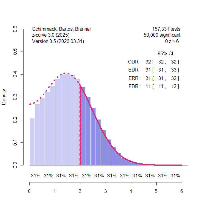
Both RMA and ash, however, take the observed data at face value, even though the data contain few negative results. Z-curve can model truncated data without assuming a normal distribution. The next figure shows the z-curve plot with local power and local effect-size estimates. This model does not assume publication bias.
Z-curve models truncation of the data at zero and makes no distributional assumption about the population effect sizes. The z-curve plot shows the histogram with the fitted model, along with local average effect sizes below the x-axis and local power estimates beneath them. Even the non-significant results are estimated to have moderate effect sizes (~.5), and the overall mean is .77.
As with ash, the median is smaller than the mean — .63 versus .77 — reflecting the same right skew. That two flexible methods independently recover both a mean near .8 and a median near .62 indicates the skew is a real feature of the effect distribution, not an artifact of either method. A random-effects model cannot represent this asymmetry, because assuming normality forces its mean and median to coincide.
Across models, then, the mean estimates agree reasonably well — z-curve (.77), ash (.80), and the random-effects model (.81) all indicate a moderate-to-large average effect — with the weight-function selection model the lone exception, producing an implausible negative estimate. For this literature, truncation and the normality assumption have a relatively small effect on the point estimate, consistent with the simulations, which showed close agreement among models when the average effect is large. This is the favorable case, however: when the average effect is small, the normality assumption’s implied negative effects and the truncation at zero have a much larger impact.

So far, all models assumed no selection for statistical significance. This is unlikely, because published articles predominantly report significant results that support theoretical predictions (Sterling et al., 1995), and Chen et al. (2025) found evidence of publication bias in this literature. Z-curve can model publication bias by fitting only the significant results and estimating the distribution of the non-significant results that were not reported.

Taking publication bias into account has two effects. First, the effect-size estimates decrease. Second, the average is now computed over a larger reference set that includes the estimated non-significant studies, which have smaller effects. The mean effect size is reduced to .52 and the median to .34. Even after this correction the distribution remains right-skewed — the mean exceeds the median — and the median of .34 is the more representative value for a typical study.
In conclusion, meta-analytic models that make different assumptions produce different results. Making sense of these differences requires testing the assumptions and preferring models that avoid assumptions that cannot be tested. In this example, the data show clear evidence of selection on the sign of the effect, further evidence of selection against non-significant positive results, and evidence that the population distribution is not normal (median < mean). A model that accommodates these features of the data — z-curve — produced lower estimates than the random-effects model, while the weight-function selection model produced an implausible negative estimate.
It is not possible to generalize from this single example to all meta-analyses, but the results raise the possibility that many published effect-size estimates are biased by false distribution assumptions, especially when publication bias is also present. To assess the extent of these biases, such literatures should be reexamined with methods that can model selection and avoid the untestable assumption of normally distributed population effects — as z-curve does.