After a general consensus or willingness to accept social distancing measures imposed by politicians (often referred to as lock-downs), societies are polarizing. Some citizens want to open stores, bars, and restaurants (and get a hair cut). Others want to keep social distancing measures in place. Some people on both sides are not interested in scientific arguments for or against their position. Others like to find scientific evidence that seemingly supports their viewpoint. This abuse of science is becoming more common in a polarized world. As a scientist, I am concerned about the weaponizing of science because it undermines the ability of science to inform decisions and to correct false beliefs. Psychological research has shown how easily we assimilate information that matches our beliefs and treat disconfirming evidence like a virus. These motivated biases in human reasoning are very powerful and even scientists themselves are not immune to these biases.
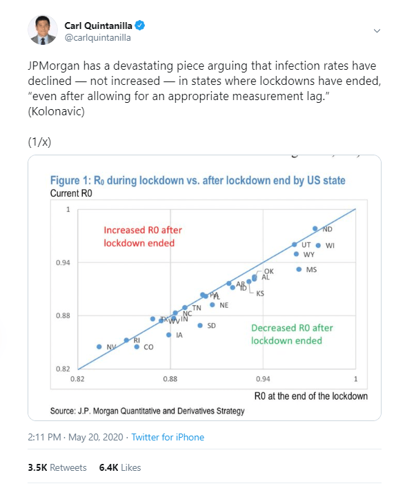
Some economists appear to be afflicted by a bias to focus on the economic consequences of lock-downs and to downplay the effects of the virus itself on human lives and the economy. The idea is that lock-downs were not helpful to save lives at immense costs to the economy. I am not denying the severe consequences of unemployment (I actually co-authored an article on unemployment and well-being), but I am shocked by claims in a tweet that social distancing laws are ineffective that have been retweeted 3,500 times or blog posts that make similar claims accompanied by scatterplots that give the claims the appearance of scientific credibility.
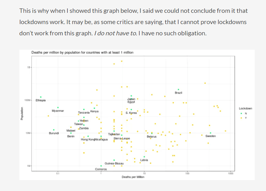
There is nothing wrong with these graphs. I have examined the relationship between policies and Covid-19 deaths across US states and across countries, and I have also not found a significant correlation. The question is what this finding means. Does it imply that lock-down measures were unnecessary and have produced huge economic costs without any benefits? As some responses on twitter indicated, interpreting correlational data is not easy because many confounding factors influence the correlation between two variables.
Social distancing is unnecessary if nobody is infected
Let’s go back in time and impose social distancing policies across the world in May 2019 randomly in some countries and not in others. We observe that nobody is dying of Covid-19 in countries with and without ‘lock-down’. In addition, countries with lock-down suffer high rates of unemployment. Clearly, locking countries down without a deadly virus spreading is not a good idea. Even in 2020 some countries were able to contain relatively small outbreaks and are now mostly Covid-free. This is more or less true of countries like Taiwan, Australia, and New Zealand. However, these countries impose severe restrictions on travel to ensure that no new infections are brought into the country. When I tried to book a flight from Toronto to Sydney, I was not able to do so. So, the entire country is pretty much in lock-down to ensure that people in Australia cannot be infected by visitors from countries that have the virus. Would economists argue that these country-wide lock-downs are unnecessary and only hurt the tourist industry?

The fact that Covid-19 spread unevenly across countries also creates a problem for the correlation between social-distancing policies and Covid-19 deaths across countries. The more countries are actively trying to stem the spread of the virus, the more severe social-distancing measures will be, while countries without the virus are able to relax social distancing measures. Not surprisingly, some of the most sever restrictions were imposed at the peak of the epidemics in Italy and Spain. This produces a positive correlation between severity of lock-downs and spread of Covid-19, which could be falsely interpreted as evidence that lock-downs even increase the spread of Covid-19. A simple correlation between lock-down measures and Covid-19 deaths across countries is simply unable to tell us something about the effects of lock-down measures on deaths within countries.
Social Distancing Effects are Invisible if there is no Variation in Social Distancing Across Countries
To examine the effectiveness of social-distancing measures, we need to consider timing. First, social distancing measures may be introduced in response to a pandemic. Later on, we might see that countries or US states that imposed more severe restrictions were able to slow down the spread of the virus more. However, now we encounter a new problem. Most countries and states responded to the declaration of Covid-19 as a pandemic by the WHO on March 11 with very similar policies (school closures). This makes it difficult to see the effects of social distancing measures because we have little variation in the predictor variable. We simply do not have a large group of countries with a Covid-19 epidemic that did nothing. This means, we lack a proper control group to see whether spread in these countries would be bigger than in countries with severe lock-downs. Even countries like the UK closed schools and bars in mid March.
Sweden is often used as the example of a country that did not impose severe restrictions on citizens and kept schools open. It is difficult to evaluate the outcome of this political decision. Proportional to the population, Sweden ranks number 6 in the world in terms of Covid-19 deaths, but what is a proper comparison standard? Italy and Spain had more severe restrictions and more deaths, but their epidemics started earlier than in Sweden. Other Nordic countries like Norway, Denmark, and Finland have much lower fatalities than Sweden. This suggests that social distancing is effective in reducing the spread, but we do not have enough data for rigorous statistical analysis.
Social Distancing Policies Explain Trajectories of Covid-19 spread in hot-spots.
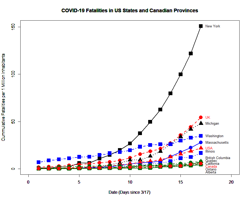
One advantage of epidemics it is possible to foresee the future because exponential growth produces a very notable trajectory over time that is hard to miss in statistical analyses. If every individual infects two or three other people, the number of cases will grow exponentially until a fairly large number of the population is infected. This is not what happened in Covid-19 hot spots. Let’s examine New York as an example. In mid March, the number of detected cases and deaths increased exponentially, with numbers doubling every three days.
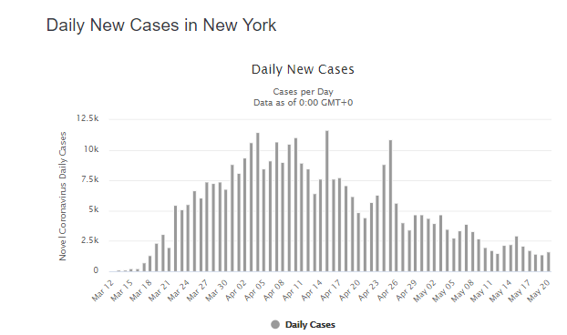

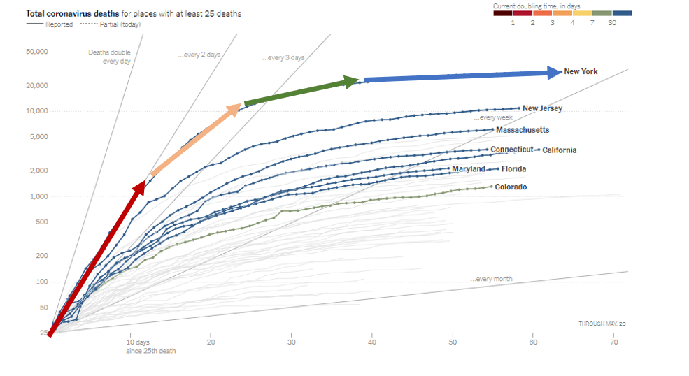
The number of new cases peaked in the beginning of April and has been decreasing until now. One possible explanation for this pattern is that social-distancing policies that were mandated in mid-March were effective in slowing down the spread of the virus. Anybody who claims that lock-downs are ineffective needs to provide an alternative explanation for the trajectory of Covid-19 cases and deaths over time.
Once more it is difficult to show empirically what would have happened without “lock-downs”. The reasons is that even in countries that did not impose strict rules people changed their behaviors. Once more we can use Sweden as a country without ‘lock-down’ laws. As in New York, we see that rapid exponential growth was slowed down. This did not happen while people were living their lives as they did in January 2020. It happened because many Swedes changed their behaviors.

The main conclusion is that the time period from March to May makes it very difficult to examine scientifically what measures were effective in preventing the spread of the virus and what measures were unnecessary. How much does wearing masks help? How many lives are saved by school closures? The best answer to these important questions is that we do not have clear answers to these questions because there was insufficient variation in the response to the pandemic across nations or across US states. Most of the variation in Covid-19 deaths is explained by the connectedness of countries or states to the world.
Easing Restrictions and Covid-19 Cases
The coming months provide a much better opportunity to examine the influence of social distancing policies on the pandemic. Unlike New Zealand and a few other countries, most countries do have community transmission of Covid-19. The United States provide a naturalistic experiment because (a) the country has a large population and therewith many new cases each day and (b) social distancing policies are made at the level of the 50 states.
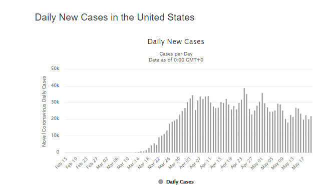
Currently, there are still 20,000 new confirmed (!) positive cases in the United States. There are also still over 1,000 deaths per day.
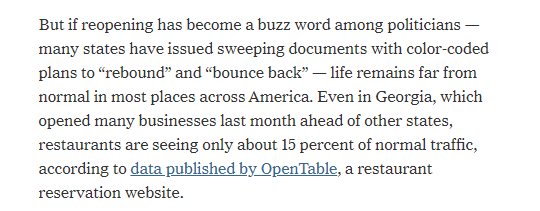
There is also some variation across states in the speed and extend to which states ease restrictions on public life (NYT.05.20). Importantly, there is no state where residents are just going back to live as it was in January of 2020. Even states like Georgia that have been criticized for opening early are by no means back to business as usual.
So, the question remains whether there is sufficient variance in opening measures to see potential effects in case-numbers across states.
Another problem is that it is tricky to measure changes in case-numbers or deaths when states have different starting levels. For example, in the past week New York still recorded 41 deaths per 1 Million inhabitants, while Nebraska recorded only 13 deaths per 1 Million inhabitants. However, in terms of percentages, cumulative deaths in New York increased by only 3%, whereas the increase in Nebraska was 23%. While a strong ‘first wave’ accounts for the high absolute number in New York, it also accounts for the low percentage value. A better outcome measure may be whether weekly numbers are increasing or decreasing.
Figure 1 shows the increase in Covid-19 deaths in the past 7-days (May 14 – May 20) compared to the 7 days after some states officially eased restrictions (May 2 – May 8).

It is clearly visible that states that are still seeing high numbers of deaths are not easing restrictions (CT, NJ, MA, RI, PA, NY, DE, IL, MD, LA). It is more interesting to compare states that did not see a big first wave that vary in their social distancing policies. For this analysis, I limited the analysis to the remaining states.

States below the regression line are showing faster decreases than other states, whereas states above the regression line show slower decreases or increased. When the opening policies on May 1 (NYT) are used as predictors of deaths in the recent week with deaths two weeks before as covariate, a positive relationship emerges, but it is not statistically significant. It is a statistical fallacy to infer from this finding that policies have no influence on the pandemic.

More important is the effect size, which is likely to be somewhere between -2 and + 4 deaths per million. This may seems a small difference, but we have to keep in mind that there is little variation in the predictor variable. Remember, even in Georgia where restaurants are open, the number of diners is only 15% of the normal number. The hypothetical question is how much bigger the number of Covid-19 cases would be if restaurants were filled at capacity and all other activities were back to normal. It is unlikely that citizens of open states are willing to participate in this experiment. Thus, data alone simply cannot answer this question.
Conclusion
Empirical science rely on data and data analysis. However, data are only necessary and not sufficient to turn a graph into science. Science also requires proper interpretation of the results and honest discussion of their limitations. It is true that New York has more Covid-19 deaths than South Dakota. It is also true that some states like South Dakota never imposed severe restrictions. This does not imply that stay-at-home orders in New York caused more Covid-19 deaths. Similarly, the lack of a correlation between Covid-19 policies and Covid-19 cases or deaths across US states does not imply that these policies have no effect. Another explanation is that there are no states that had many deaths and did not impose stay-at-home orders. For this reason, experts have relied on models of epidemics to simulate scenarios what would have happened if New York City had not closed schools, bars, and night clubs. These simulations suggest that the death toll would have been even greater. The same simulations also suggest that many more lives could have been saved if New York City had been closed down just one week earlier (NPR). Models may sound less scientific than hard data, but data are useless and can be misleading when the necessary information is missing. The social-distancing measures that were imposed world-wide did reduce the death toll, but it is not clear which measures reduced it by how much. The coming months may provide some answers to this questions. S. Korea quickly closed bars after one super spreader infected 40 people in one night (businessinsider). What will happen in Oklahoma where bars and nightclubs are reopening? Personally, I think the political conflict about lock-downs is unproductive. The energy may be better spend on learning from countries that have been successful in controlling Covid-19 and who are able to ease restrictions.