I have been tracking the Covid-19 statistics of Canadian provinces for several weeks (from March 16 to be precise). Initially, Ontario and Quebec were doing relatively well and had similar statistics. However, over time the case numbers increased, deaths, especially in care homes were increasing and the numbers were diverging. The situation in Quebec was getting worse and recently the number of deaths relative to the population was higher than in the United States. Like many others, I was surprised and concerned, when the Premier of Quebec announced plans to open businesses and schools sooner than later.
I was even more surprised when I read an article on the CTV website that reported new research that claims the situation in Quebec and Ontario is similar after taking differences in testing into account.
The researchers base this claim on a statistical model that aims to correct for testing bias and that is able to estimate the true number of infections on the basis of positive test results. To do so without a representative sample of tests seems rather dubious to most scientists. So, it would be helpful if the researchers could provide some evidence that validates their estimates. A simple validation criterion is the number of deaths. Regions that have more Covid-19 infections should also have more deaths, everything else being equal. Of course, differences in age structures or infections of care homes can create additional differences in deaths (i.e., the caes-fatality rates can differ), but there are no big differences between Quebec and Ontario in this regard as far as I know. So, is it plausible to assume that Quebec and Ontario have the same number of infections? I don’t think so.
To adjust for the difference in population size, all Covid-19 statistics are adjusted. The table shows that Ontario has 1,234 confirmed positive cases per 1 Million inhabitants while Quebec has 3,373 confirmed positive cases per 1 Million residents. This is not a trivial difference. There is also no evidence that the higher number in Quebec is due to more testing. While Ontario has increased testing lately, testing remains a problem in Quebec. Currently, Ontario has tested more (21,865 per Million tests) than Quebec (19,471 per Million tests). This also means that the positive rate (percentage of positive tests; positives/tests*100) is much higher in Quebec than in Ontario. Most important, there are 741 deaths for 10 Million residents in Ontario and 2157 deaths in Montreal. That means there are 2.91 times more deaths in Quebec than in Ontario. This matches the differences in cases where Quebec has 2.73 times more cases than Ontario. It follows that Ontario and Quebec also have similar case-fatality rates of 6.00% and 6.39%. That is, out of 100 people who test positive, about 6 die of Covid-19.
In conclusion there is absolutely no evidence for the claim that the Covid-19 pandemic has affected Ontario and Quebec to the same extent and that differences in testing produce misleading statistics. Rather, case numbers and deaths consistently show that Quebec is affected three time worse than Ontario. As the false claim is based on the Montreal authors’ statistical model, we can only conclude that their model makes unrealistic assumptions. It should not be used to make claims about the severity of Covid-19 in Ontario, Quebec, or anywhere else.
Like many colleagues who are professional scientists, I have followed the COVID-19 pandemic closely. We have been warned against turning into “armchair epidemiologists” who are not trained to analyze or understand epidemiological data. The problem is that the real experts are very busy analyzing data and modeling data and don’t seem to have time to communicate with the public about their results or data. So, the general public is left in the dark or is told about the COVID-19 numbers by politicians or journalists, who are not trained in data analysis at all. Some of the numbers that are being shared are doing more harm than good. For example, it is not helpful to compare the number of cases who tested positive in the UK and Canada because Canada has done a lot more testing than the UK, especially when we take population size into account. As I demonstrated elsewhere, taking testing rates into account, Canada looks better than the UK (Schimmack, March 30, 2020).
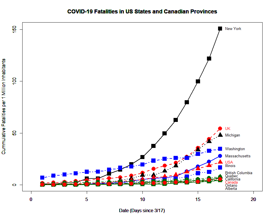
Ultimately, the most important statistic is not the number of people who tested positive or how many people were infected by the virus, but how many people died of COVID-19. These numbers were small and not very informative in the beginning, but all over the world these numbers are increasing at a rapid rate. This makes it possible to compare Canada to other countries, and to compare Canadian provinces to each other, or to US states. For this purpose, I recorded the cumulative fatality rates in the UK, USA, and Canada; as well as six states in the US, and four Canadian provinces, Alberta, British Columbia, Ontario, and Montreal. Figure 1 shows the results.
Figure 1 adjusts for population size. Deaths are computed as the number of deaths for 1 million inhabitants. In New York, 150 people out of 1 million people have died so far. The graph shows that this high fatality rate is unique. In comparison, Canada has recorded only 5 deaths for every 1 million Canadians. This is 30 times fewer deaths than in New York state. The UK has recorded 54 deaths for every million residents. This is 10 times more than in Canada. The USA has recorded 21 deaths for every 1 million residents. This is still 4 times more than in Canada. Thus, in comparison, Canada is doing well, although some other countries (e.g. Australia) are doing better, we are lucky that COVID-19 has not created a major crisis here.
Luck is probably not the only reason why Canada has been doing relatively well. It is well-known that the response by Canadian governments (federal and provincial) differed from the response in the UK and in the United States. Canada was faster to conduct more tests, to close schools, and to introduce social distancing measures. Although the data do not prove that these measures caused the better outcome in Canada, it is a plausible and probable explanation. Every Canadian who has complied with social-distancing rules has contributed to the positive outcome so far.
The fairly uniform response in Canada may also explain why there is little variation across Canadian provinces that all cluster at the bottom of the graph. Although BC had an early outbreak, it was able to get on top of it, and is now seeing a flattening of the curve in BC (not visible in the graph).
New York
In contrast, US states differ dramatically from each other. The most notable exception is New York. Although the numbers are for the entire state, the death toll is mostly due to a crisis in New York City. I have been asking colleagues and read newspaper articles to understand why NY has been hit so hard. As the numbers are adjusted for population size, size is not the answer. A more plausible factor is population density, which is mentioned as a key factor. Of course, the virus is spreading more in urban areas all over the world, but I find it hard to believe that this is the only explanation. I have looked at data from Germany, where cities like Berlin have much lower death rates than New York. Like many Berliners, I did not have a car and used public transport to get around the city. If public transport is a major risk factor, the situation should be worse. The same is true of Montreal and Toronto. For some reason, Canadian big cities have been spared the fate of New York City. I included Illinois in the graph because over half of the inhabitants of Illinois live in ‘Chicagoland.’ Although Illinois is more affected than Canada or Ontario, it is nothing like New York or even Detroit, Michigan. I don’t have an answer for the unique situation in New York (and New Jersey), but the good news is that neither Canada nor other US states are on the same trajectory.
Washington
Like British Columbia, Washington was hit early. It has the highest fatalities on March 18 when the graph starts. However, Washington has been able to ‘flatten the curve’ and to keep fatalities relatively low. This shows that it is possible to flatten the curve and that we can examine what measures Washington put in place to do so. Internationally, Asian countries have also been able to flatten the curve, but it is an open question whether Europeans and North Americans can do so. Washington and British Columbia show that it is possible.
Predicting the Future
You do not need to be a rocket scientist or an epidemiologist to understand the numbers of the past. Training in epidemiology is more important when it comes to predicting the future. Of course, predicting the future is also much harder because we are making educated guesses (guestimates) about the future based on data from the past. In this way, epidemiology is more like forecasting the weather, stock markets, or climate. Many Canadians like me have been frustrated by the reluctance of scientists or politicians in Canada to share their models and the predictions of these models. A notable exception was the premier of Ontario, Dough Ford, who shared some predictions on March 3 (CBC). The headline figures were that over the full course of the pandemic, which could last up to two years, 3000 to 15,000 people in Ontario may die of the coronavirus. Of course, a prediction over a two year time-frame is extremely uncertain and depends on many unknown factors such as how quickly a vaccine will be available. Personally, I found it more important to learn that experts expect about 1,600 deaths in Ontario by the end of this month (National Post), if the current measures stay in place. This translates into 123 deaths per 1 million citizens, compared to the current number of 5 deaths per 1 million. That is 25 fold increase over the next weeks until April 30. In the graph, this level is well above the UK and not much below the current level of 150 deaths / million in NY. This is a scary and sobering thought. Our minds are not used to think in terms of exponential growth. We tend to extend graphs in a linear fashion and the trajectory in Canada seems reassuring but they are not. Michigan’s trajectory in the figure shows what can happen in a short period of time. I am not an epidemiologists and I don’t have a model or a crystal ball to predict the future. I am only sharing with Canadians how things have played out so far. We are probably not even at the end of the first period of a hockey game that may well go into several overtimes. So far, we are up 1:0, but as all Canadians know that doesn’t mean we won the game or we can relax. All we know is that we played pretty well in the first period, and that we have a fighting chance if we continue to play well.
Cookie Consent
We use cookies to improve your experience on our site. By using our site, you consent to cookies.