Disclaimer: I tried my best to use the best available data, but I may have made some mistakes. The general points about tracking the spread of COVID-19 remain valid even if there are mistakes in the actual numbers, but the actual statistics may be misleading. Of course, even the best available data can also be distorted by errors. This is a best effort, but the results remain guestimates of the current situation.
COVID-19 is a pandemic like and unlike previous pandemics. It is spreading faster than any previous pandemics because the world is more interconnected than it every was. The virus spread from China to neighboring countries like South Korea, to Iran, and to Italy early. However, a virus doesn’t know or respect boarders. It is spreading around the world. COVID-19 is also unprecedented because modern technology made it possible to develop tests that can identify infected individuals within days. Testing makes it possible to track the spread of COVID-19 before people are dying in large numbers. Websites and newspapers report the number of confirmed COVID-19 cases as quickly as these numbers become available. Most of the time, the key statistic is the absolute number of COVID-19 cases.
For example, a popular COVID-19 tracking site posts a ranking of countries on the basis of case counts (https://www.worldometers.info/coronavirus/#countries).

There are three problems with the use of case counts as a statistic that reflects the severity of the problem. First, countries with a larger population are bound to have a higher number of cases. Switzerland has a population of 8.5 million people, while China has a population of 1.4 billion. Using Switzerland’s number of cases with China’s population, implies 1,722,164 cases (1.7 million). Thus, the COVID-19 pandemic is a much bigger problem in Switzerland than in China. A solution to this problem is to provide information about cases relative to the size of the population. This is done too rarely. The German news channel ARD provided a map of cases for every 100,000 inhabitants of one of the states. The map shows that small city-states like Berlin and Hamburg have a relatively high rate of infections, compared to bigger states with larger populations in neighboring states. Thus, it is much more informative to show information relative to population size than to compare absolute case numbers.

Another factor that influences case counts is time. High case counts are observed in places where the pandemic is out of control and widespread community transmission is taking place. At this point, statistics only document the pandemic, but they cannot inform policies or actions because it is too late. At this stage in the pandemic, case counts are also relatively unimportant because deaths are a more tragic and objective indicator of the severity of the crisis. For example, on March 16, the state of New York reported only 669 cases with a population of nearly 20 million people, which translates into 3 cases for every 100,000 inhabitants. Nine days later, this has increased exponentially to 91,270 cases, which translates into 456 cases for every 100,000. More important, the number of deaths increased from less than 10 to 200 deaths. Thus, within 10 days a region can go from a low case count to crisis.
A better statistic is to track the increase in the number of cases over time. A case count of 10 cases per 100,000 inhabitants may not sound alarming, but ignores that this number can explode if the number of cases is increasing rapidly. The financial times provides informative graphs that take growth rates into account.

The graph shows that Italy and China had similar growth rates in the beginning, but then the growth rate in China slowed down more than the growth rate in Italy. It also shows, that Singapore was able to slow down the growth rate early on and that South Korea was able to slow the growth rate even after they had a substantial number of cases and the same growth rate as China and Italy (about 33% increase a day). It also shows that many countries are on the same trajectory as Italy and China.
Although the FT graphic is an improvement over simple count data, it has some problems and can be easily misinterpreted. First, it still relies on absolute numbers that are distorted by population size. The graph suggests that problems are worse in the United States than in the Netherlands. However, fatality rates tell a different story. The Netherlands have seen already 276 deaths with a population of 17 million, whereas the USA has seen 784 deaths with a population of 34 million, nearly 20 times as many as the Netherlands. If the Netherlands had the same population as the United States, the fatality rate would be 5,520, which is 7 times higher than the rate in the United States. Thus, the situation in the Netherlands is considerably worse than in the United States.
A third factor that distorts comparisons is that regions differ considerably in the amount of testing that is done. The more tests are being conducted, the more positive cases will be found. Thus, low case counts may provide a false sense of security and comfort, if they are caused by low rates of testing. Testing can also distort comparisons over time. Absolute numbers might jump simply because the number of tests has increased dramatically. For example, in NY the number of positive cases jumped from 669 cases on March 16 to 2,601 cases on March 17, an increase by 289%. Another way of saying it is that case numbers nearly quadrupled in one day. This jump does not suggest that cases quadrupled in one day, but rather a dramatic increase in testing. Another problem is that data may not be updated regularly. For example, Germany announced a surprising flattening of the curve last weekend, only to be surprised again when cases increased more than usual on Monday. The reason was that some states did not report updated numbers on Sunday.
A solution to this problem is to count the proportion of positive tests relative to the number of tests that were conducted. Countries with bigger populations will conduct more tests, but that will not affect the proportion of positive tests. Similarly, the number of tests can vary from day to day, but this would not influence the proportion of positive tests that are recorded. For most researchers, this seems to be obvious. We may report, that a study had 132 female and 68 male participants, but we really only care about the fact that the gender composition was 66% female and 34% male. However, when it comes to COVID-19 data, this statistic is rarely reported. To make matters worse, in some countries it is impossible to compute it because only positive tests are recorded and reported. Nobody knows how many tests are conducted in Germany (Dear Robert Koch Institute, improve the recording and reporting of COVID-19 cases!).
Most of the states in the USA and the Canadian provinces report the numbers of tests that are being conducted. This makes it possible to examine the spread of the COVID-19 pandemic in the USA and Canada. For the states in the USA, I used data from the covidtracking website. I was not able to compute statistics for all states because some states do not report negative results. Without reporting of negative results, it is unclear how widespread COVID-19 in these states is. The best estimates may be based on results from neighboring states that report credible testing rates.
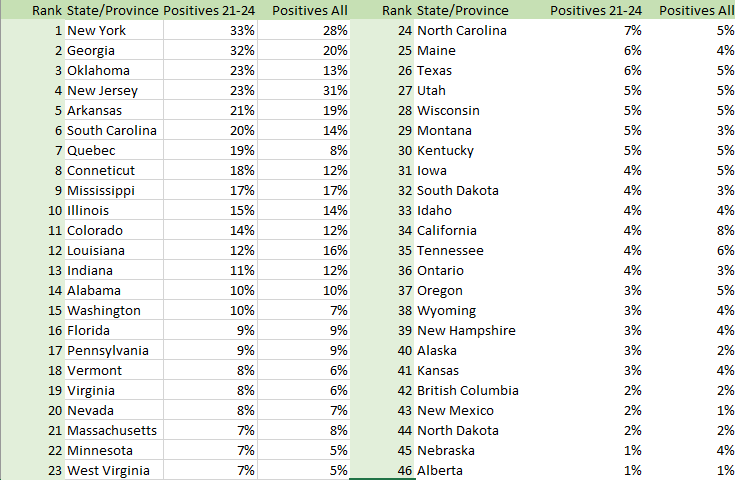
With every new statistic, we have to examine whether it produces useful, valid information. One indication that the statistic provides some useful information is the ranking of New York as the state with the biggest problem. Not surprisingly, neighboring New Jersey also ranks highly. It is harder to validate the statistic at the lower end because it is not clear whether places with low case numbers have low cases of COVID-19 or testing rates are low. However, Alberta has the highest testing rate of all states and provinces, and only 1% of cases test positive. This suggest that COVID-19 is not widespread in Alberta.
The placement of Quebec is interesting because Quebec has been testing at a fairly high rate with relatively low case numbers, but it recorded big increases over the past two days. This spike made Quebec move to rank #7 and there is concern about widespread community transmission.
Thus, some results suggest that the positive rate is a useful indicator of the spread of COVID-19. However, there are some problems with this statistic as well. Testing is not random and in places where tests are limited, testing will focus on testing of cases in hospitals with a high positive rate. In places with more capacity, the general public has more opportunity to get tested and the positive rate will be lower. Interestingly, I found no correlation between the amount of testing (tests conducted as of March 24 / population) and the positive rates, Pearson r = .03, and only a small negative rank correlation, rank r = -.27. Thus, a considerable amount of the variation in the positive rates may reflect the actual spread of COVID-19 in different states. This would suggest that COVID-19 has spread already in the East of the United States, while prevalence in the Great Plains is still low. This would suggest that the Southern states may be more affected than other statistics suggest because testing rates in these states are low. There is still a chance that some Western states can prevent a pandemic by implementing the right measures before it is too late. In Canada, Ontario and Alberta seem to be doing well so far, and have implemented measures to prevent community transmission, but the spike in Quebec shows that case numbers and positive rates can increase quickly.
In sum, statistics can provide valuable information, but they can also be misleading if numbers are not presented in a way that is informative. Absolute case counts are relatively easy to compute and to report, but absolutely uninformative. To provide the general public with valuable information, everybody needs to do better. Labs and governments need to record and report the number of negative tests, and media need to report numbers that actually reflect the risk to a particular population. Widespread community testing is needed to detect new outbreaks of the pandemic. This has worked in South Korea, the only country that has been able to stop the pandemic. Japan and Singapore were able to prevent it from spreading widely in the first place. In some places, it is not too late to follow these examples.