Since mid-March many countries are in some form of lock-down or have instituted other measures to slow the spread of Covid-19. However, for many countries, mid-March was too late to prevent widespread community transmission of the virus. Just as countries differed in their response to Covid-19, we are going to see national differences in the way countries are trying to come out of lock-downs and to restart their economies. Rankings of nations in terms of case numbers or deaths inevitably raise questions about the rank ordering of nations. Just as much there are debates about the accuracy of the data. For example, relative to its population, Belgium has the highest death toll, but some Belgians argue that other countries are not counting deaths properly. The comparison of case numbers is severely distorted by different amounts of testing. To move beyond armchair epidemiology, we need to take a more careful look at the numbers.
The number of deaths relative to the population is a reasonable indicator of severity. The main problem with this indicator is that some countries may not counting all deaths. Another indicator is the number of people that test positive. This is not an ideal indicator for several reasons. First, some positive cases may only have mild symptoms. Second, countries that test little will severely underestimate the number of real cases. However, we would expect that countries that have a bigger problem have more deaths and also more positive tests. To adjust for national differences in testing, we can compute the positive rate; that is the percentage of tests with a positive result. For example, if one country conducts 1000 tests and has 20 positives, the positive rate is only 5%. In contrast, a country that has 100 tests and 10 positives, has very positives, but a higher positive rate of 10%.
Neither indicator is perfect and both indicators are likely to have some measurement error. Ideally, these errors are relatively independent of each other and cancel each other out. In that case, countries with a high death rate and a high positive rate are likely to be more severely affected than countries with a low death rate and a low positive rate.
To examine how well the two indicators are related, I used the death rates reported on Worldometers and computed the positive rate based on reported tests and positives on wikipedia. Deaths numbers were for April 19. The testing data were obtained on April 21 for the last available day of testing. Testing is not always reported daily, but positive rates do not change dramatically from day to day. Only countries with information about testing could be used.
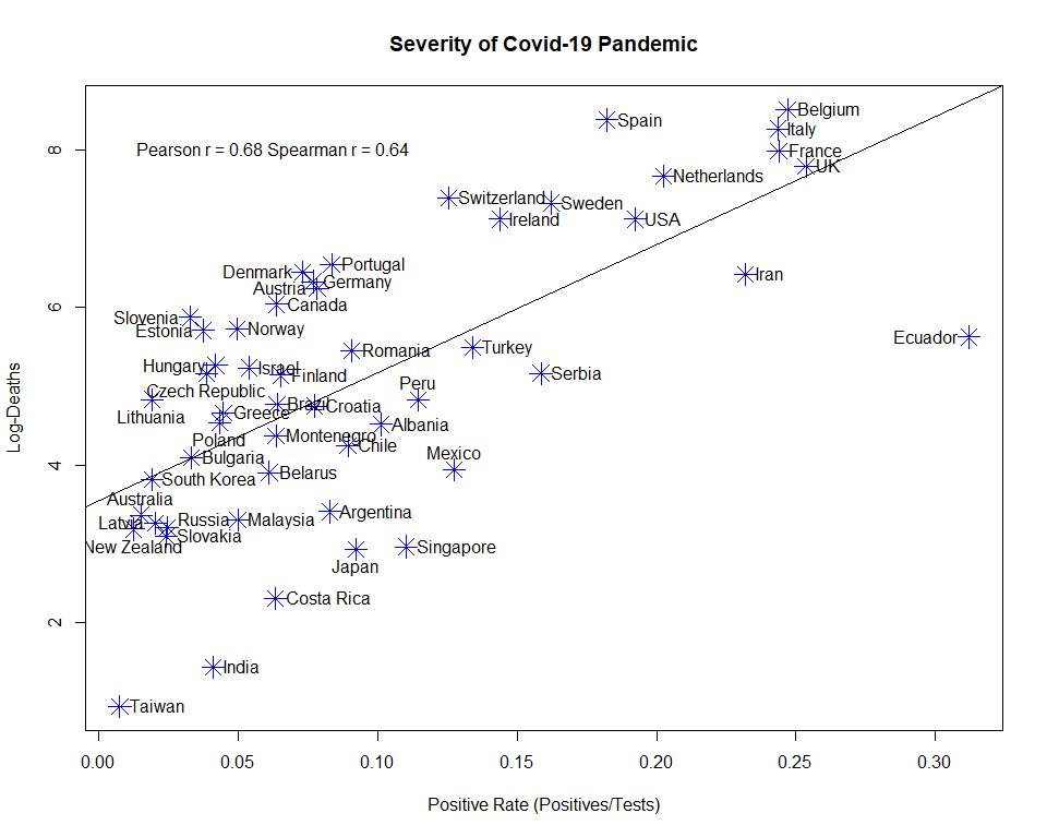
Deaths were log-transformed to take exponential growth into account. The Pearson correlation between the two indicators was r = .68. The rank correlation was similar, r = .64, indicating that both indicators track severity of the Covid-19 pandemic.
Figure 1 also shows the location of individual countries. This makes it possible to examine potential factors that may explain discrepancies between the two indicators. For example, Belgium does indeed have more death than the regression of deaths on the positive rate predicts. However, the differences is relatively small and the positive rate also identifies Belgium as a country that has been severely affected by Covid-19. A notable outlier is Ecuador, and it is possible that death counts severely underestimate the Covid-19 spread in Ecuador. The same is probably true for Iran.
The most interesting question is whether the reliable variation across nations is simply random or whether there are systematic factors that explain why some countries were affected more than others. This blog post merely shows that deaths rates and positive rates are related and can be used to examine this question.