You can find links to the other chapters on the post with Chapter 1.
Chapter 5 compares z-curve to p-curve using the same simulation design as Chapter 4. zcurve3.0/Tutorial.R.Script.Chapter5.R at main · UlrichSchimmack/zcurve3.0
Introduction to Chapter 5
I assume that you are familiar with z-curve, but not familiar with p-curve. P-curve is a similar method that was developed by Simonsohn, Nelson, and Simmons (2014). The method has gained popularity to examine evidential value in meta-analysis. Evidential value is assessed in several ways by testing the null hypothesis that all significant results are false positives. The most powerful (pun intended) evidence of evidential value is an estimate of the average power of the significant studies. This makes p-curve test of evidential value equivalent to z-curve’s estimate of the expected replication rate (ERR). If the original studies were all false positives, z-curve would predict that only 2.5% of exact replication studies would produce a significant result in same direction. P-curve uses power of 33% or more as good evidence of evidential value, but it also provides an estimate of the true average power with a confidence interval. This allows researchers their own criterion for evidential value.
While p-curve estimate of average power and z-curve’s ERR provide the same information, the estimation methods vary in important ways. P-curve is a one component model. It finds the parameter that best fits the observed data. This works well, when all studies have the same power. In contrast, z-curve uses multiple components to allow for heterogeneity in power. This gives it an advantage when power varies across studies (Brunner & Schimmack, 2020).
Another difference between z-curve and p-curve is that z-curve provides a test of bias, but p-curve does not. Nevertheless, p-curve results in meta-analysis are often presented as evidence that there is no publication bias. This conclusion is based on a logical error by users of p-curve.
The authors of p-curve make it clear that p-curve does not test bias.
“The shape of that distribution diagnoses if the findings contain evidential value, telling us whether we can statistically rule out selective reporting of studies (file-drawering) and/or analyses (p-hacking) as the sole cause of those statistically significant findings” (p. 1).
Ruling out selective reporting and/or p-hacking (bias) as the sole cause of significant p-values does not imply that evidence of evidential value rules out bias. In most meta-analyses, evidential value and bias are present. Previous tutorials explained how z-curve can be used to assess the presence and amount of bias by comparing the expected and observed discovery rates. P-curve only focuses on the significant results even when non-significant results are available. Thus, it cannot assess whether the dataset contains too few non-significant results.
In conclusion, the sole purpose of p-curve is to correct for selection bias and to estimate the average power of the significant results. Here you can compare the performance of p-curve to the performance of z-curve. Tutorial 4 already showed very good performance of z-curve. So, the only question is whether p-curve can perform as well as z-curve.
Illustration with OSC Reproducibility Project Data
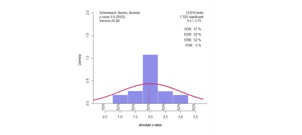
Chapter 2 used the Open Science Collaboration (2015) data to illustrate z-curve. In this project 97 studies with a significant* (including marginally significance, 88 with p < .05) were replicated as closely as possible with some variation in sample sizes. Only about 30-40% of the replication studies produced a significant result in the replication studies. The z-curve results are shown in Figure 1. Z-curve shows evidence of selection bias (EDR 21% versus ODR 91%). The average power of the studies with significant results is estimated as 60%, with a confidence interval ranging from 44% to 74%. Even the 44% estimate is higher than the actual success rate.

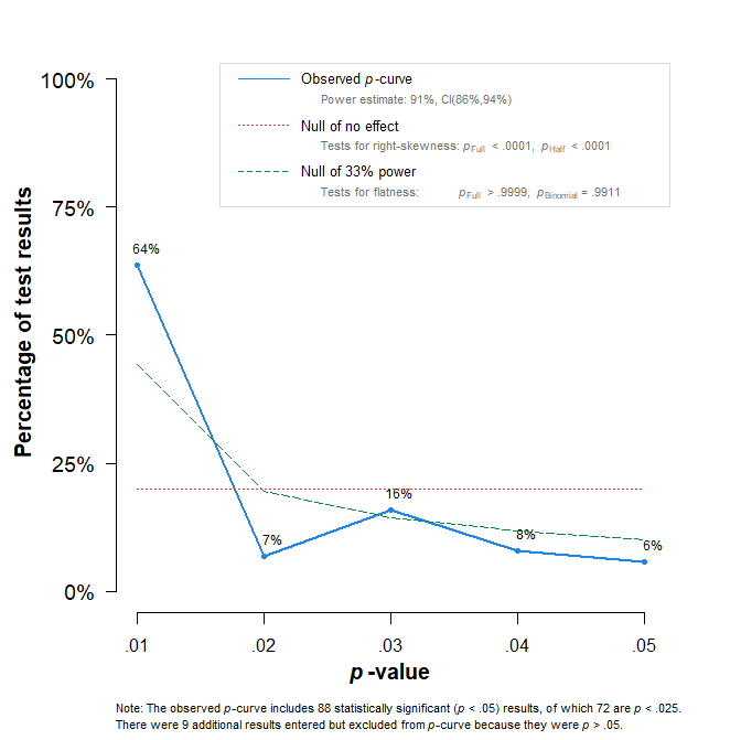
The p-curve does not test for bias. The estimated average power of the significant results is 91%, with an overly tight confidence interval ranging from 86% to 94%. Thus, p-curve estimates a success rate in replication studies of at least 86%, which is more than double the actual success rate.
The Simulation
The setup of the simulation study is described in more detail in Chapter 4. The most important information is that the original studies are assumed to be z-tests with three levels of power. Z0 assumes the test of true null-hypothesis with a center of the z-distribution at 0. This produces a power to replicate a study with p < .05 (two-sided) with an effect in the same direct. Z2 simulated a distribution centered at 2, slightly above the critical value for a significant result, z= 1.96. This is moderate power, slightly above 50%. The third component, Z4 is centered at a value of 4, and power is 98%. The mixture of these three components produces sets of studies with average power that covers the full range of power with few extreme values (z > 6) that might be considered outliers and are not used for the fitting of z-curve. The simulation program samples from the three distributions. To examine systematic biases, the simulation created 10,000 significant z-values.
Chapter 4 showed that z-curve produced very similar estimates of the ERR with the density and the EM method. Here I used only the EM method that is preferred for actual data analyses because it produces better estimates of the EDR. The same data were also analyzed with p-curve.
The z-curve and p-curve estimates of the average power of the significant results or expected replication rate are then compared in terms of (a) root mean square error (RMSE), average direction bias, and coverage of the 95% confidence intervals.
Results
Figure 3 shows the fit for both methods (z-curve = green, p-curve = purple). The large number of simulated studies makes it easy to spot the systematic differences between the two methods. Z-curve produces estimates close to the diagonal that represents accuracy (simulated values = expected values). P-curve does well for low to moderate power,but tends to overestimate moderate to high levels of power. This bias decreases again as power approaches 1.
Figure 3 also shows the confidence intervals. P-curve confidence intervals are so narrow that they are hard to distinguish from the point estimates. Thus, p-curve is overconfident in its biased estimates. The z-curve confidence intervals are easier to see because they are wider, and they are correctly on both sides of the diagonal that represents perfect accuracy.
In short, visual inspection of the results is sufficient to see that z-curve outperforms p-curve.

The following results merely quantify these performance differences. The RMSE for z-curve is .008, whereas the RMSE for p-curve is .102. The directional bias shows that z-curve and p-curve do not differ in terms of underestimation. The maximum downward bias for z-curve is -1.6 percentage points and -2.7 percentage points for p-curve. The maximum upward bias for z-curve is 2.9 percentage points, but p-curve has a maximum upward bias of 22%. The average directional bias is 0.1 percentage points for z-curve, and 8.2 percentage points for p-curve. All of the z-curve confidence intervals included the true value. Only 11% of the p-curve confidence intervals included the true value.
In sum, z-curve consistently performs as well or better than p-curve. Thus, z-curve is the better p-curve and there is no need to conduct p-curve analyses. Z-curve also provides information about bias, the expected replication rate, and the false discovery risk. P-curve does not provide information about any of these statistics. Rather, evidence of evidential value is treated as evidence that there are no false positive results because the average is used to make inferences about all studies, even when the data are heterogenous and some significant results are false positives.
Conclusion
Figure 3 is all you need to see that z-curve is the better p-curve. Of course, you should not trust a figure produced by a statistician to show that their method performs better than other methods. Therefore, you can reproduce the figure and change the simulation to examine whether I hacked the simulation to hide cases where p-curve performs better than z-curve.
Similarly, nobody should trust the authors of p-curve when they claim that their method works well. After an email exchange with Uri Simonsohn (Z-curve vs. P-curve: Break down of an attempt to resolve disagreement in private. – Replicability-Index), the authors of p-curve posted a blog post that claimed p-curve works just fine, even when there is heterogeneity in power. Their blog also does not allow for discussion and comments to alert readers that claims on their blog are false (Open Discussion Forum: [67] P-curve Handles Heterogeneity Just Fine – Replicability-Index). In contrast, the p-curve authors could have commented on my previous posts about p-curve or the one by my collegue and statistics professor Jerry Brunner, who told them how they could improve p-curve (An Even Better P-curve – Replicability-Index). They showed no interest in scientific discussion or made any effort to improve p-curve since 2018.
When they were invited by Susan Fisk to write an article in Annual Review of Psychology, they repeated their claim that p-curve is doing just fine.
“Some critics have claimed that p-curve analysis is distorted in the presence of effect size heterogeneity, that is, when different studies included in p-curve investigate effects of different sizes (McShane et al. 2016, van Aert et al. 2016). However, p-curve is actually robust to heterogeneity (see, e.g., Simonsohn et al. 2014a, figure 2; Simonsohn et al. 2014b, supplement 2).” (Nelson et al., 2018, p. 524).
The reason for the popularity of p-curve in meta-analyses may be that it has become the new fail-safe N, which was a previous toothless method to pretend that publication bias was not a problem. No wonder, Fiske loves p-curve and invited the p-curve authors to write about the replication crisis. They happily complied and wrote:
“Many have been referring to this period as psychology’s “replication crisis.” This makes no sense.” (Nelson et al., 2018, p. 512).
It is ironic that the authors of an article “False Positive Psychology” developed a method that seems to suggest that everything is fine and estimates 91% replicability for psychological science. The method was developed to reveal all the false positive results in psychology, but it didn’t find them. The method was not designed to show that 90% success rates are often obtained with 30% power. To uncover these biases and to demand more honest reporting of results, meta-analysts need to use z-curve.
1 thought on “Z-Curve.3.0 Tutorial: Chapter 5”